Finnish Design
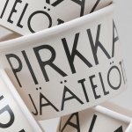
Pirkkalan by Werklig
It’s been years since millennials were first accused of buying too many avocado toasts and expensive coffees. The stereotype of young people loving handmade, refined and artisanal products holds true in their spending patterns, and today, that generation has matured into business leaders, reshaping the world’s mindset to align with these priorities. As consumers, Gen Z seem to be picking...
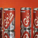
Ghia Non-Alcoholic Aperitif by Perron-Roettinger
In case you’ve missed it, low and no-alcohol drinks are a thing. With over 20% of adults in the UK claiming to be teetotal, abstinence is cool: Brewdog is now Punk AF (that’s ‘alcohol free’), Thomson & Scott’s Noughty is (fairly) nice, and Seedlip is sexy. This sobriety revolution is driven, in part, by the mindfully sceptical Gen Z, turned...
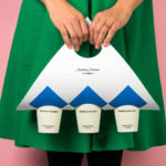
Sitko Pizza Co. by Werklig
Pizza making is a lot like brand identity design. It has many potential configurations: it can be generic or wildly individual, but fundamentally, it’s systematic, a framework of organised elements. It is a base that holds a variety of communicative assets and techniques (the toppings, if you will). Appeal is determined by how well this is orchestrated, and how well...
Cable Factory by Bond
Cable Factory (Kaapelitehdas) is one of Helsinki’s most famous buildings, originally designed by the Finnish industrial architect Wäinö Gustaf Palmqvist in 1939. For many decades it was the largest building in Finland with a footprint of 56,000 m², and it remains one of the most iconic. In 1991 the site was redeveloped to become the country’s biggest cultural centre, housing...
Anton&Anton Kioski by Bond
Anton&Anton (A&A) is an alternative to and antithesis of the large supermarket chains. Staff are described as relaxed, smiley and proud. Their ranges (mostly) organic, some homecooked and also available online for home delivery. With a desire to express an approachable, playful yet credible positioning, and a need to develop a cohesive set of packaging and communications assets A&A worked...
Helsinki by Werklig
In August 2017 Scandinavian design studio Werklig was commissioned to develop the graphic identity for the Finnish city of Helsinki, a capital with an urban region of roughly 1.4 million inhabitants and 751,000 jobs. The challenge was to resolve a disparate and fragmented visual system that represented a broad range of public services, departments and development projects that were helping and...

Kape 24h by Bond
Kari Aihinen is a Finnish chef with a growing international reputation. Aside from creating exclusive pop-up Finnish dinning experiences for New Yorkers, working for Ravintola Savoy and developing one-off Nordic-Asian menus with chef Eric Neo in Singapore, he is also the co-founder and headchef of Helsinki restaurant Roster. Roster is a distinct experience. It features an interior design of custom furniture with a...
Holvi by Werklig, Finland
Holvi is a digital bank account created for entrepreneurs and micro-businesses with the intention of making banking, paperless bookkeeping and invoicing simpler and more efficient. Holvi is positioned as more than just a digital bank account, and comes with a plethora of integrated features. These include the seamless syncing of information between different systems, sending invoices in a few clicks, a...
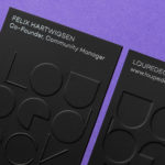
Loupedeck by Bond
Loupedeck is a Finnish startup and photo editing console designed to make the process of image manipulation faster in Adobe Lightroom for both Windows and Mac users. It is described as being an intuitive replacement for keyboard and mouse, is mapped exactly to Lightroom to encourage creative spontaneity and experimentation, and suited to beginners and professionals alike. To help establish and...
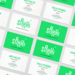
Sakki by Bond
Sakki is Finland’s national union of vocational students. It is made up of 15-20 year olds from a variety of nations, and offers support, tackles student issues, and engages in activism. Scandinavian graphic design studio Bond worked with the union to design and develop a mobile-first experience, and a visual identity made up of tilt-responsive iconography, a bright, simple and modern colour...
Paulig Kulma by Bond
Paulig Kulma is distinctive space, located in the heart of Helsinki, developed by Paulig, the leading coffee brand in the Nordics. It combines a coffee shop, roastery and barista institute, and intends to appeal to a broad customer group, and accommodate a variety use cases throughout the day. Paulig Kulma serves multiple functions. From the inviting and flexible space of the coffee shop, to...

Finland 100 by Kokoro & Moi
This year Finland celebrates its centenary and will mark the occasion with a broad programme of events created and supported by a wide range of stakeholders. Based around the theme of “Together”, and with the intention of creating a cohesive and useful system to unite events and initiatives from local councils and independent organisations and businesses, Scandinavian design studio Kokoro & Moi created “Finland’s Faces”, a brand...