Pirkkalan by Werklig
Opinion by Anna Marar Posted 1 February 2024
It’s been years since millennials were first accused of buying too many avocado toasts and expensive coffees. The stereotype of young people loving handmade, refined and artisanal products holds true in their spending patterns, and today, that generation has matured into business leaders, reshaping the world’s mindset to align with these priorities. As consumers, Gen Z seem to be picking up the torch, holding many of the same values, especially prioritising authenticity and ethical standards in the places they choose to shop. This shift has propelled the remarkable popularity of small brands across many different industries, outpacing the growth of their larger counterparts in recent years. Anecdotally, I’ve found that for my generation, it’s hard for large brands to hold that elusive ‘cool’ factor.
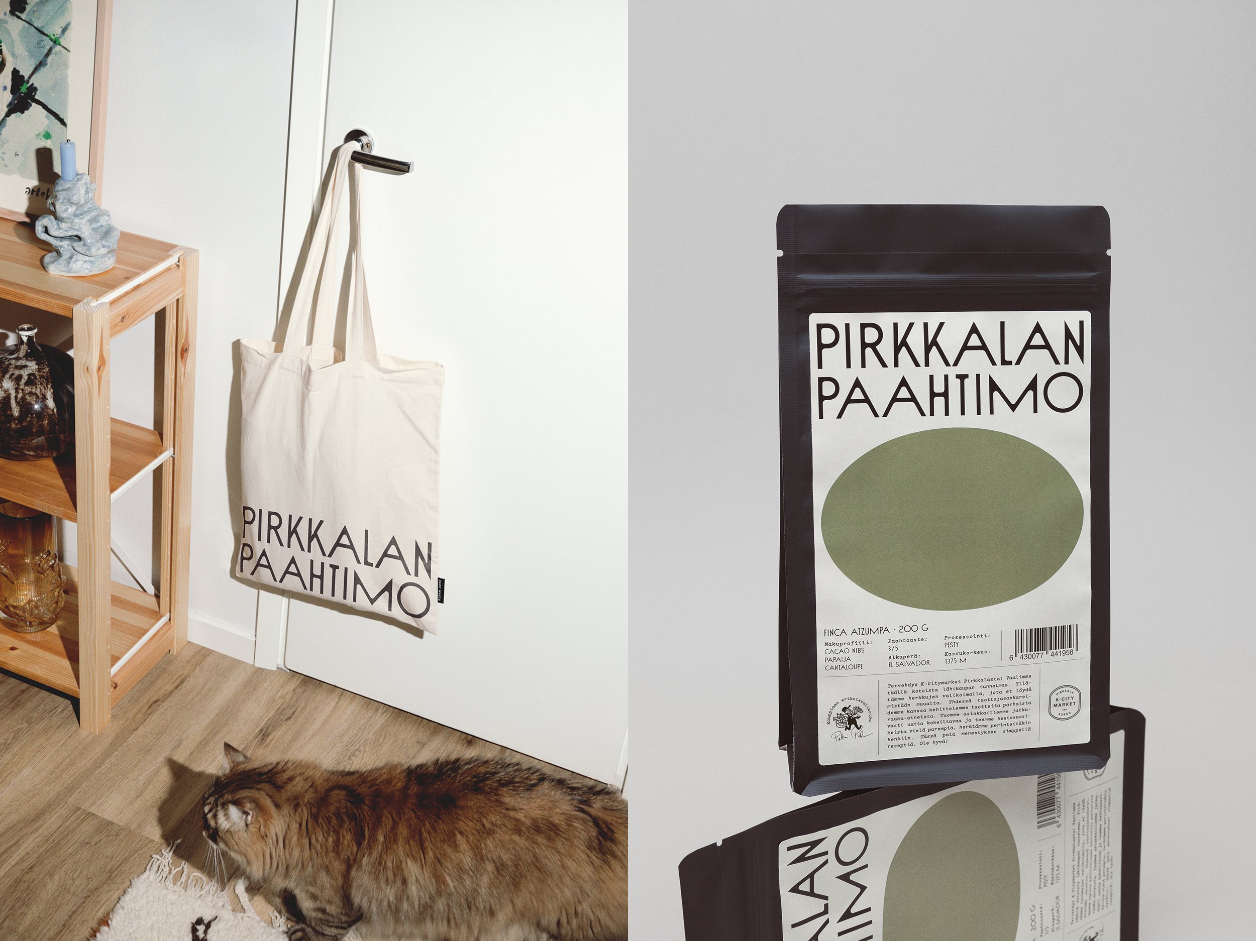
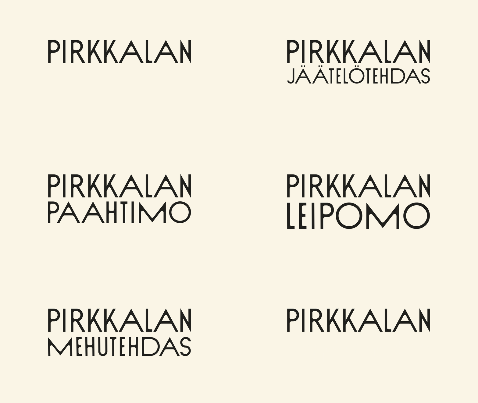
Petri Putila, owner of supermarket K-Citymarket Pirkkala, partnered with the Finnish agency Werklig to create the Pirkkalan range, aiming to bring ‘artisan culture to the middle of a hypermarket’. With designers Anni Koskimies and Mikko Reponen, the goal was ‘to create the look and feel of a local store’, putting the focus on ‘quality and service’. The naming of the brand is straightforward, derived from the location.
Looking at this from a British perspective, Putila’s decision to convey artisanal quality through a supermarket’s own brand is somewhat surprising, given the common perception of ‘own-brand’ items as more affordable alternatives. Even premium own-brand lines like Tesco’s Finest or Sainsbury’s Taste the Difference typically avoid dipping into the language of trendy independent labels, primarily communicating a supermarket style product. A closer comparison may be found with the many internal brands in the American chain Trader Joe’s, where choices within typography, illustration style and colour clearly aim to tap into that love of artisanal and unique products.
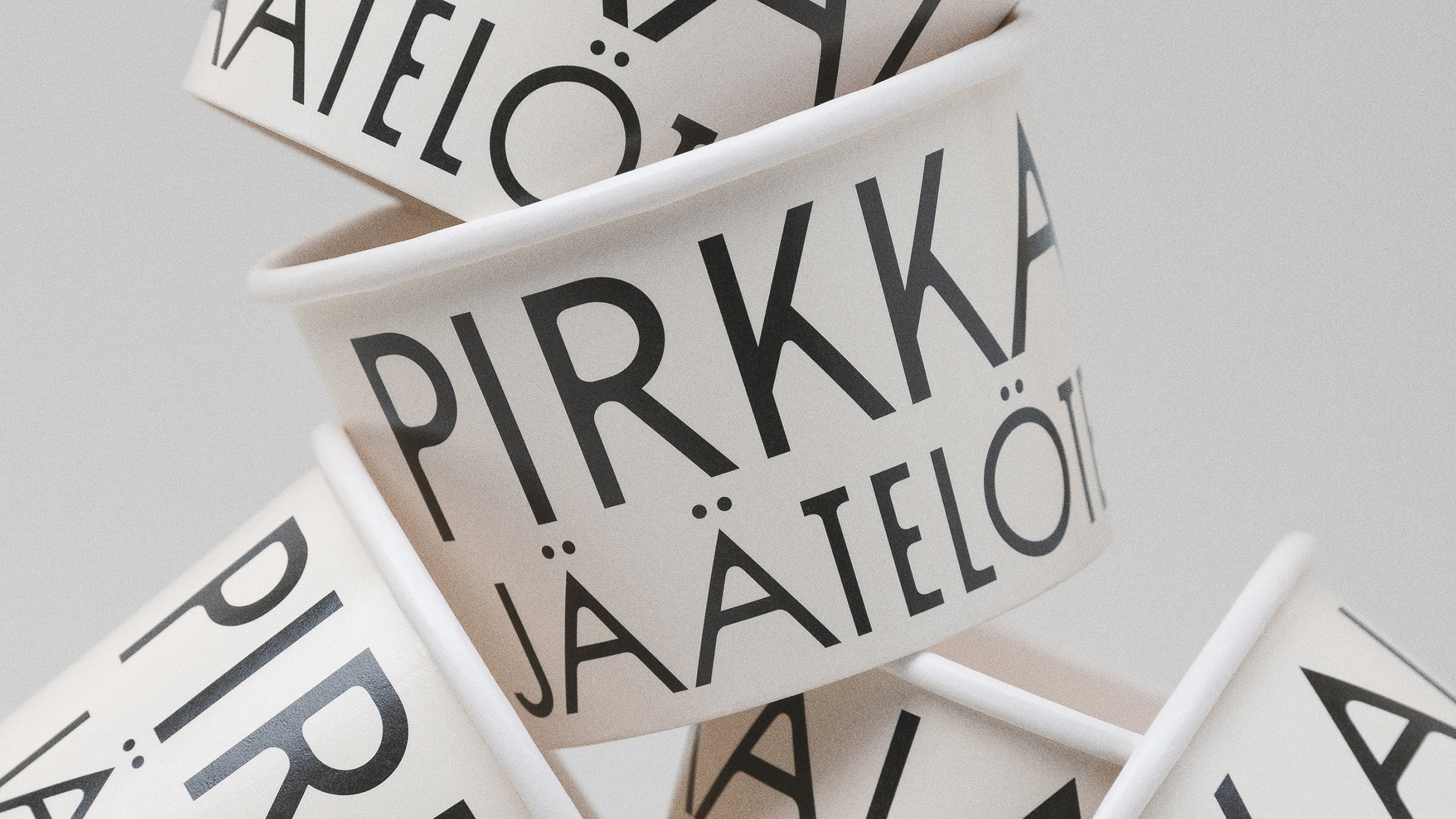
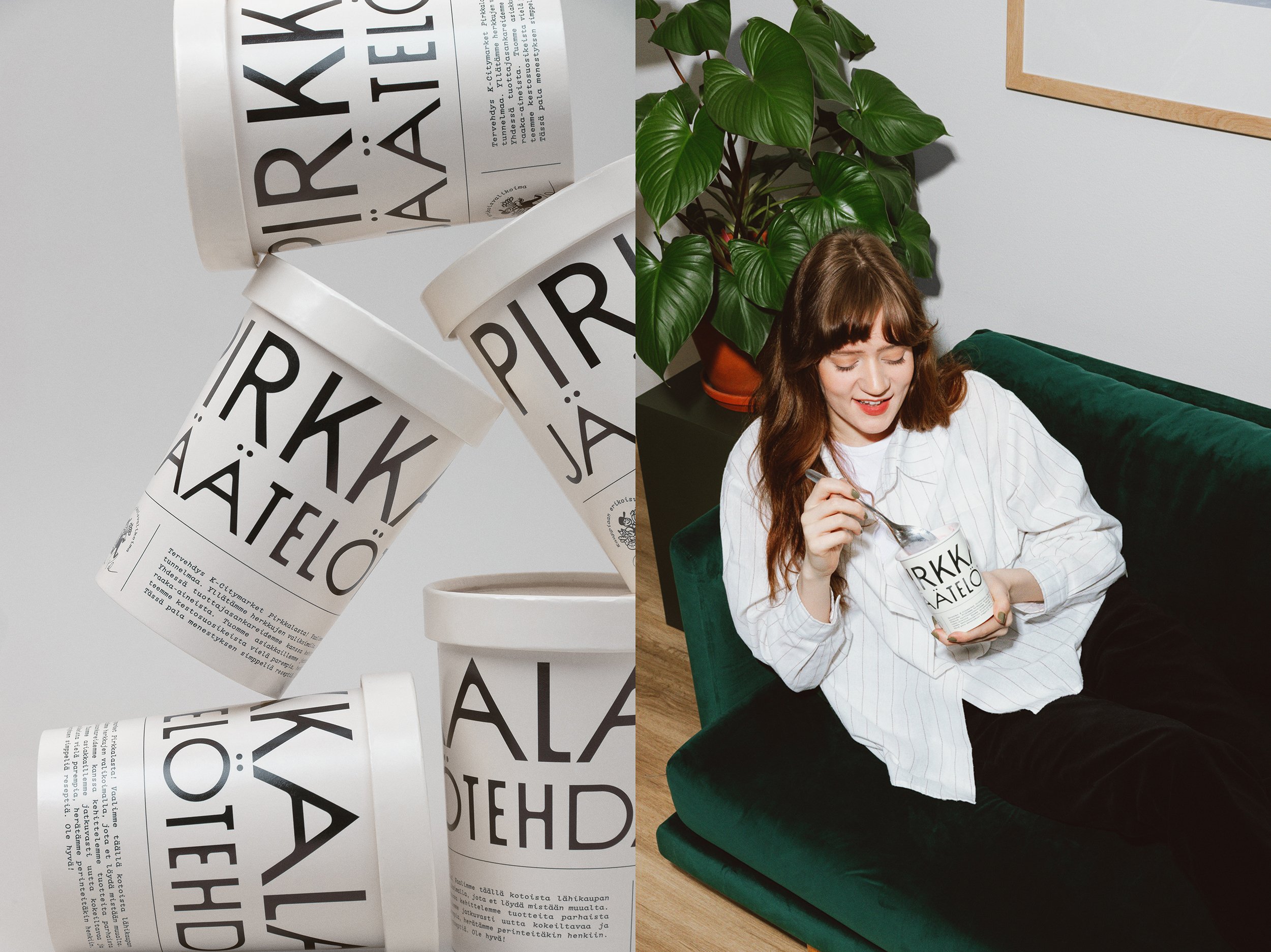
Koskimies points out that ‘you won’t find many monochromatic ice cream or coffee brands in Finland’ and that ‘choosing visual simplicity’ was a clear way to stand out. The design blends old and new, featuring a clean layout with a minimal colour palette that feels both high quality and modern. Inspired by old newspapers, the off-white base colour and dark charcoal text prevent the packaging from becoming overly stark. The subtle curves in the headline typeface, Sud by VJ-Type, add a subtle ink bleed effect. Originally designed for the identity of a nineteenth-century Parisian theatre, this typeface suggests a harmony between past and present.
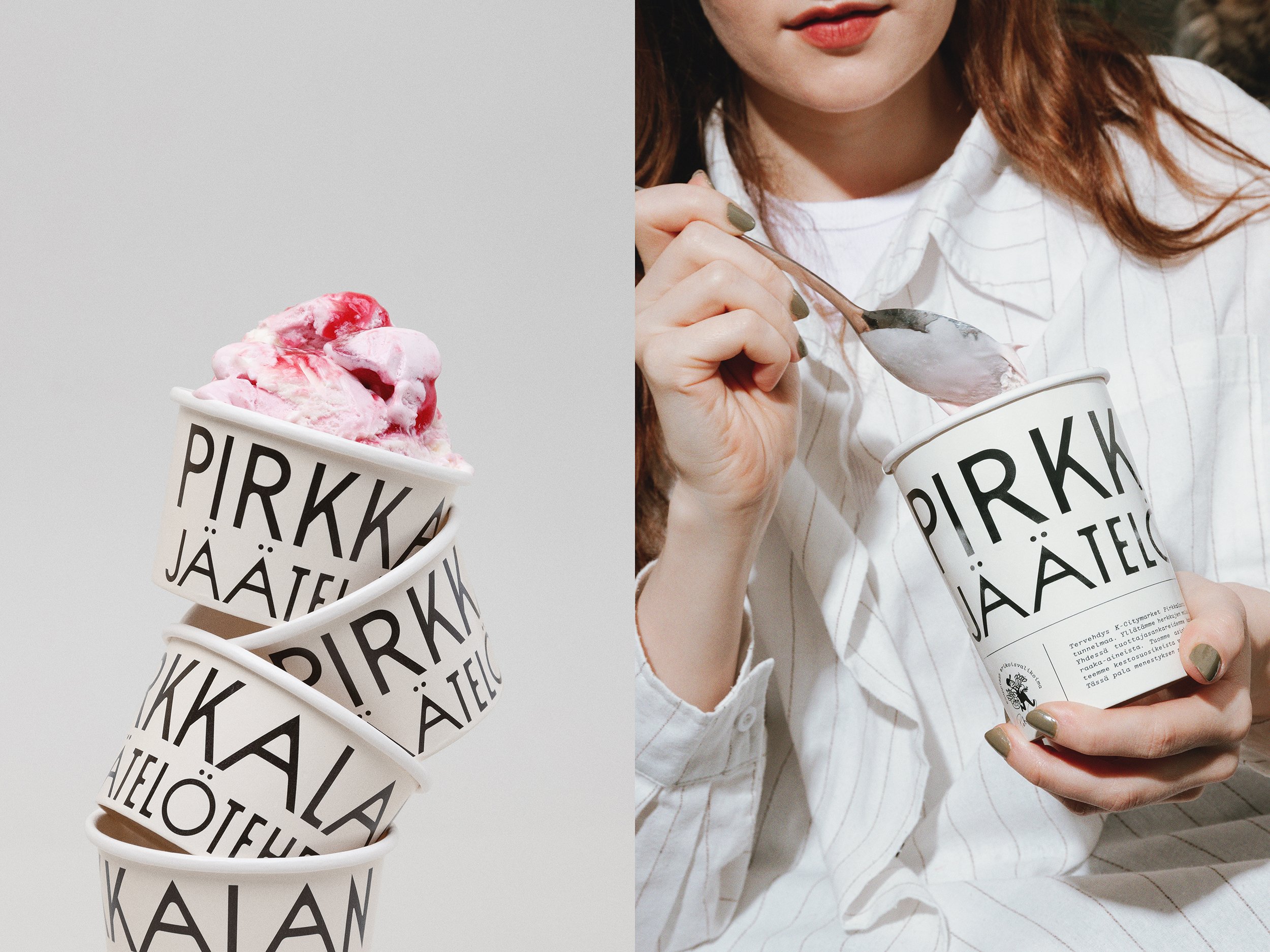

While Werklig cited old newspapers as a source of inspiration, the design appears to reference even earlier influences. When I first saw the packaging it actually reminded me of Mark Ecob’s cover of Beast by Paul Kingsnorth from 2016 — a writer whose style has been described as ‘a kind of ancient modernism’. Like this cover design, the Pirkkalan packaging features a dramatic graded hierarchy and dense type layout which almost emulates old mediaeval manuscripts. This style choice creates a satisfyingly simple hierarchy between the elements, drawing the eye neatly from the top to the bottom of the design. This density, however, is lacking, on the accessories (a set of gift bags and totes). If I was shopping in the store, I would have loved to take away a bag with a bit more of the personality of the main design.
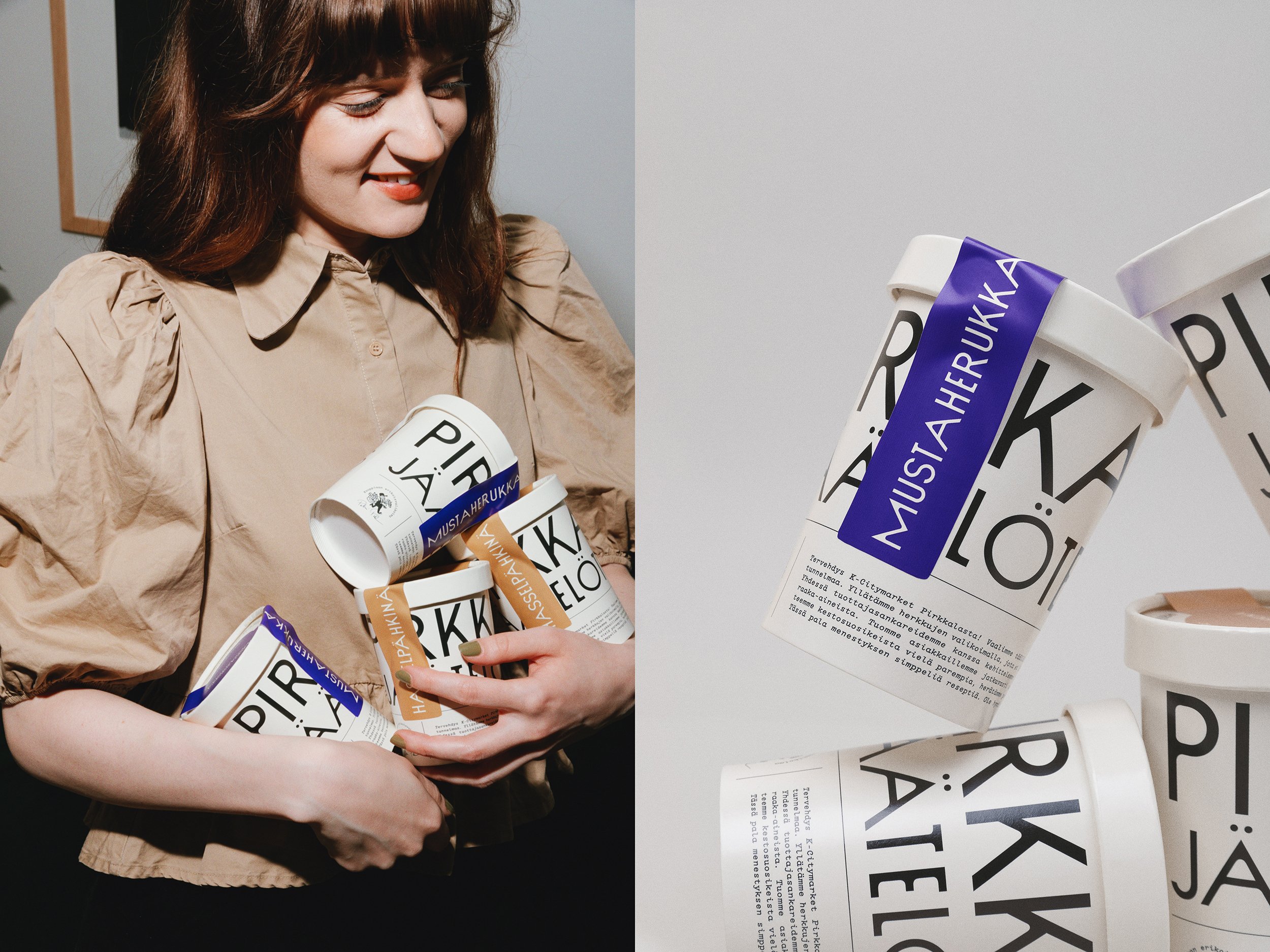
Colourful accents, including a pale lilac, muted yellow ochre, and light sage green, update the older style elements, reinforcing the soft modernity of the design. The muted colours also allow the colour of the product to stand out when the packaging is opened, contrasting with the monochromatic type lockup. A quirky illustration style links these products firmly with the visual language of other trendy food packaging (Black Bee Honey by OMSE is a good example), while rich colours in the brand photography give an almost film camera quality.
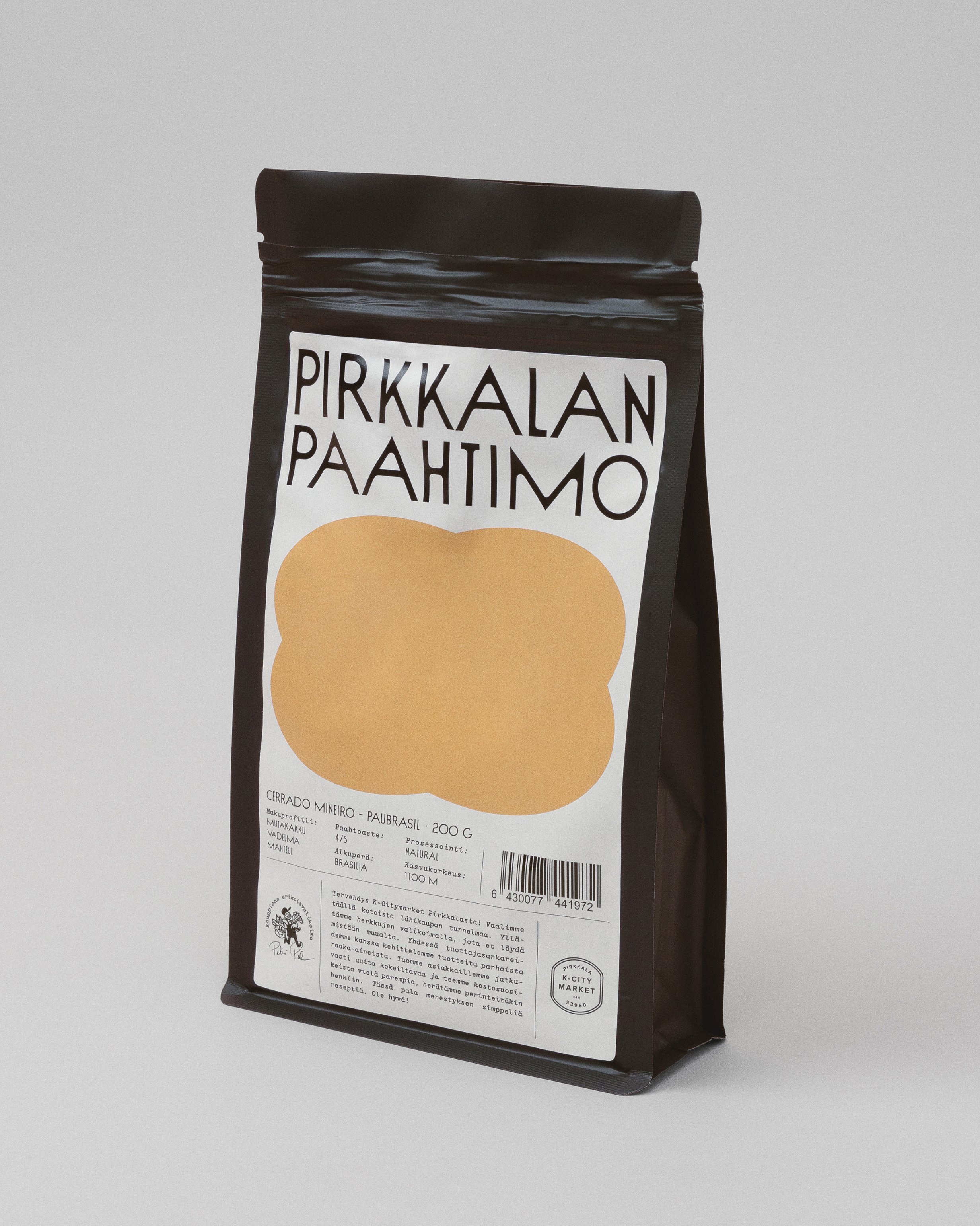
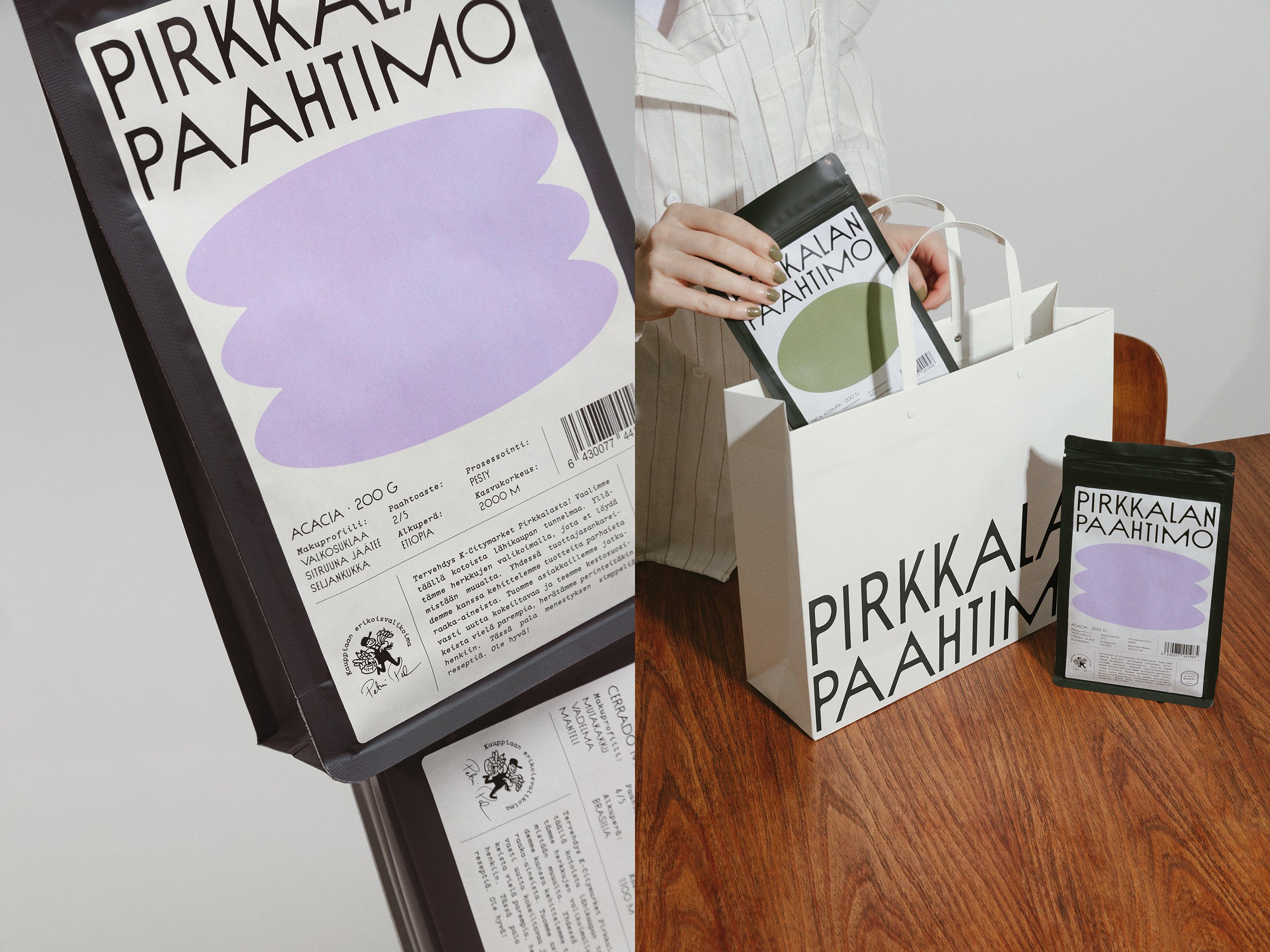
While the design and brand idea are lovely, one could question the authenticity of a supermarket chain taking on the associations of an indie brand. A comment on Werklig’s Instagram asks ‘wouldn’t it be great to promote the actual small businesses? We have a tiny market and K could help them grow’. While this is a fair criticism, the Pirkkalan range does genuinely seem committed to supporting local producers and emphasising quality ingredients. Successful small brands also often feature a founder with an authentic backstory, and Putila fulfils this function for the Pirkkalan brand, going beyond the typical role of a K-Citymarket merchant. His signature even appears below the tagline ‘kauppiaan erikoisvalikima’ (which roughly translates to ‘merchant’s special selection’), creating a sense of personal ownership over this section of the wider K-Citymarket brand. The question of authenticity will always be a fraught one, but, ultimately, the Pirkkalan range feels like a valuable addition to the local community and points to a successful new design direction for food packaging in Finland.
