Anton&Anton Kioski by Bond
Opinion by Richard Baird Posted 26 October 2018

Anton&Anton (A&A) is an alternative to and antithesis of the large supermarket chains. Staff are described as relaxed, smiley and proud. Their ranges (mostly) organic, some homecooked and also available online for home delivery. With a desire to express an approachable, playful yet credible positioning, and a need to develop a cohesive set of packaging and communications assets A&A worked with Bond to create a new visual identity. This is characterised by an intersection of an elegant wordmark, simple shapes, multi-colour and distinctive structural designs that also move into a retail space designed by Futu Design. Alongside wordmark, iconography and packaging, Bond also designed signage, tote bags, aprons and sweatshirts.

The retail experience perhaps lacks some of the architectural elegance and restraint of some of Futu Design’s other work. It very much shares (at least in the image above) the spatial language of small supermarkets, there are, however, a few pleasant details in the tall chairs, shelving and recurring shapes. What really marks this out is the extent to which Bond’s graphic language is present and pronounced within this space. Where large supermarket chains favour fewer colours, easily replicable and changeable signage models, a necessity for hundreds of locations and an in-house design team, here there is an abundance of colour, permanent signs and a preference for iconography. The approach recognises and leans right into the critical differences in scale between small and large retailers.


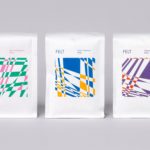
There is a strong and intelligible correlation between packaging, shelving and signage structures, and a graphic language of geometric gestures derived from the square, a reference to the chess icon of the parent company. This feels like the central premise, the concept; the simple and cheerful. It also serves a practical function, with a strong take-away positioning. Packaging finds a comfortable intersection of graphic immediacy and usefulness, albeit at the occasional expense of a material economy, although this is not excessive, falling more towards the nifty (in the single die cut sheets) another part of positioning.

In a competitive market, positioning, character and a distinctive spatial experience is critical to drawing people in, to ask for consideration, to try products and experience, and that experience is unbroken; online to delivery, shop entry to exiting with packaging. This certainly achieves this. Continuity serves to establish a credibility. Although the colour and form language of space and packaging is far less prominent online it shows a sensitivity to context and functionality.

The direction does feel very much of the moment. It is difficult to see what the retail landscape may look like in five years. The geometric and the colourful, as well as the rendering of the wordmark is likely to offer some kind of longevity, colour, type and iconography perhaps a little less so but could easily be reconfigured over time, again a flexibility big chains do not have. Colour palette leans into the synthetic, striking and cheerful, rather than the natural, favouring a distinction over the familiar visual language of the organic.
Bond’s approach, supported and evidenced by assets such as packaging and merchandise, seeks to project brand outside of store, to make a connection with people. There is an element of lifestyle-desirability in this, that the store’s proposal; the antithesis of the humourless utility of the giant supermarket chain, the support for the small, cheerful and nifty, is strong enough for people to co-opt and project themselves. More work by Bond on BP&O.
Design: Bond. Spatial Design: Futu Design. Photography: Paavo Lehtonen. Opinion: Richard Baird. Fonts: Adieu.