Packaging Design
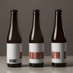
O/O Long Boil Barley Wine by Lundgren+Lindqvist
O/O Brewing is a craft brewery set up in 2011 by Olle Andersson & Olof Andersson. They presently operate out of the facilities of Stigbergets Bryggeri in the Swedish city of Gothenburg, but are due to open their own brewery in the Autumn of 2017, with the intention of increasing volume and gaining further control over quality. O/O worked with Scandinavian studio Lundgren+Lindqvist, who have created packaging design for a...
Terence Woodgate by Charlie Smith Design
Terence Woodgate is a lighting design and manufacturing business, founded by industrial designer Terence Woodgate in 2014, that looks to “fully optimise the benefits of LED technology”. Charlie Smith Design recently worked with Terence Woodgate to develop a visual identity for the business and modular packaging treatment for its first line of products as well as manuals, fitting instructions and website....
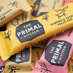
The Primal Kitchen by Midday
The Primal Kitchen is a UK based health food brand founded by nutritionist Suzie Walker with the intention of making the paleo lifestyle, a modern nutritional plan based on the presumed diet of Paleolithic humans, easier and more accessible. The Primal Kitchen commissioned design studio Midday to create a visual identity for the brand which would extend across the packaging for its cold pressed...