Can Design
A collection of distinctive designs for canned beverages designed as part of a broader brand identity programme, reviewed and published on BP&O.
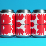
Fhirst by Mother Design
Agua de Madre by Chris Chapman
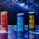
Yes You Can by Marx Design
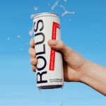
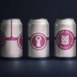
Rolus by Re
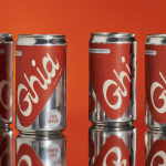
Ghia Non-Alcoholic Aperitif by Perron-Roettinger
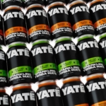
Yaté by Herefor
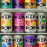
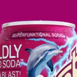
Hip Pop by Robot Food
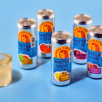
Omaka by Stockholm Design Lab
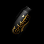
Carlsberg Black Gold by Kontrapunkt
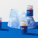
Berg by Marx Design
Detour Beer Co. by Weave
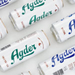
Agder Bryggeri by Frank
Forgotten Boardwalk Brewing by Perky Bros
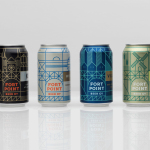
Fort Point Beer Co. by Manual
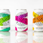
Vocation Brewery by Robot Food
Suupaa by A Friend of Mine
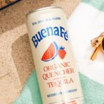
Buena Fé by Saint Urbain
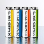
Departed Spirits by Marx Design