Fort Point Beer Co. by Manual
Opinion by Richard Baird Posted 14 January 2016

Fort Point is a San Francisco-based small batch craft beer company that references traditional styles yet is firmly rooted in the present, and has a philosophy that values craftsmanship and innovation, creativity and technique. In 2015, working with local graphic design studio Manual, Fort Point launched a new graphic identity and packaging system to unite its expanding range.
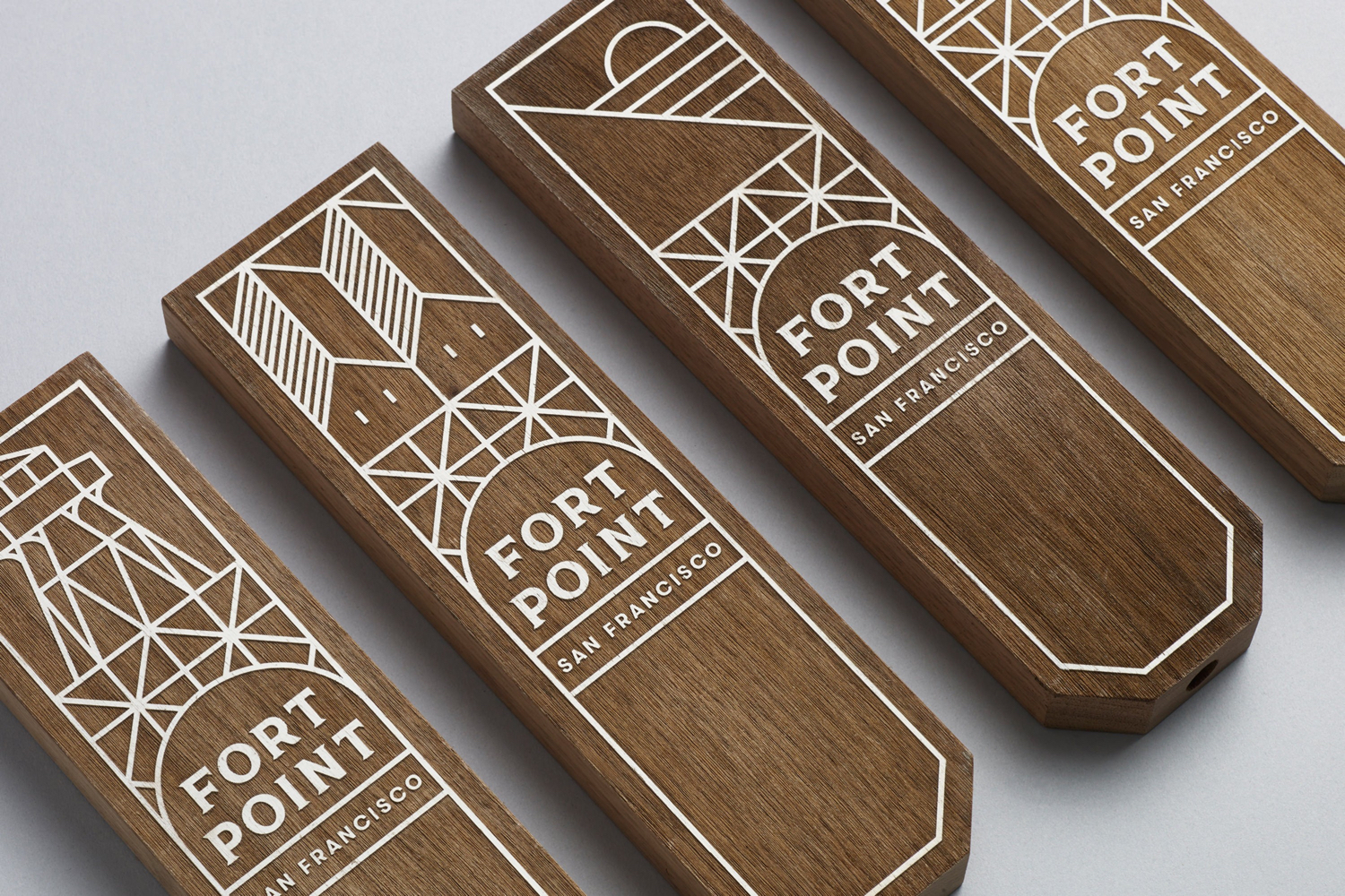
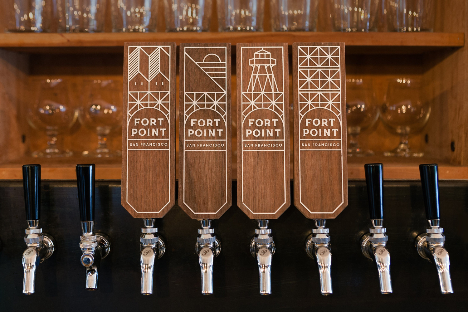
Fort Point’s forward-thinking, fast-growing and innovative nature, but also its acknowledgement of traditional processes, recipes and craft, as well as its location—not far from Fort Point National Historic Site and overlooked by the Golden Gate bridge—plays out across its packaging. This is characterised by the current favour for monolinear and geometric illustration, a flexible and expanding modular arrangement, engraved type and an unusual mix of girders and landscapes, the natural and the industrial. This post was updated November 2017 with new images, and shots of Fort Point’s latest brews.

Manual continue to work with Fort Point, and this year, have published images of the brewery’s six pack boxes and cans. These make great use of the modular illustrative panels of the identity and, alongside a distinctive colour palette of metallic gold, black and pastel spot colours, mononlinear sans-serif and engraved serif, continues to play with past and present in an interesting and compelling way.


The illustrative detail does a good job of referencing the natural and industrial qualities of the brewery’s locality, which draws distinction from an increasingly popular illustrative style, and its modularity neatly touches upon growth. The addition of uncoated unbleached boards, alongside pastels, successfully leverages materials and colours associated with craft. Together these secure a visually distinctive but also communicative brand identity and package design that has its origins in the location, practices and philosophies of the brewery. More from Manual on BP&O.
Design: Manual. Opinion: Richard Baird. Fonts Used: GT Walsheim.