Agder Bryggeri by Frank
Opinion by Richard Baird Posted 7 September 2017
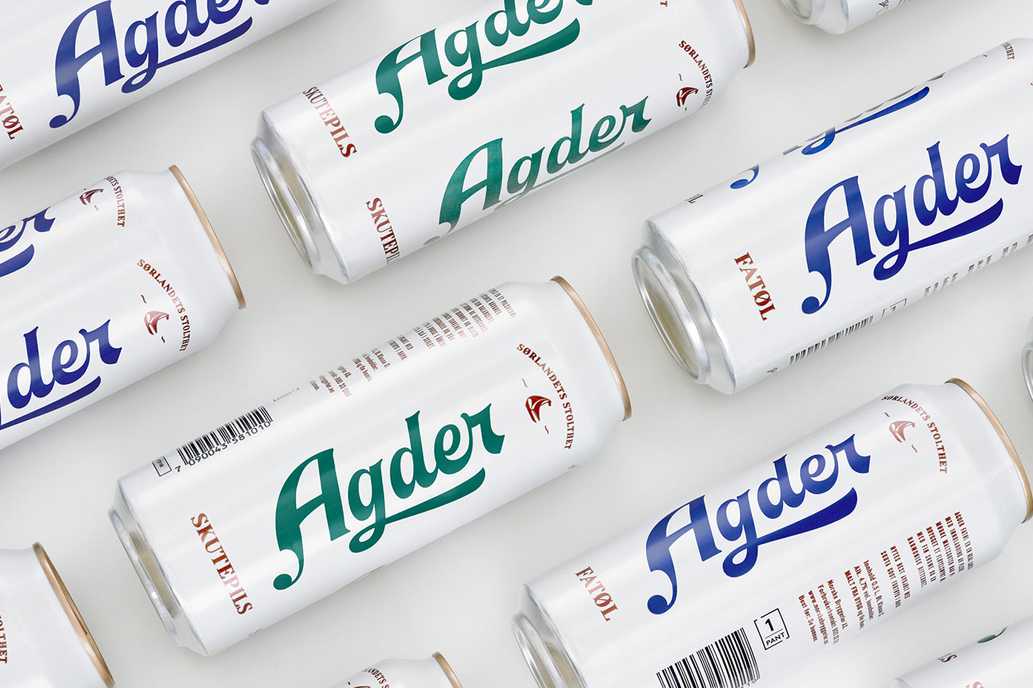
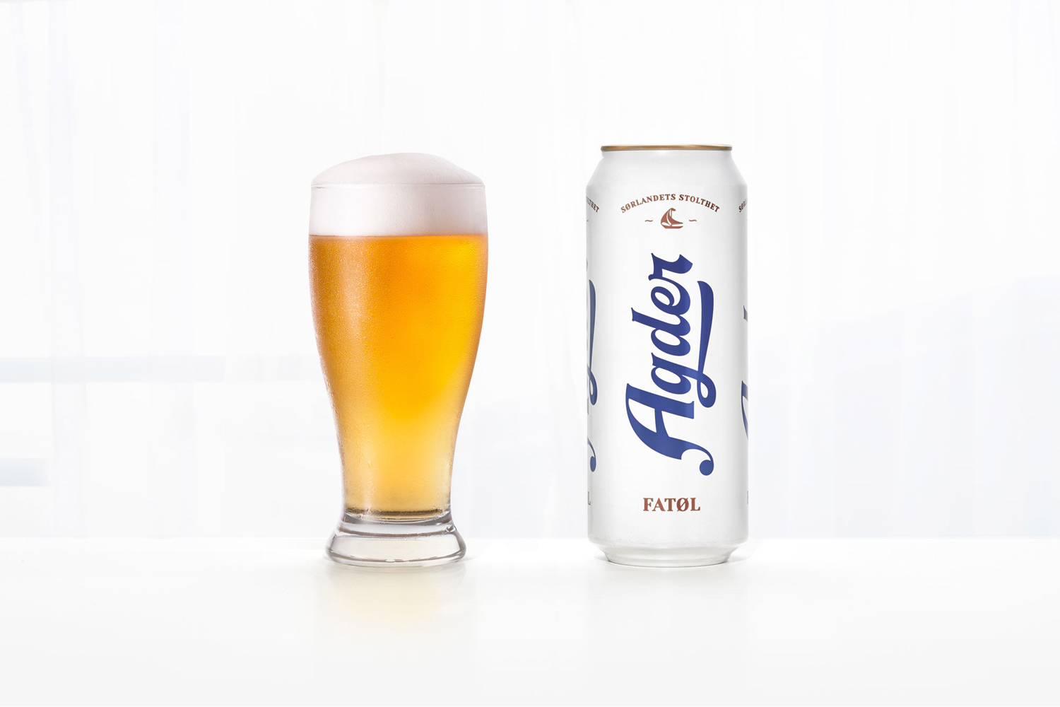
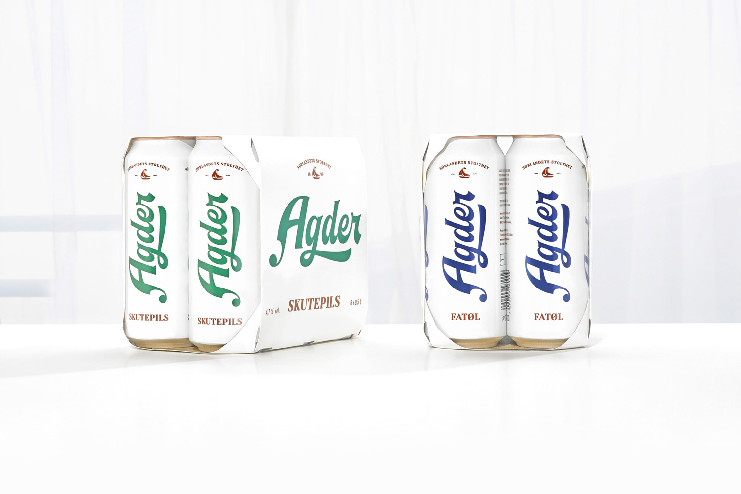
Agder Bryggeri is a well-regarded and historical name amongst breweries throughout Norway. It was first established in 1900 but was closed down in 1904 due to operational problems. Recently, the brewery has been resurrected as part of Norsk Bryggerier’s commitment to local beer brands, and is now sold throughout the Agder counties of southern Norway. As part of this resurrection Oslo-based design studio Frank delivered brand strategy, concept, visual identity and packaging design for Agder Bryggeri. Taking inspiration from the “de hvite byene” or “white towns”, and the sailing heritage of the region, the studio established a sea-breezy and minimal expression using the craft and windswept character and flourishes of a distinctive logotype, blue and green ink, white background and plenty of space.
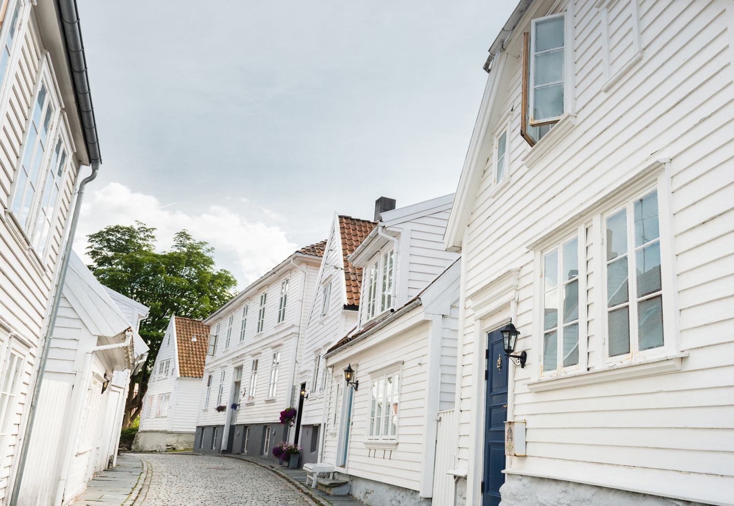
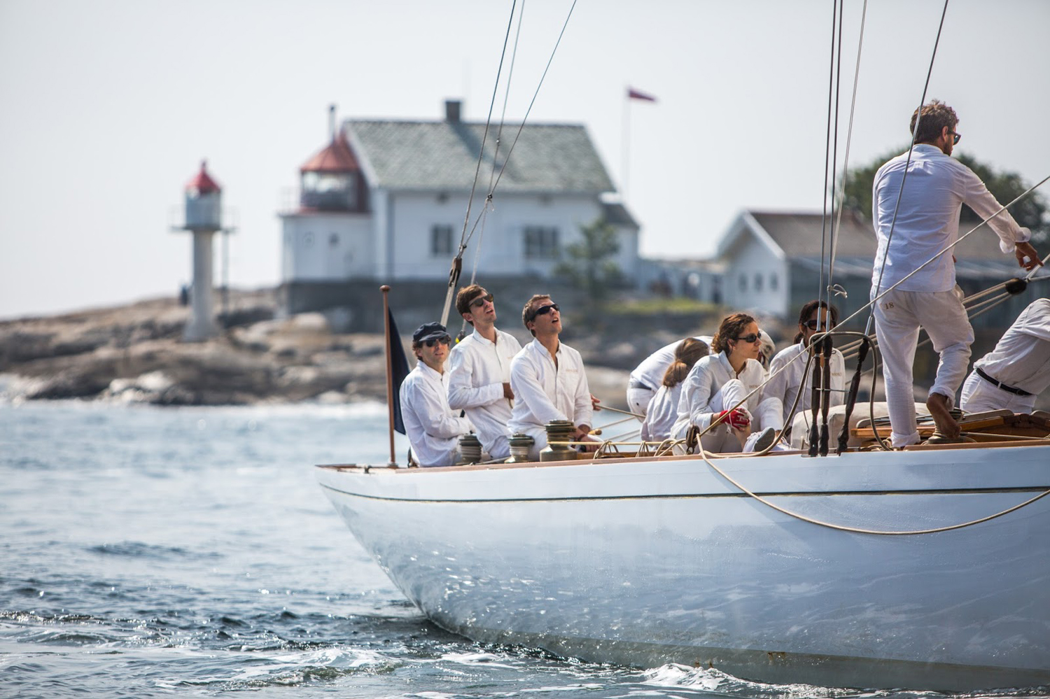
White towns and sailing heritage, as conveyed through type and colour, function to differentiate. Together, these are the antitheses of the full-colour and busy design conventions that currently exist within the beer local market.
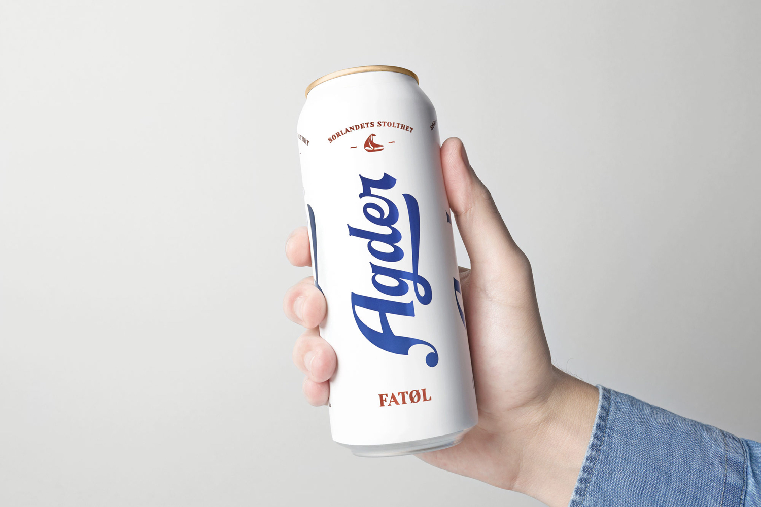
Lettering effectively works as a familiar shorthand for craft and legacy in its initial impressions, but is followed up with some region-specific ideas and thoughtful details. High contrast strokes, the “r” and small serif flourishes are quick to establish a sense of heritage, while the more unusual shape of the “A”, based on an old metal type sample, calls to mind the sail of a boat. It is a pleasant element that finds a good balance between being referential but not blunt. Ligatures give the logotype a satisfying and well-realised wave-like flow, while the swash of the “A” and the loop and underline of the “g” balances out the height of the “A” and the ascender of the “d”.
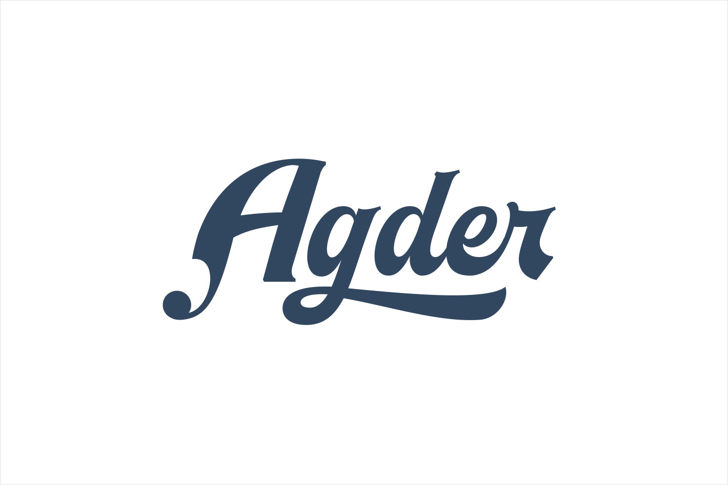
Strategically and stylistically it follows something of a more recent favour for paired back and concise visual expressions, typically characterised by solid colour, plenty of space and a balance between character and restraint, yet still manages to convey an individual personality informed by region. The ideas here are largely implied, aside from the motif of a boat, but certainly intelligible to the local market.
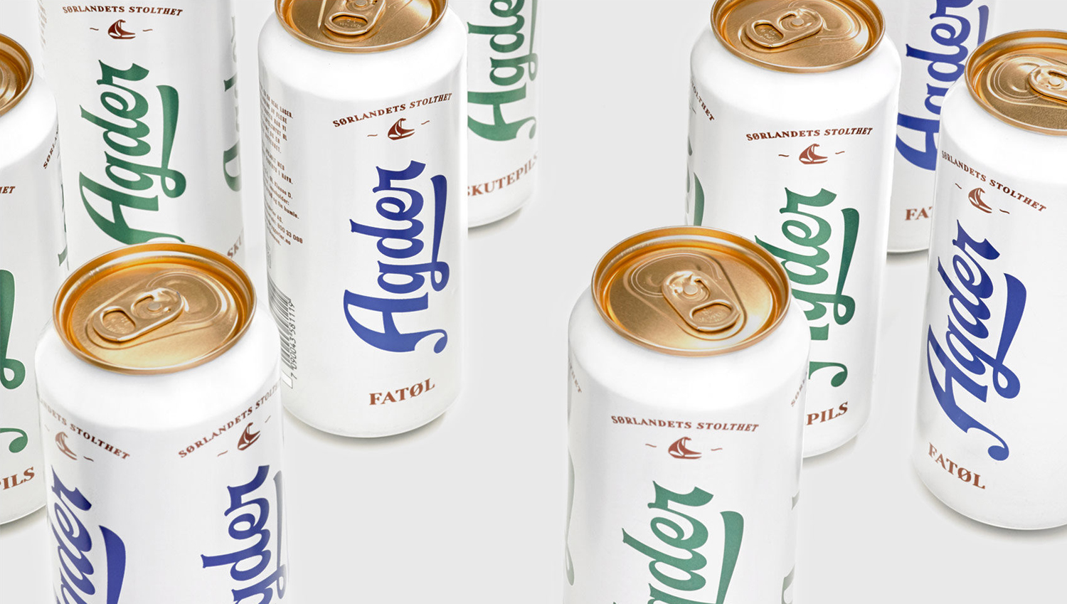
Other neat details include the use of a deep sea green and blue, the use of a condensed serif in conjunction with generous line spacing to give text a lighter quality and balance alongside the logotype, and finally the traditional universality of a copper ink. The sailing boat motif, while immediate, feels like a detail too much, when colour and lettering is subtle and intelligent in its references.
Proportion of the logotype to can, its orientation, its lettering and sailing influences, arrangement and space, colour and colour contrast secure an immediate visual disruption. There is a sense of modernity in its simplicity and concise visual language, yet a continuity of legacy in its references to the local area.
Design. Frank. Opinion: Richard Baird. Fonts: Yeseva One.
