Designed by Triboro
Tigre by Triboro
LES Tigre – not to be confused with seminal electroclash/riot grrrl combo Le Tigre – is a cocktail lounge in Manhattan’s Lower East Side area, which opened at the end of last year and apparently combines ‘sophistication and refinement in drink, sound and ambiance’ with an entrance that boasts ‘an original graffiti-worn door’. So far, so hip, amirite? It all...
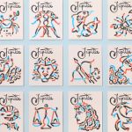
Jupiter by Triboro
Triboro worked on its first restaurant branding project over a decade ago, at a time when the folklore was that if you were a restaurant serving traditional food the visual language should evoke the region and time period of the cuisine. This was intuitive and, as Triboro founder David Heasty recounts, led to some well-crafted and beautiful results but often leaned...
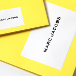
Marc Jacobs by Triboro
Fashion designer Marc Jacobs heads his own eponymous fashion brand, as well as diffusion lines The Marc Jacobs and Heaven by Marc Jacobs. He was also creative director at Louis Vuitton from 1997 to 2014, where he created the company’s first ready-to-wear clothing line. In his own words, Jacobs’ work is ‘a little preppy, a little grungy, a little couture’, and this...
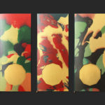
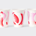
The Golden Hour by Triboro
The Golden Hour is an outdoor seasonal restaurant located in New York’s The High Line Hotel. It is a place to experience the softening of sunlight with unobstructed views of the Chelsea skyline. The restaurant intends to draw to mind the casual elegance of a coastal soirée rather than the rushing of pre-dinner drinks. The restaurant space is described as being...
Sauvage by Triboro
Sauvage is a Brooklyn-based cafe and cocktail bar from Joshua Boissy and Krystof Zizka, the duo behind Maison Premiere. It is described as being reflective of the staple establishments of New York and Paris, and has a menu of French-accented American dishes. This is also reflected throughout its interior design, a mix of mosaic flooring, brass rimmed circular tables, bent wood furniture,...
L’Observatoire International by Triboro
L’Observatoire International is a American lighting design studio co-founded in 1993 by Hervé Descottes. The studio is made up of architects, interior designers, engineers, artists and lighting designers working on a variety of projects, illuminating and accentuating both modern and classical architecture and spaces. These include retail premises and museums, airports, landscapes and concert halls. L’Observatoire International worked with New York-based design...