Sauvage by Triboro
Opinion by Richard Baird Posted 10 October 2016
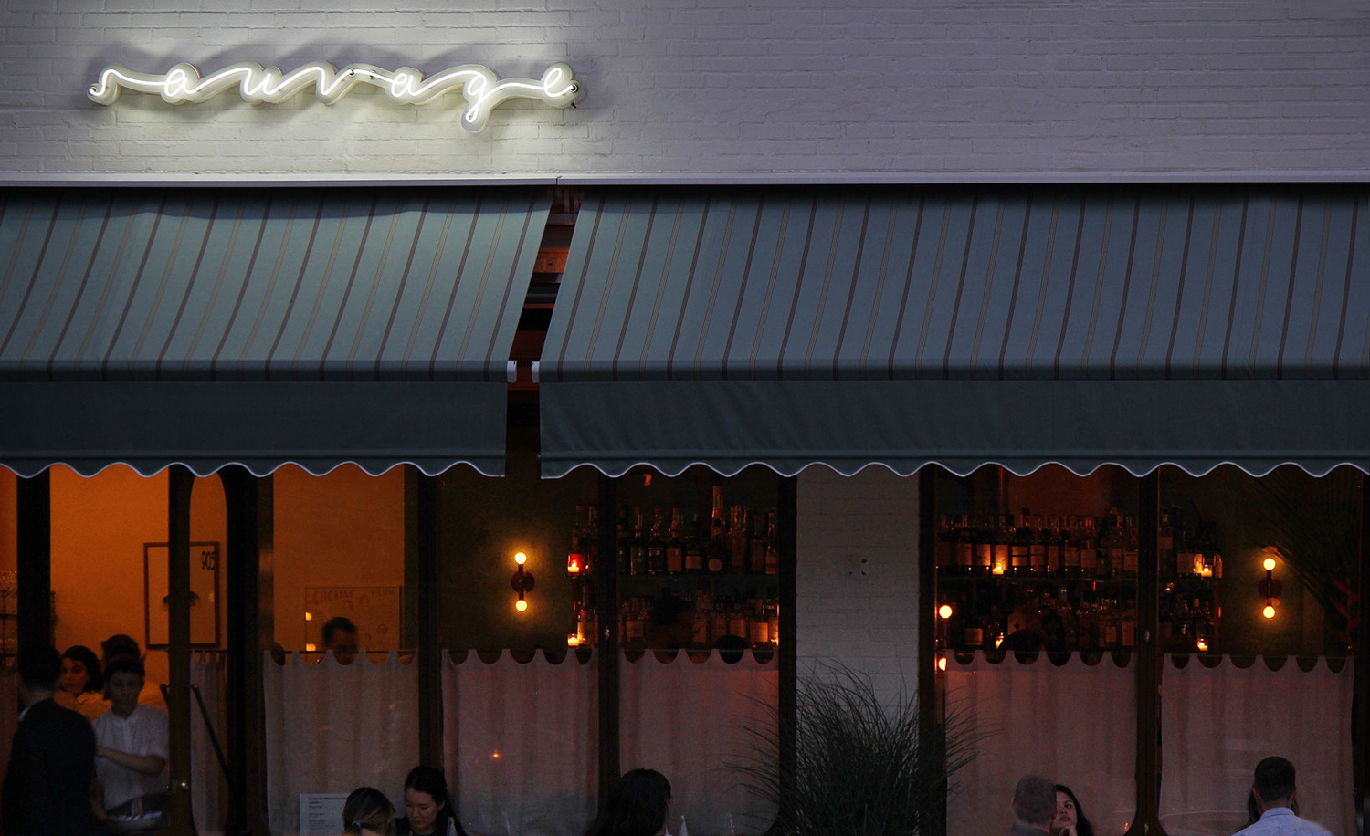
Sauvage is a Brooklyn-based cafe and cocktail bar from Joshua Boissy and Krystof Zizka, the duo behind Maison Premiere. It is described as being reflective of the staple establishments of New York and Paris, and has a menu of French-accented American dishes. This is also reflected throughout its interior design, a mix of mosaic flooring, brass rimmed circular tables, bent wood furniture, ornamental mirrors, brass fixtures and fittings, and a curved bar with a white marble top.
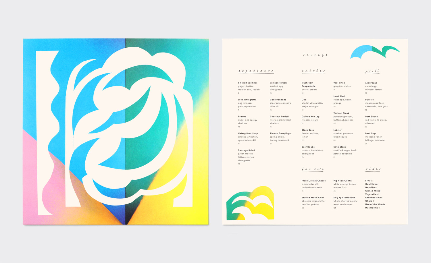
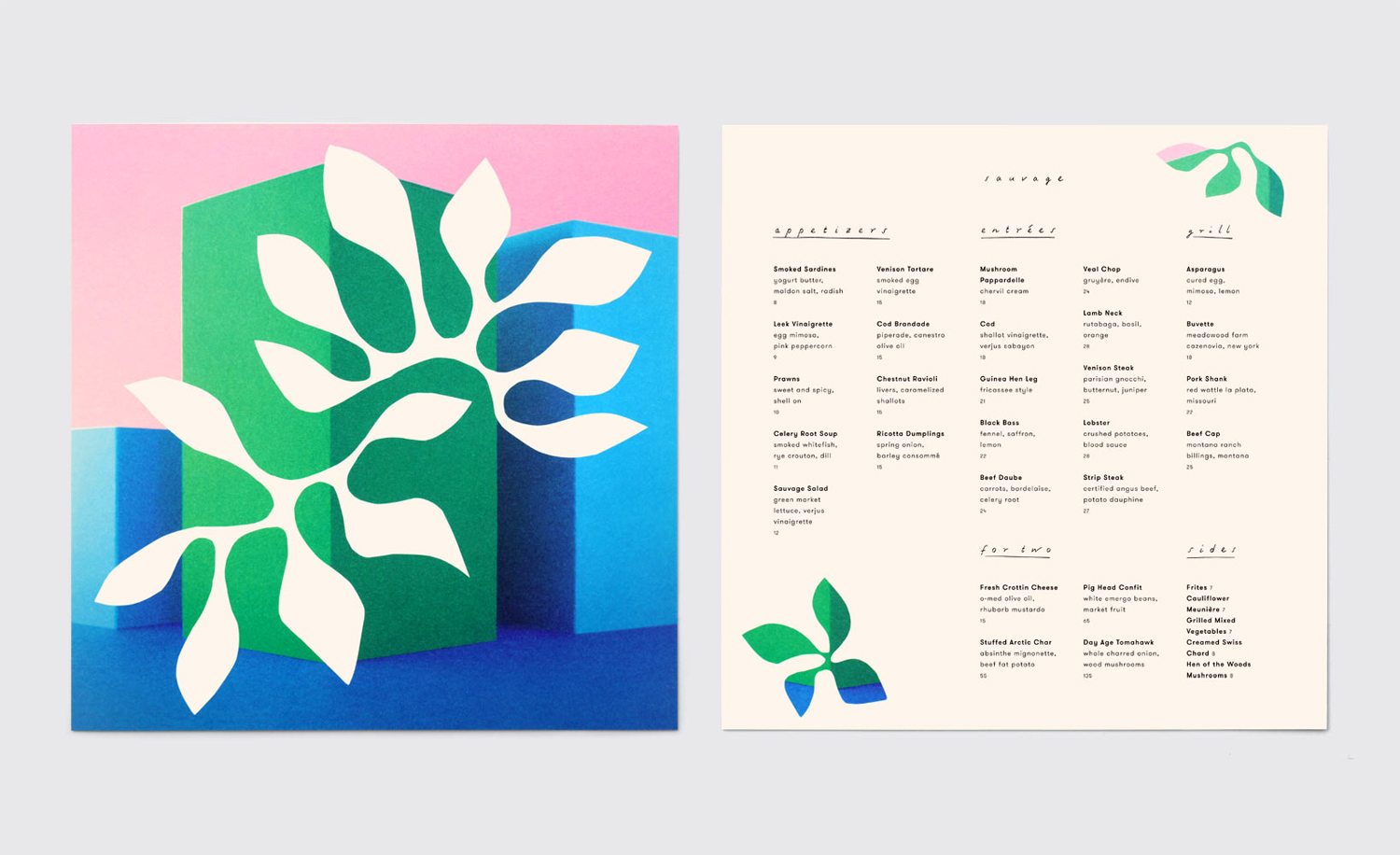
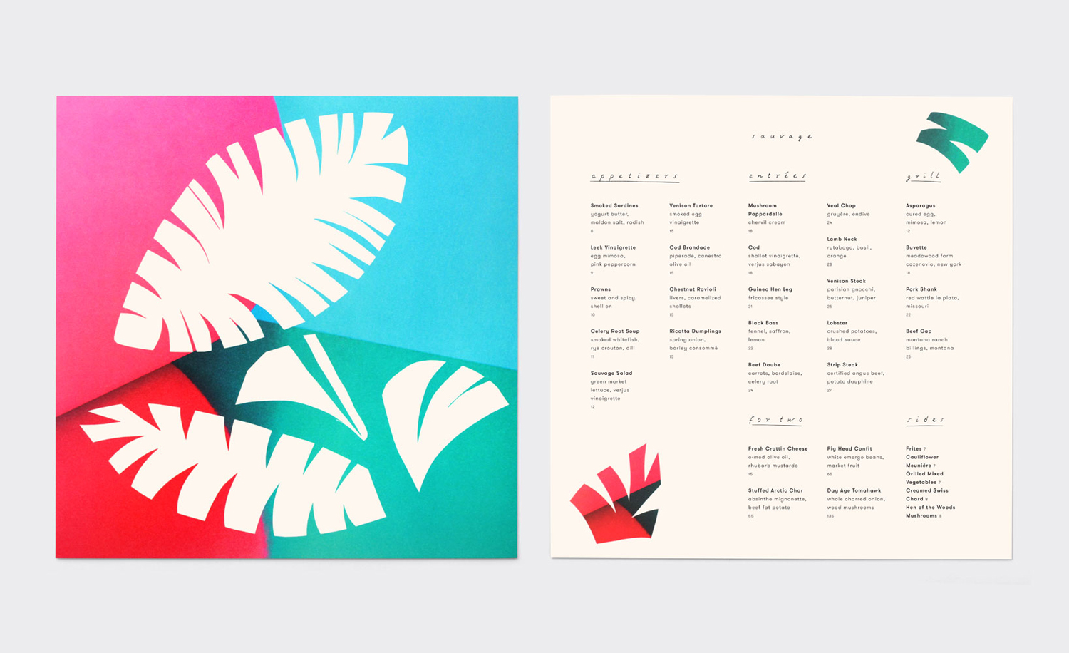
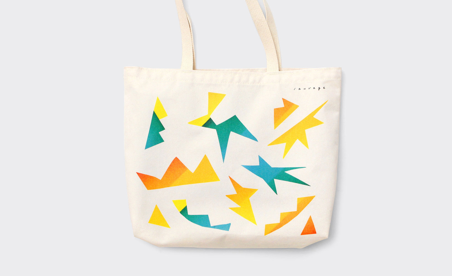
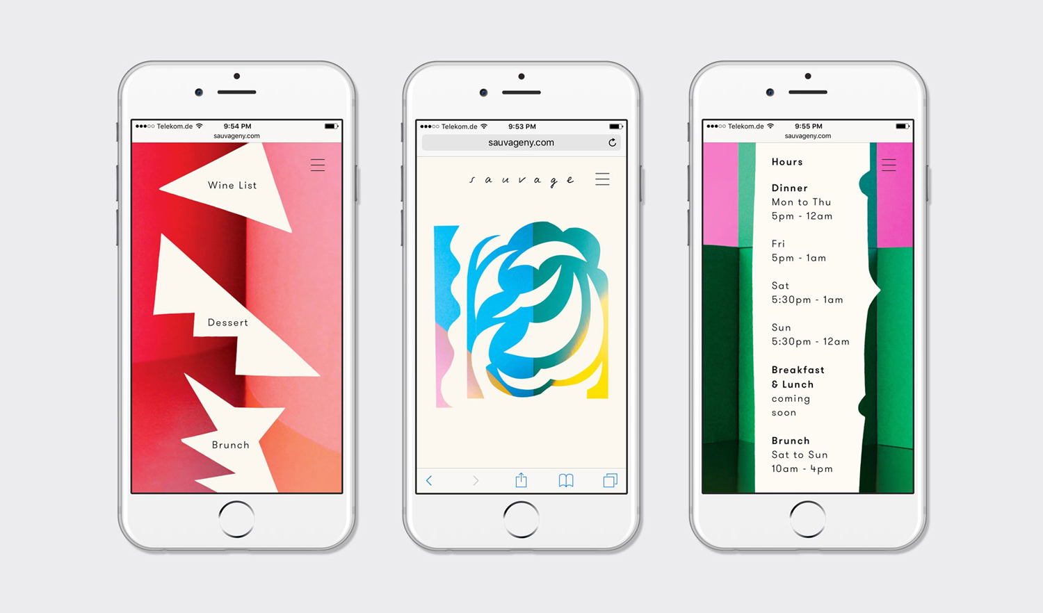
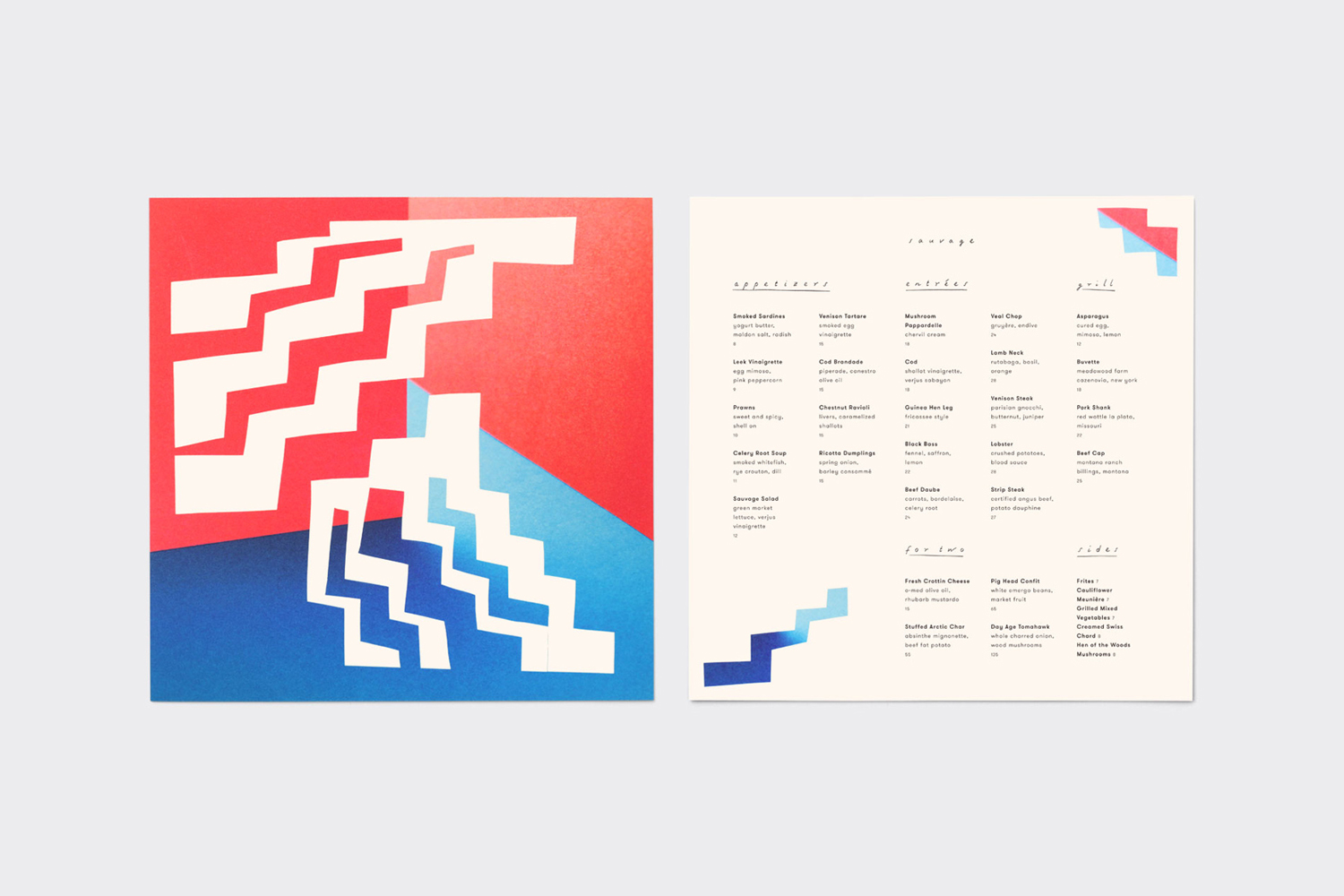
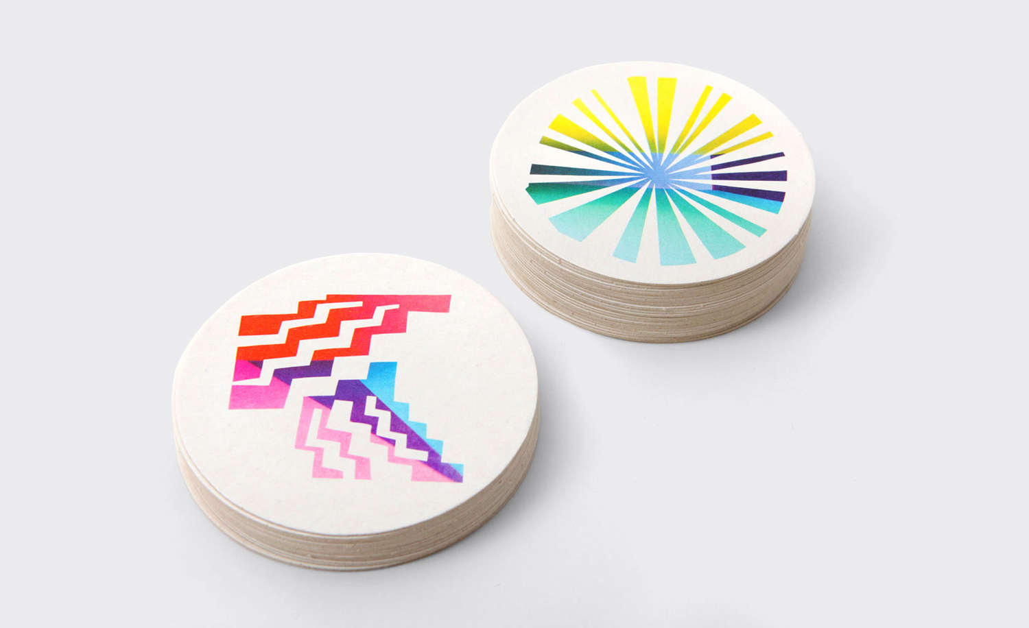
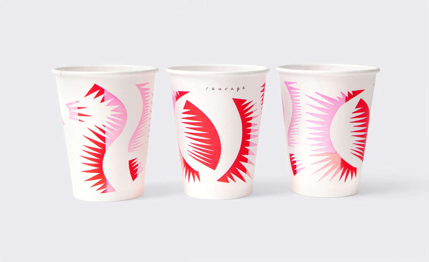
Sauvage’s visual identity, designed by New York studio Triboro, mirrors some of the period European and American interior influences, whilst working in individual personality through multi-colour and form. This runs across business cards, menus, coffee cups, coasters and tote bags, and included signage and web design.
Where interior design sets mood; appearing as an expression of menu and contributing to an informal and personable experience, visual identity introduces something in the way of attitude and personality.
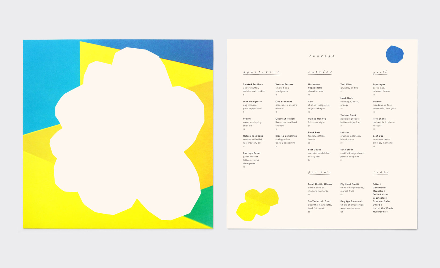
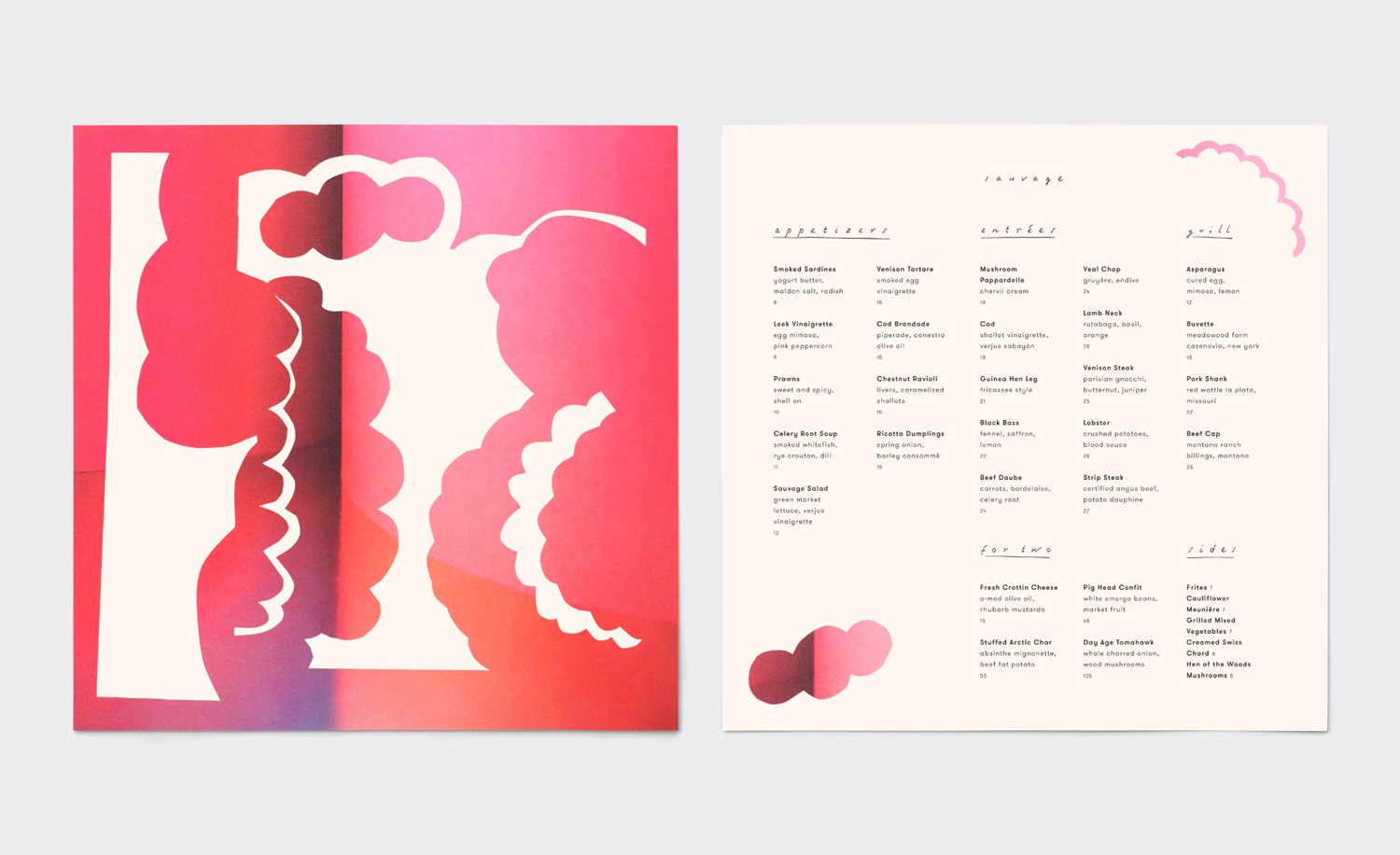
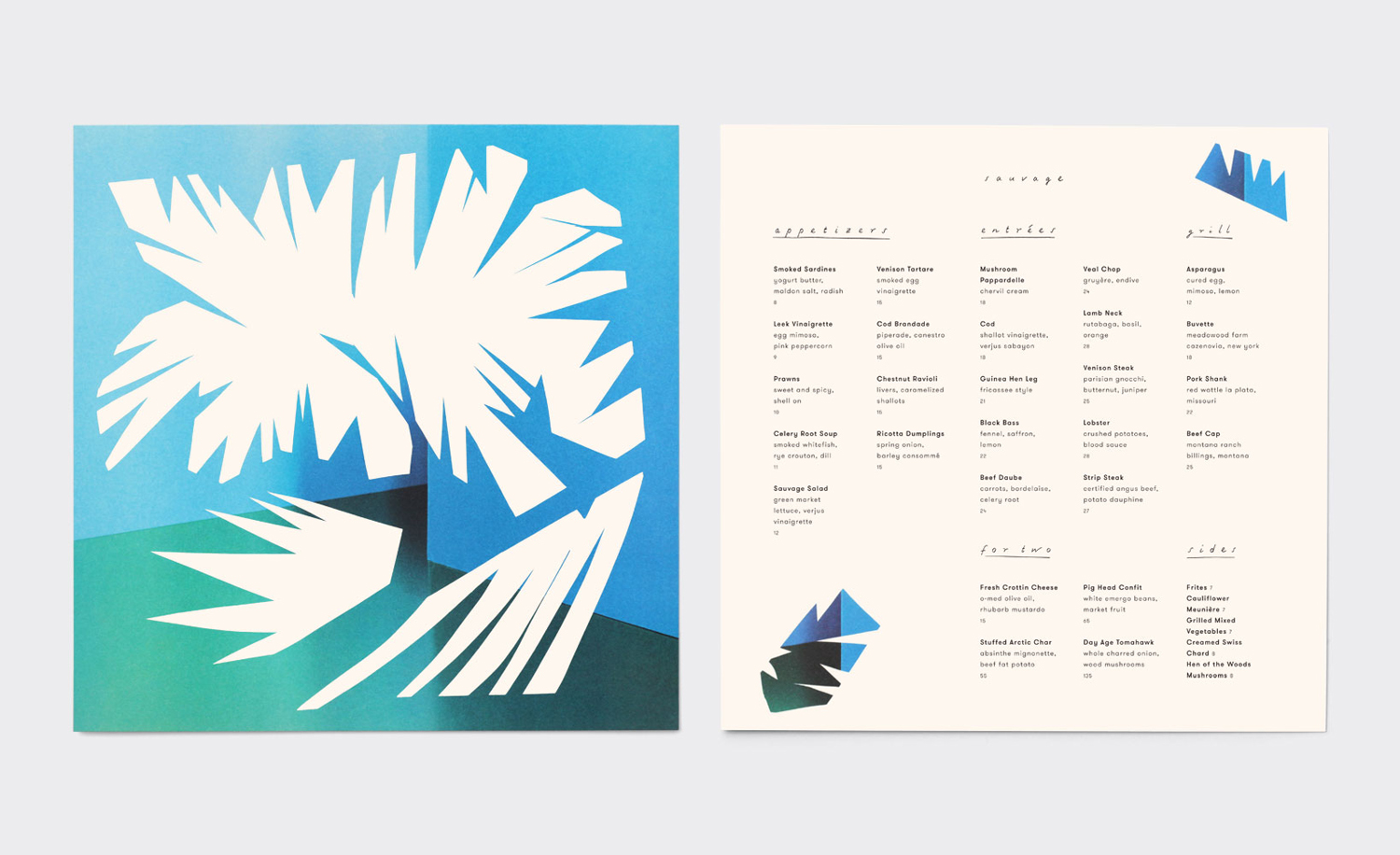
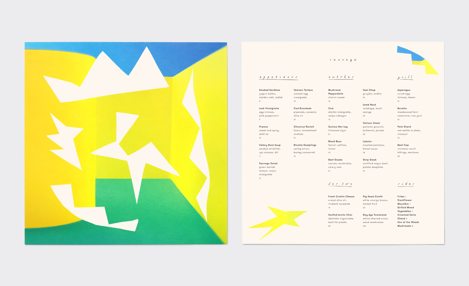
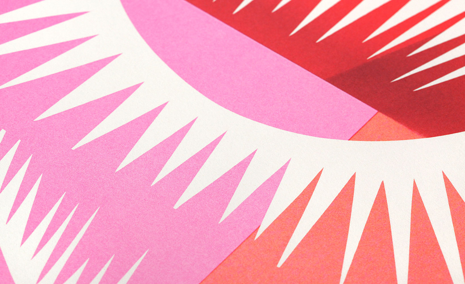
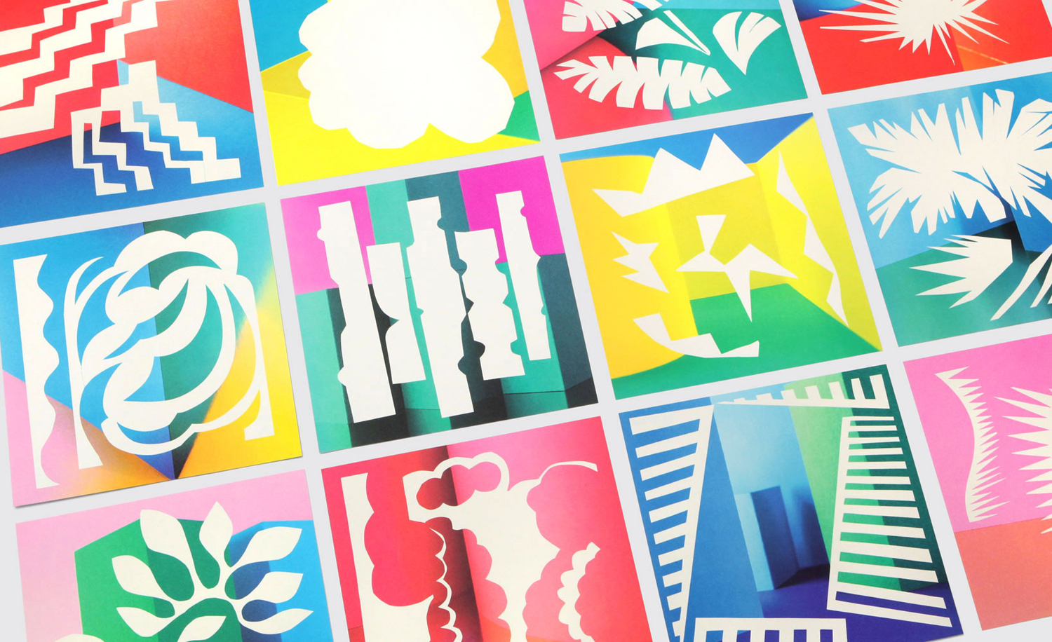
Abstracts provide much of this personality, both punctuating interior through menus, and dominating online experience. These are bright, lively and full of character with an interesting contrast of flat, rough cut shapes and the light and shade of three-dimensional backgrounds. These invoke more a feeling of energy and vibrancy than anything communicatively specific. Some will make a connection with Jazz record covers, others something else.
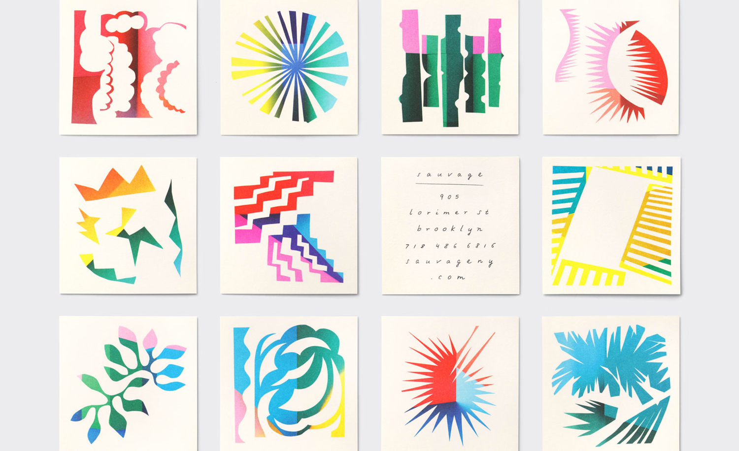
There are some lovely colour combinations and a crafty, hand cut quality to shapes with a good balance of positive and negative space. You could infer a creativity and vibrancy of menu, however, these feel more to do with mood.
A pleasant variety yet continuity exists between these, with compositions that fit well into squares, perhaps another record reference, but sensitive to contexts such as rectangular matchbooks, circular coasters and the curve of the coffee cups.
Colour and shape is effectively emphasised by a light background and plenty of space, or inverted, with rough shaped knocked out of colourful background. Together these establish an unmistakable link between print and digital experience.
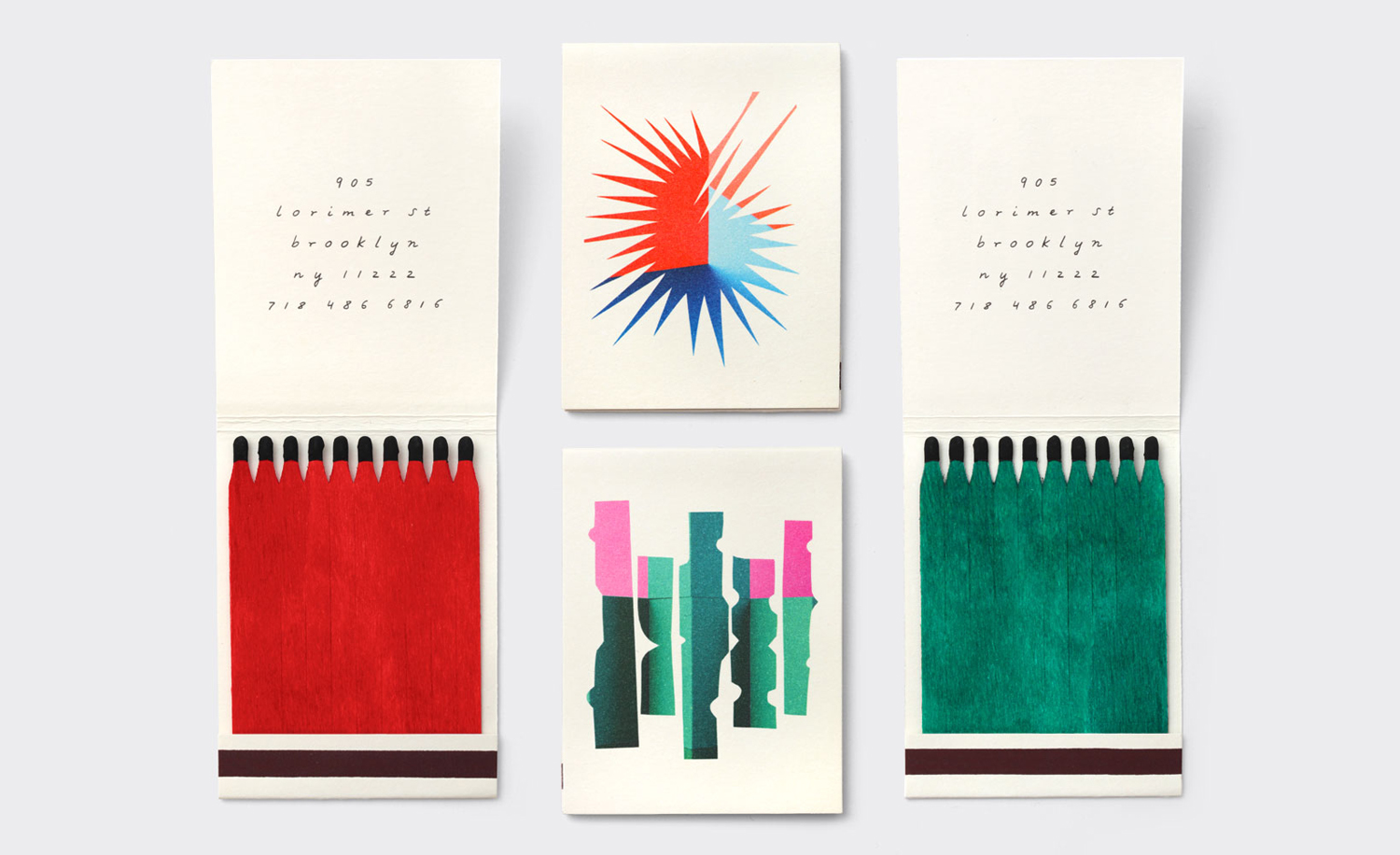
Abstracts contribute to experience, rather than simply reflecting it, while type and typesetting, a mix of script and a very broadly spaced sans-serif, Grilli Type’s Swiss-inspired GT Walsheim, touches upon the aesthetic of interior, and provides a continuity in its expression of the informal, intimate and period. The script works particularly well on the inside of the matchbooks and as neon signage.
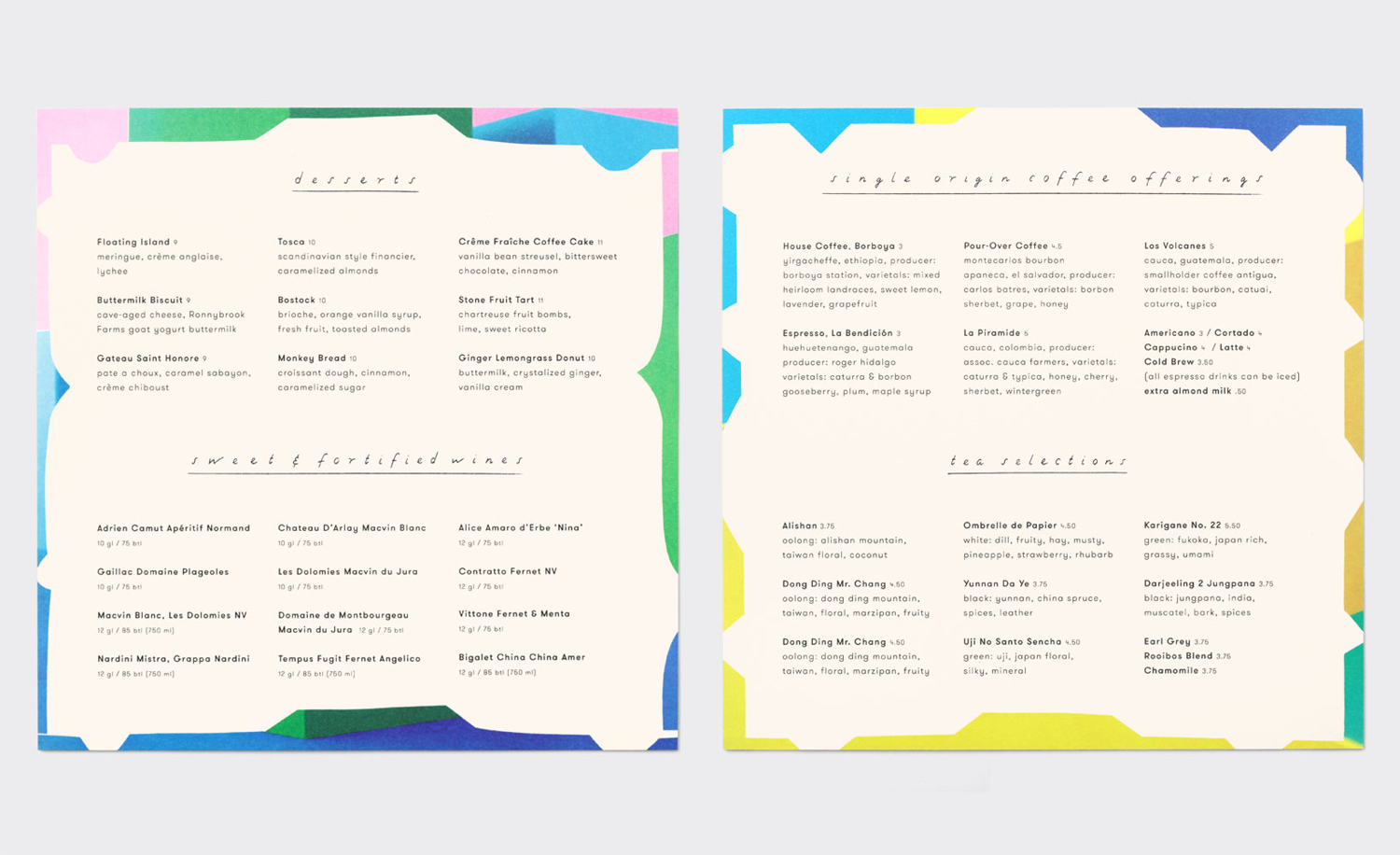
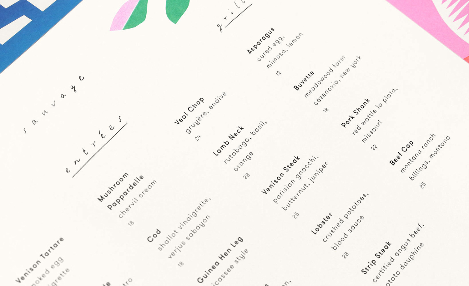
Menu layouts again feel like references to LPs, particularly in the use of bold and regular weights, structure and square context and in a pricing format reminiscent of track numbers. Whether intentional or not it is difficult to shake, but certainly something that feels appropriate for a cafe making a connection between European and American culture and visually articulating something of a lively atmosphere. More from Triboro on BP&O.
Design: Triboro. Opinion: Richard Baird. Fonts Used: GT Walsheim.
