Whittard’s B Tea by Nick and Carole
Opinion by Richard Baird Posted 26 May 2011
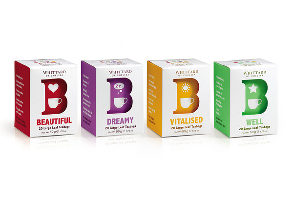
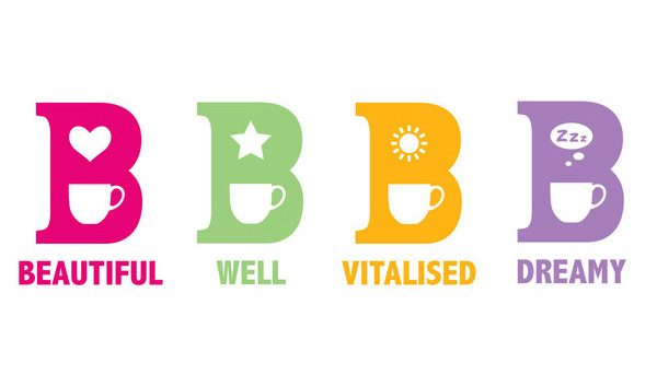
Whittard is UK based high street retailer of Tea, Coffee and related products that was founded in 1886. The packaging for their latest range of teas ‘Whittard’s B Teas’ were designed by Cheshire based design agency Nick and Carole and are based around a colourful and playful B utilising negative space.
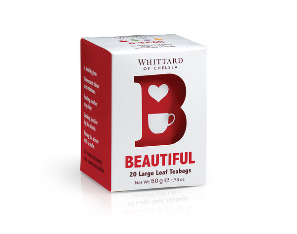
The simplicity of this packaging is a significant change in direction for Whittard standing it apart from their more exclusive (and visually detailed) ranges. The key ‘B’ identity, built around the use of negative space, sets a playful relaxed tone suitably delivering a light informal tea theme. The colour choices are fun, modern and work really well against the white, while the die cut detail creates a nice level of shading on the ‘B’.
Each illustration contained in the character is simple and well-considered, neatly representing the varieties while forming the right amount of white space with only the ‘Dreamy’ variety appearing a bit cluttered. This is a nice addition to Whittard’s range delivering a new casual and accessible everyday brand proposition.
