Delfex by Jan Zabransky
Opinion by Richard Baird Posted 27 July 2011

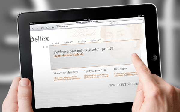
Delfex is a Czech based trading and consulting company that specialises in foreign currencies and works within the public, private and non-profit sectors. They approached brand designer Jan Zabransky to develop a complete and consistent identity that included logo design, stationery, web design, programming, copy-writing and brand guidelines.
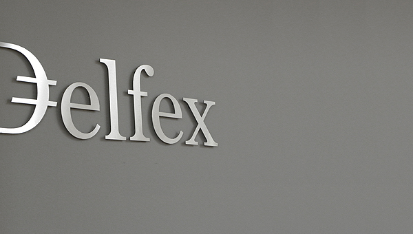
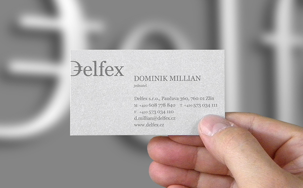
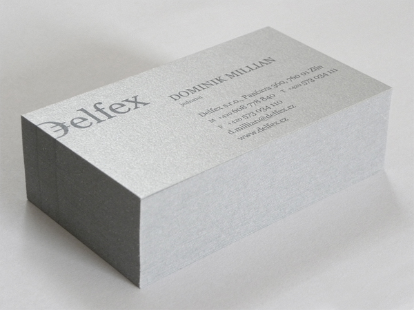
“[The logo] was carved out of brushed aluminum plate to gain a metallic look which is symbolic interpretation of currency, money and prosperity. The metallic effect literally connects whole identity. All stationery is printed by PANTONE 811 C metallic silver color. For selected materials such as business cards, compliment cards, envelopes and documents folder a special silver metallic paper was used.” – Jan Zabransky
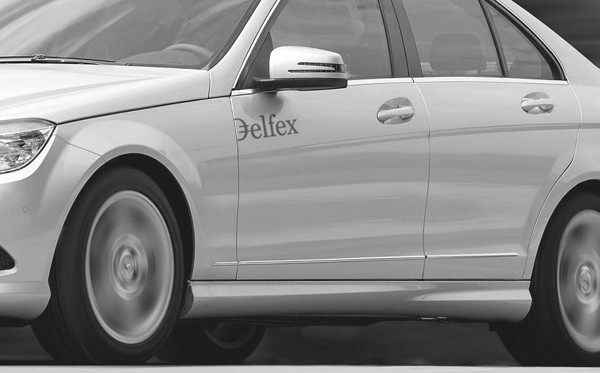
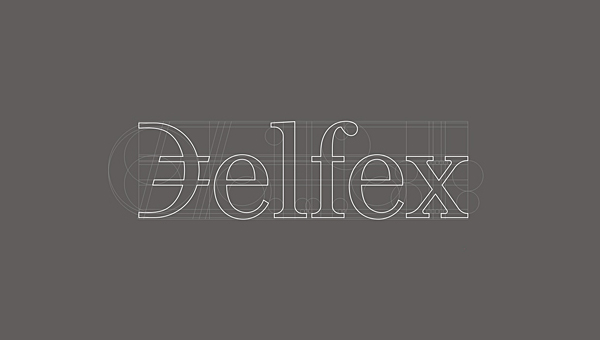
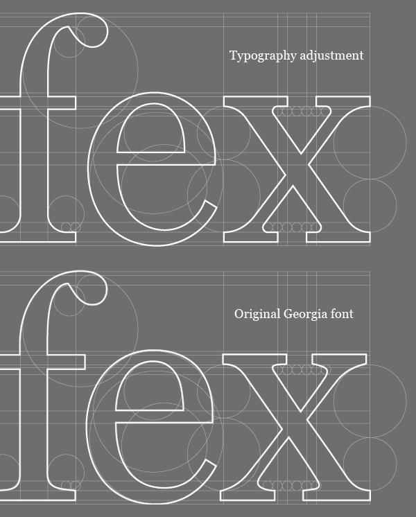
The logotype, set in Georgia, has a classic and elegant banking sensibility with subtle revisions to the typeface that greatly improves on the original giving the brand a more bespoke and finely crafted aspect. The D character is a lovely twist to the classic serif type execution and immediately speaks of currency, it sensibly avoids referencing any one currency carrying a more global and distinctive tone. It essentially becomes a currency of its own. The edge of the printed collaterals are cleverly utilised to form the left side of the ‘D’ and establishes a consistent logo application throughout making each a valued part of the overall identity system. The silver colour palette is consistently applied throughout in a variety of textures neatly bringing everything together while adding depth and quality to the overall brand experience.
This a strong identity with currency simply and timelessly represented through the combination of colour, texture and a solid logotype treatment.
