Madefire by Moving Brands
Opinion by Richard Baird Posted 22 June 2012
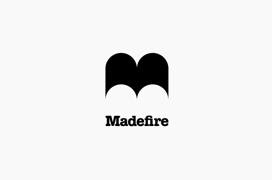
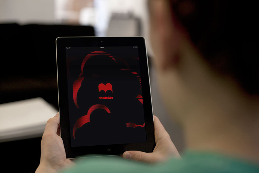
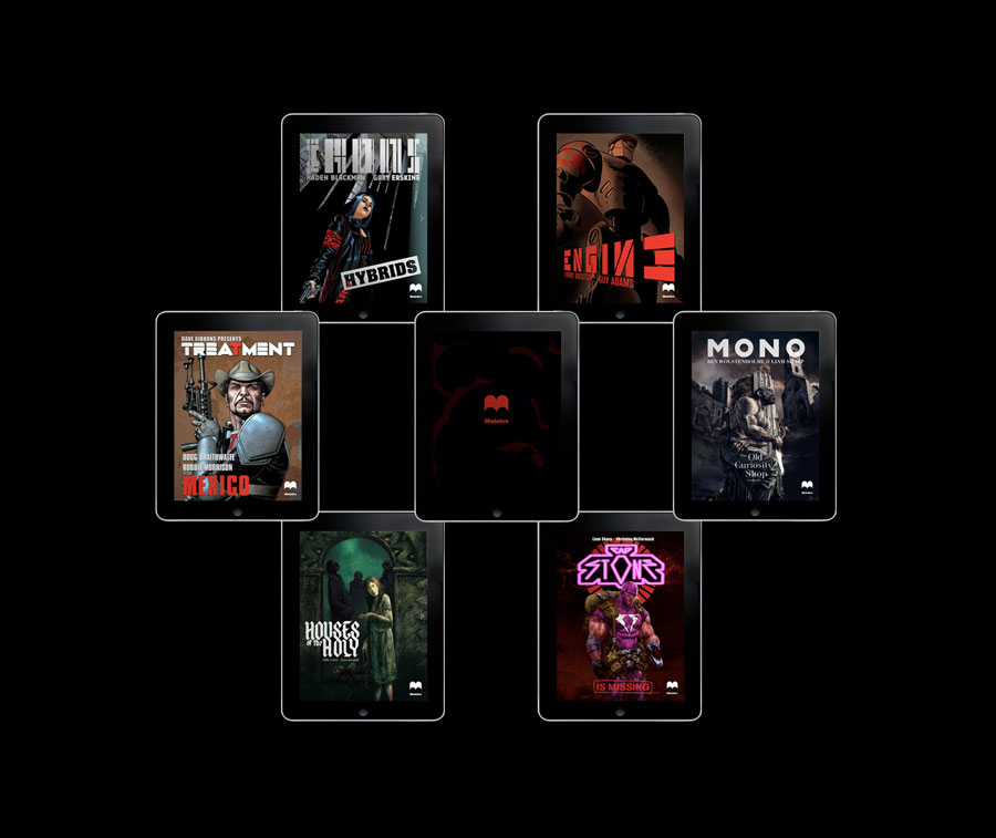
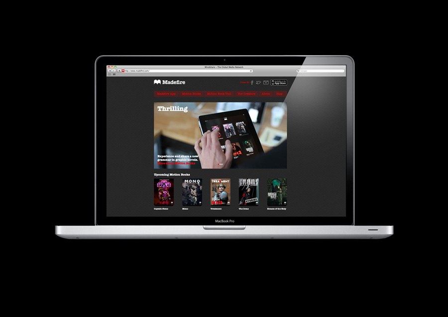
Madefire is a browser-based digital publishing platform and app created by Ben Wolstenholme, Liam Sharp and Eugene Walden to aid graphic novelists in the development and sharing of motion books and to provide readers with a new and dynamic digital experience. International design agency Moving Brands was responsible, from inception, for developing and defining Madefire’s purpose, visual identity, complementary assets, printed collateral and digital interface.
“Madefire provides a platform for storytellers to shine, whether they are ‘old masters’ like Dave Gibbons who have penned graphic novels we’ve all experienced, or up-and-comers itching to express their skills with paint and pixels. This notion is what differentiates Madefire as an alternative to the near-anonymity of creators that the existing publishing models demand. Madefire is for people who love creating and reading visual stories.”
“Our work captured trends in the tablet, reading and publishing spaces in order to fully understand the opportunity. The purpose of ‘creators first’ was underpinned by audience definition, journeys and wireframes, helping us to map the layered Madefire user experience for people who are creating or reading. This analysis laid the foundations for the monetization model, ensuring the business’ scalability. We also defined the Madefire brand architecture and naming tightly in order to create a family of interlinked offerings.”
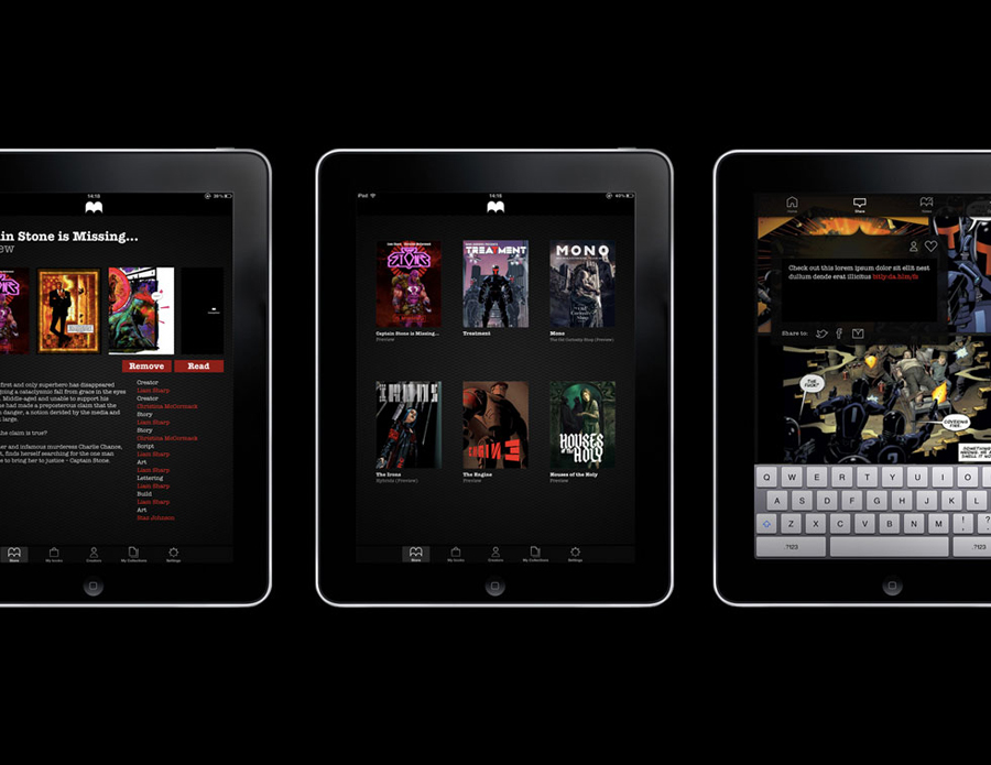
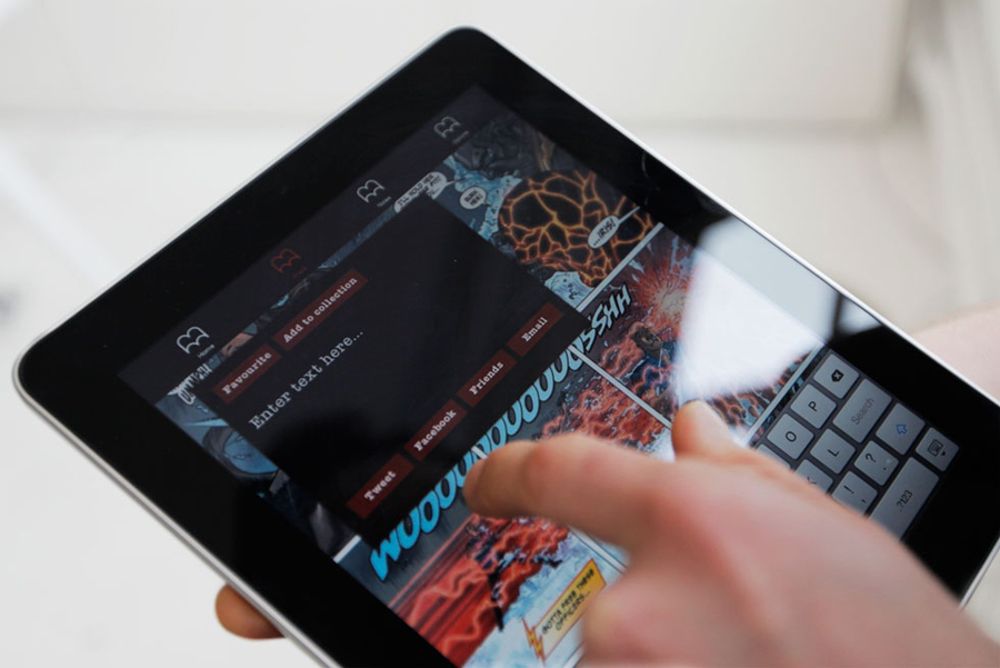
“Together, the Madefire and Moving Brands team set a vision for the app; the design will be thrilling, pushing the UX and UI boundaries of the iPad, eliminating complexity. Sharing is critical; both online via seamless integration of social profiles, and offline, to foster and engage the powerful community that exists within the industry. The Madefire app itself provides a uniquely immersive experience. Not only is the content rich and dramatic, the iPad’s technology is employed to create a thrilling reading experience with panoramic and parallax views of hand rendered scenes. The brand cues seen in the navigation buttons, background textures, loading animations and navbars are powerful reinforcements of the Madefire brand, but subtle enough to ensure the stories themselves are able to shine.”
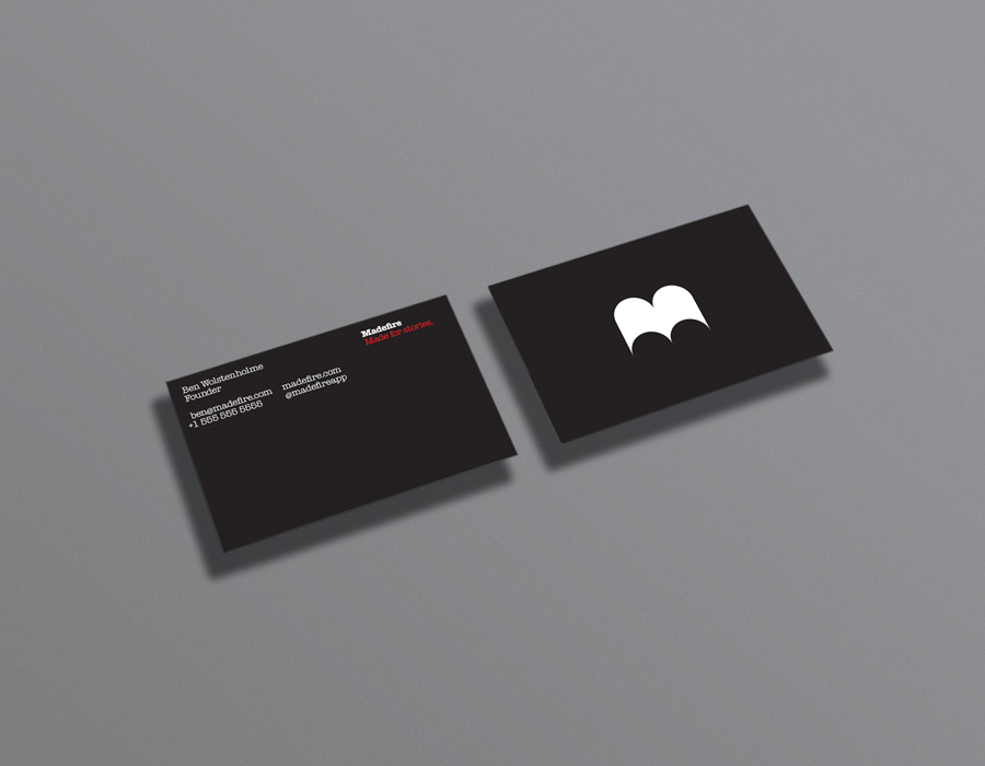
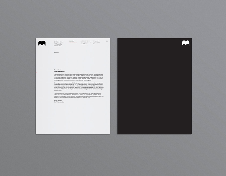
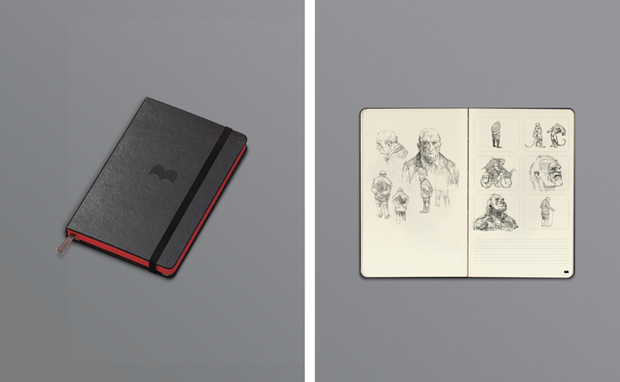
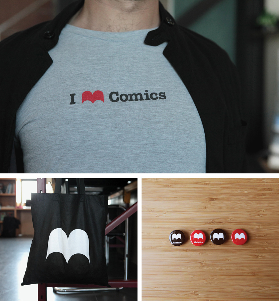
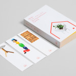
“Madefire exists as much in the real world as in the digital world. We created a full stationery set, moodbooks, storyboard sketchbooks and posters. For launch and events like Comicon (add link) we designed merchandise including T’s, stickers, iPad totes and badges. Swag like this is critical to build a brand in an industry that attracts fanboys and girls like no other.” – Moving Brands
Like their work for 46 Parallels, Moving Brands – through their minimal visual approach, strategically in-depth experience driven and closely integrated solutions – have managed to achieve a huge amount of communicative equity from such a simple and ubiquitous form.
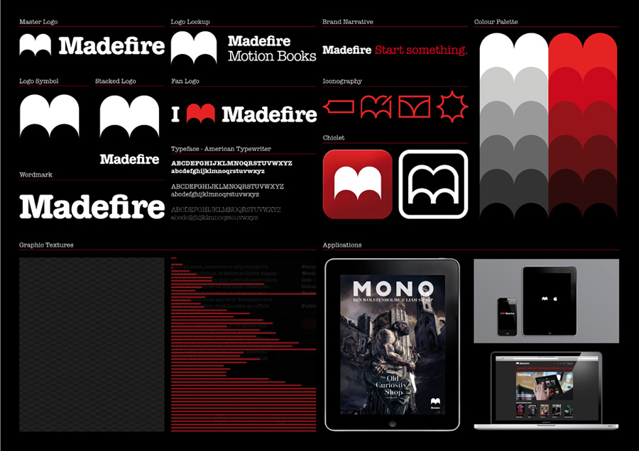
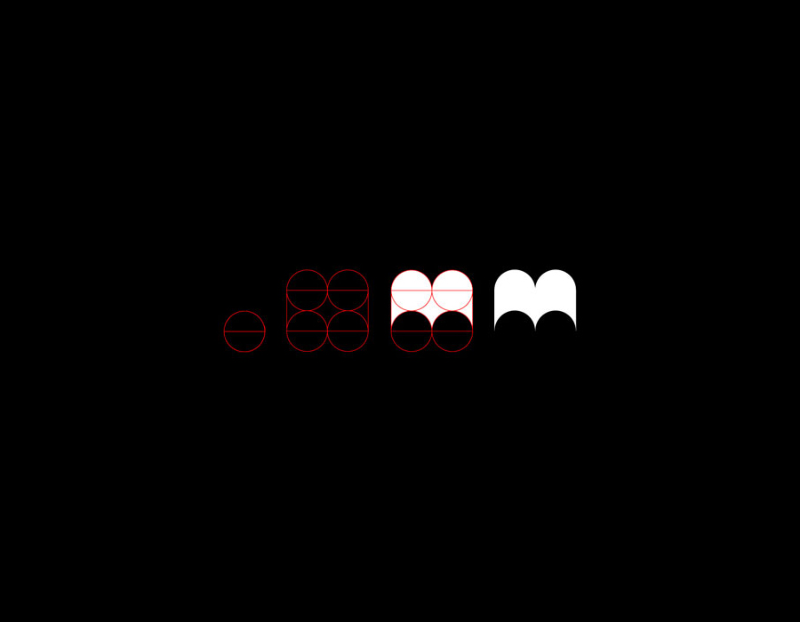
Based around an open book visual device constructed from elemental geometry, the identity neatly bridges the functionality and system based nature of technology (a detail that resonates through the grid based layout of the stationery) and the experience/history and tactile nature of the printed page. It is reflective of an attachment to the past but keen to represent the benefits of a digital future.
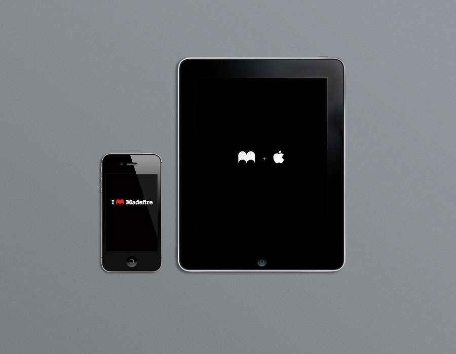
As an ‘m’ the mark offers a contemporary twist on the classic and personal monogram – operating as a badge of honour for the publisher and a neat home screen icon for the reader – it communicates a sense of shared involvement and ownership ideal for the independent and digital publishing sector. Within a typographical and linguistic context (which builds on Milton Glaser’s I ♥ NY wand shares a similar type treatment), the mark takes on a heart-like quality that conveys the passion and enthusiasm of fan boys, artists and publishers while also managing to capture some of the iconic qualities of Superman’s S or (and perhaps more directly through its sharp terminals and larger radius) the classic wings of the Dark Knight. The open book resolves the brand’s most important themes of new adventures, opportunities, discovery as well as the the unexpected through each page turn.
The logo-mark has been neatly paired with a logo-type that mixes the editorial, draft-script and utilitarian typewriter aesthetic of a slab serif that works really well within the context of story telling and development while its condensed nature, relatively tall X height (compared to the caps) and FI ligature infuse it with more of a proprietary character. A set of icons, built from a single consistent line weight that mirror the geometry of the logo-mark, reinforce the technological qualities of the brand, these are complemented by a horizontal scan line detail that gives it a underlying retro gaming quality. The black background and red highlights deliver a dark and malevolent undertone that feels mature and creates an interesting divide between the bright and optimistic comics of the past and the pessimistic adult world of graphic novels.
Despite the identity making up only a small part of a predominantly experience driven proposition, and essentially revolving around a fairly common form, Moving Brand’s solution is loaded with relevance, and executed it with a combination of restraint across the stationery and the bold confidence of an over-sized iconic tote design that clearly claims the open book for Madefire.
