S.C.J by Lundgren+Lindqvist
Opinion by Richard Baird Posted 9 September 2011
Sebastian C. Johansson is a Swedish bespoke furniture designer and manufacturer based just outside of Gothenburg who specialises in modernistic and functional pieces described as ‘intentionally rough around the edges’. He commissioned design studio Lundgren+Lindqvist with creating an identity system that represented his approach to design, view of materials and functionality while delivering the consistency of a professional business practice.
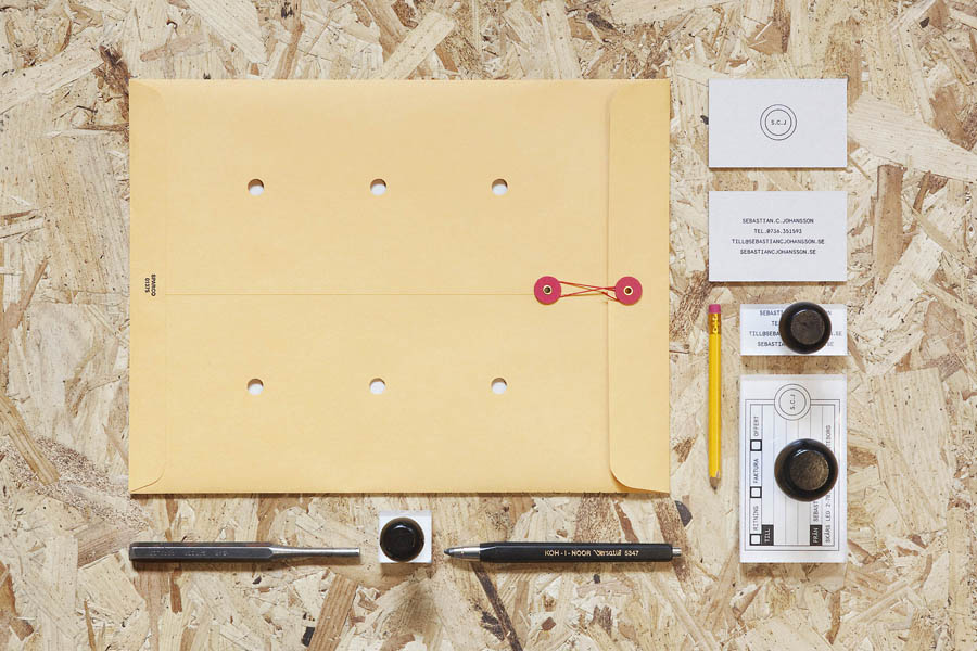
“The notion of functionality and honesty present in Sebastian’s work, paired with his ability to see the beauty in the simplest of materials, was something we used as a starting point when designing the identity. It guided us throughout the project and informed our choices of paper stocks for the stationery.
For the business cards, we used heavy grey board (a scrap material by many considered unrefined and therefore not fit for use in stationery) with the contact details and logotype stamped onto it by hand, much in line with the crafted nature of Sebastian’s work. – Lundgren + Lindqvist
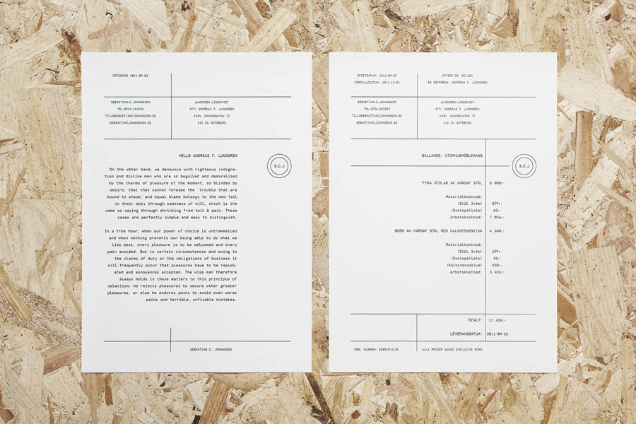
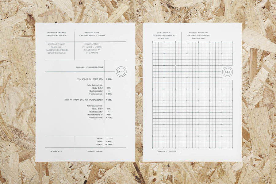
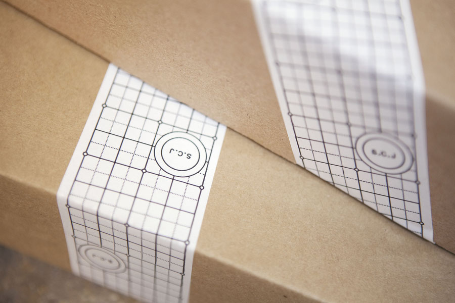
There is a very elemental sensibility to this brand that manages to resolve the complex idiosyncrasies of a personality as well as the professional qualities of a company. The concentric circles utilised in the logo-mark form a solid foundation for these ideas and embodies the core service and the dual process of design and manufacture. The internal SCJ letter-forms and full stops compliment the external rings with a clear technical legibility and an underlying, aesthetically pleasing baseline flow. There is plenty of space within the lock-up that clearly communicates an open approach and acts as a window from which to view the purity and quality of the stationary substrate while also functioning as a manufacturers mark or final seal of approval.
The fine lines and accompanying grid system allude well to the ideas of detail, planning and accuracy but is cleverly balanced by the interaction and utilisation of a stamp based treatment that takes the precision of the vector line work and gives it a rougher, imperfect but desirable tactile and personal quality.
The Twitter avatars are a nice little spin that add a playful and sociable aspect to the brand and sit comfortably just outside of the main identity system. What really stands out for me is how the brand values are also expressed through the material choices as well as the graphical elements, these remain true to Sebastian’s ideology throughout, employing and balancing, tactile, personal and precise qualities to deliver a complete but professional brand expression.
