Camerata Lausanne by Demian Conrad Design
Opinion by Richard Baird Posted 25 October 2011

Camerata de Lausanne is a group of thirteen international, classical musicians founded by Pierre Amoyal in 2002. The group’s new identity, developed by Swiss studio Demian Conrad Design, who pursue a research-led and technological approach to design manages to visualise the complex nature of music through the union of graphic design, technology and science.
“Because of my ingrained curiosity, I often ask myself the question: how can something invisible, like music, be graphically portrayed? Some time ago I needed to find a solution to visualise the concept of rarity. I solved this puzzle by inventing a random print technique called WROP. For the Camerata de Lausanne, I looked for a way of visualising sound, but without using images from the world of music per se (notes, instruments, etc).
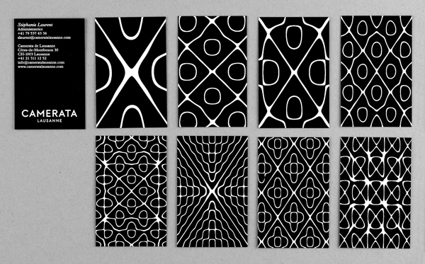
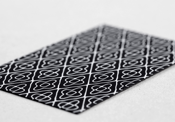
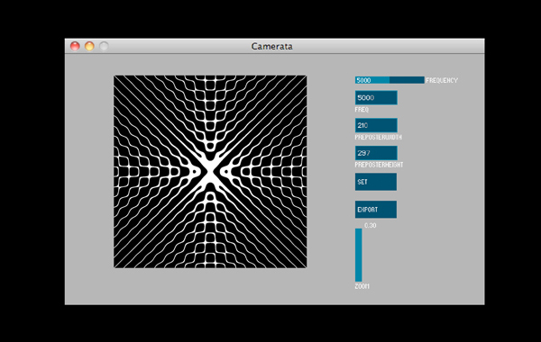
My research led me to the work of Ernst Chladni, a German physicist and the father of modern acoustics. Chladni had discovered that by taking a copper disc sprinkled with sand and rubbing it with a bow, he could obtain geometrical figures. This fact demonstrates that music also has a physical effect on matter. So I followed the geometrical thread discovered by Chladni and used it on all communication media for the Camerata de Lausanne. To give it a more contemporary feel and make it more manageable, I had software written by Mathieu Rudaz which allows us to generate images directly on the computer using a specific frequency.
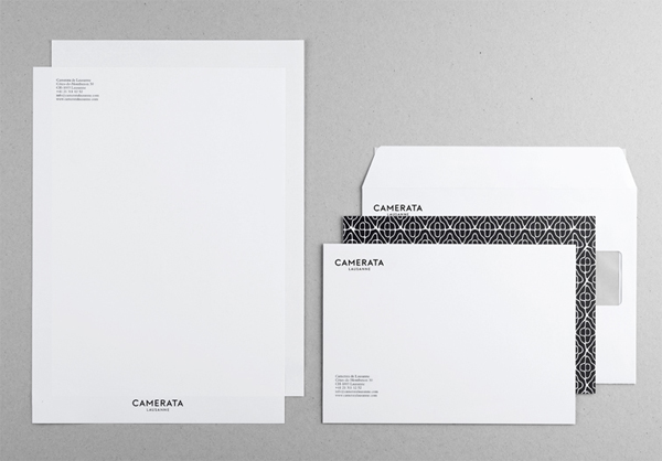
To give a contemporary identity to the ensemble, composed of young and talented musicians, I chose a very modernist and minimalist font, “Neutraface”. The geometrical architecture of this font contains echoes of mathematics, a discipline beloved by classical composers. In addition, we asked the typographer Emmanuel Rey to personalise the geometry of the logo by refining its micro-definition. The content is processed with the Plantin font of the printer Christophe Plantin. The IT company Ergopix also helped design the website by creating a Chladni motif which constantly remodels itself. As a result, the home page visual changes shape according to the time of day. Finally, portraits of musicians were made by the Lausanne photographer Cédric Widmer, whose overriding aim was to depict the particular sensitivity inherent in each one.
The graphic identity of the Camerata de Lausanne is dynamic; it adapts to the time of day, to the context, and therefore breaks free from the myth of a fixed identity.” – Demian Conrad Design
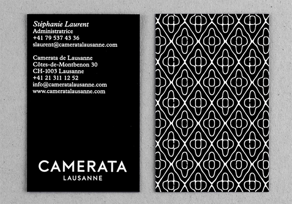
This is a seriously impressive piece of design that has at its core an idea that is not based or dominated around a key logo but a smart graphic representation of sound and the cross-pollination of science. The visual identity predominately revolves around the organic execution and almost fluctuating nature of a series of graphic patterns based on a technique to visualise sound discovered in 1807. These have been exceptionally reproduced with an experienced and restrained simplicity that extend across printed and digital touch points unifying and expressing the unique and changing line-up of artists and the beauty and creativity involved in the performing and experience of music.
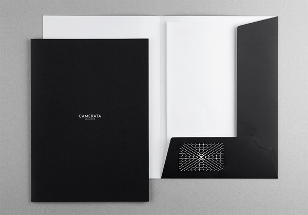
The logo-type, clearly and appropriately a secondary component, plays a clever role in juxtaposing the organic nature of the patterns in its geometric execution and emphasises the sharp structure and mathematical undertones. The black and white colour palette references the more traditional design aesthetic associated with classical music and provides a neat analogy of sound (white) and space (black). The science and technology behind this identity have been brought up to date with software that generates unique patterns and characterises the variety and individuality of each of the musicians.
