The Parcel Yard by Designers Anonymous
Opinion by Richard Baird Posted 3 August 2012

The Parcel Yard is the flagship pub of UK based hospitality brand Fuller’s situated in the grade 2 listed former parcel office of King’s Cross station. The pub’s visual identity, developed by independent design agency Designers Anonymous, takes the simple postal cues of an ink and adhesive stamp and executes these with a subtle rail line twist and original illustrative detail.
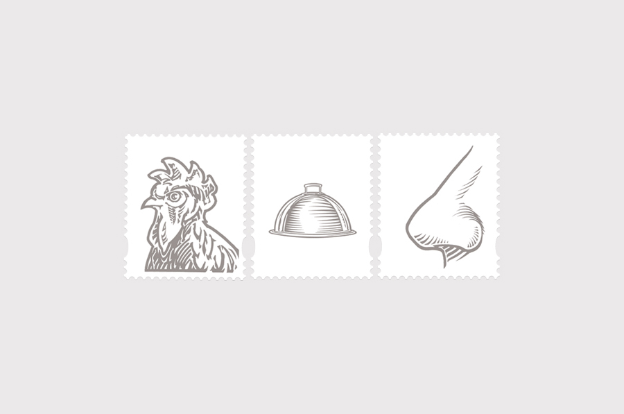
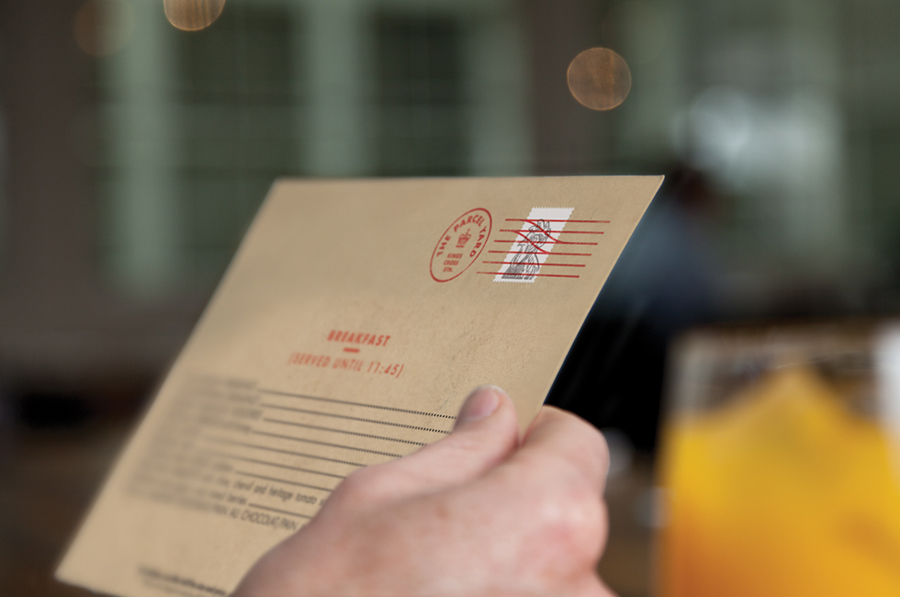
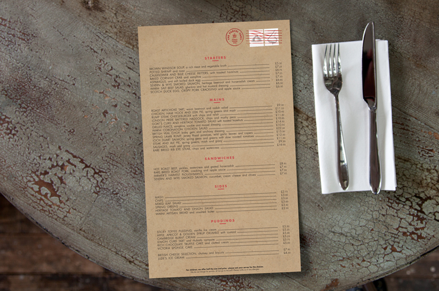
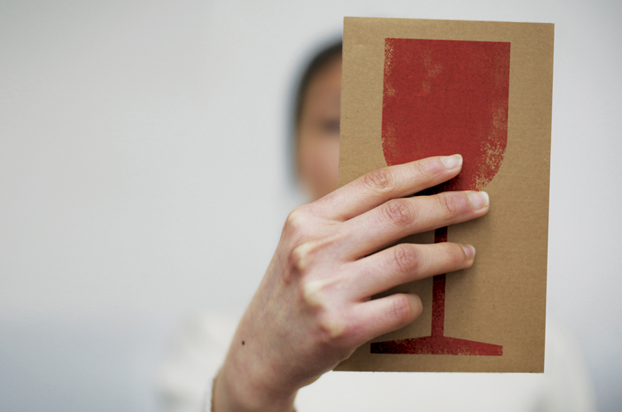
“Working with the proposed interior designs we created an identity which included menus, referencing the postal heritage and location of the new Fuller’s pub. We created a cancellation mark with a twist, turning the classic parallel lines in to train tracks. A set of stamps were created to be used in conjunction with The Parcel Yard cancellation mark logo. A cockerell for breakfast menu, a silver platter for the main menu and a nose for the wine menu. The menus were printed on manilla coloured paper.” – Designers Anonymous
The appropriation of the familiar postal aesthetic is a fantastic and relevant idea that careful balances utilitarian graphic design, a traditional illustrative style, a classic manilla material choice and two print finishes to neatly resolve the history and location of the pub with a sense of authenticity.
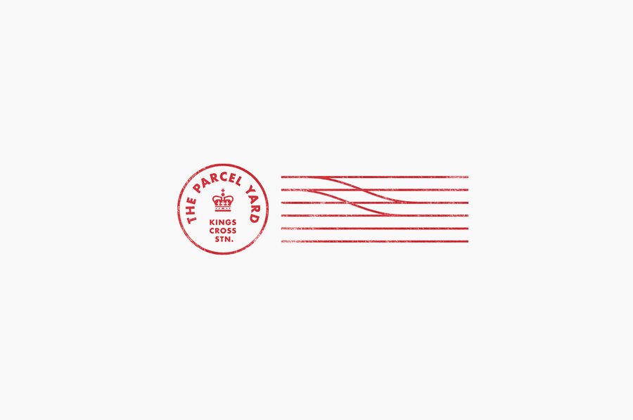
The roundel of the ink stamp is simple but incredibly well executed with plenty on internal space, a well drawn crown, neutral sans serif type and a distress effect that looks suitably realistic. For me the parallel lines are a particular highlight, the compounding of train tracks and cancellation mark appears incredibly natural and a very smart observation on the part of Designers Anonymous. The adhesive postage stamps introduce a slightly more playful personality while retaining a sense of heritage in their etched execution while the cool grey and white colour palette make them perfect for the red ink detail on top. An uncoated, unbleached manilla material choice alongside the combination of ink and adhesive stamps deliver layers of texture, taking the everyday and giving it a distinctive and proprietary twist.
