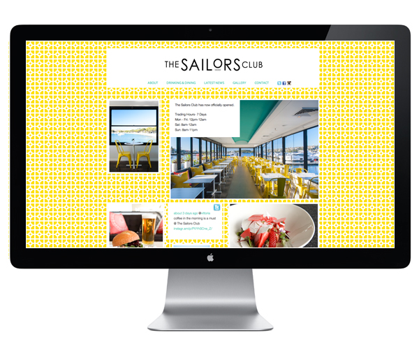
The Sailors Club by Folke
Opinion by Richard Baird Posted 12 September 2012

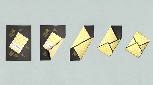
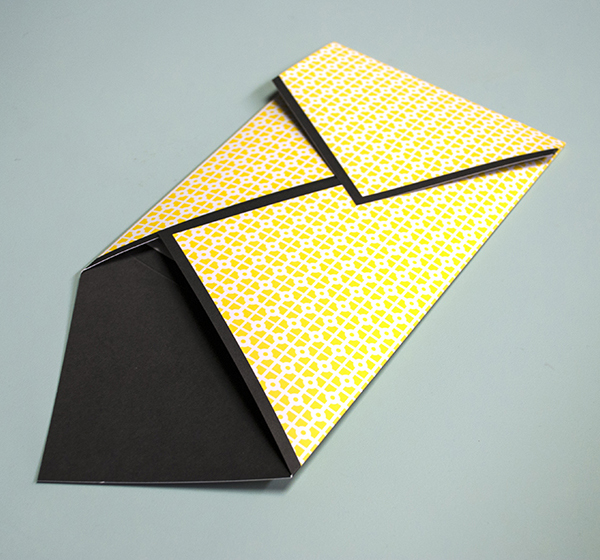
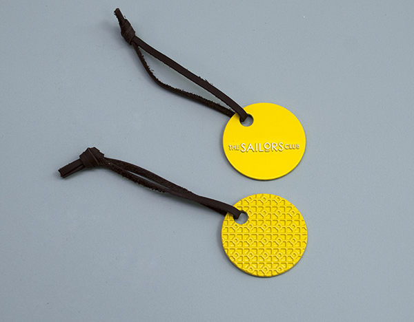
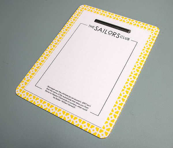
The Sailors Club is restaurant, located in the Rose Bay area of New South Wales, inspired by the ‘luxurious waterside lifestyle famously photographed by Slim Aarons and the colourful frivolity of 1960’s Palm Springs’. The restaurant’s identity, created by independent and multidisciplinary design agency Folke, manages to deliver a retrospective authenticity through the combination of a classic sans serif logo-type and geometric floor tile pattern.

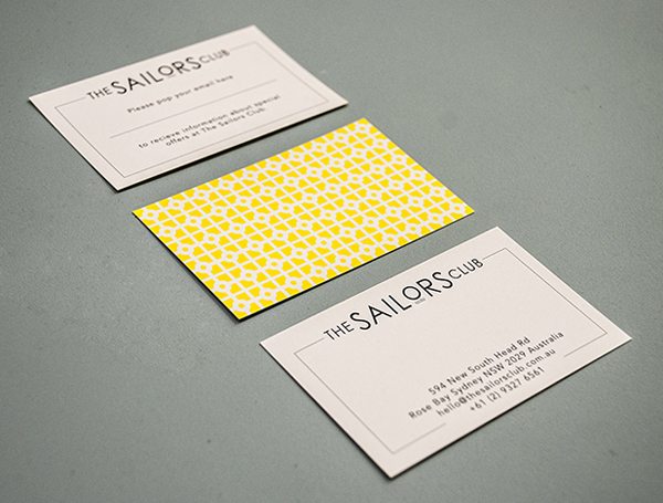
I love the logo-type, for me the combination of wide and slim uppercase sans serif letter-forms, consistent line weight, plenty of space, monochromatic colour palette, raised letter and wave-like underline detail, confidently mixes the subtle qualities of the art deco, humanist and art and craft movements to draw together the restaurants seaside local, its ‘traditional dishes executed with a twist’ and retrospective inspirations. A bright geometric pattern introduces a vibrancy and energy to the logo-type, its floor and wall tile aesthetic has a distinctive 60’s authenticity and a bright seaside positivity that like the images of Slim Aarons, delivers a nostalgia that perhaps wishes to convey some of the simple pleasures of the past. It is a design solution that borders on the kitsch but manages to appear contemporary and crafted in its restraint and application.
