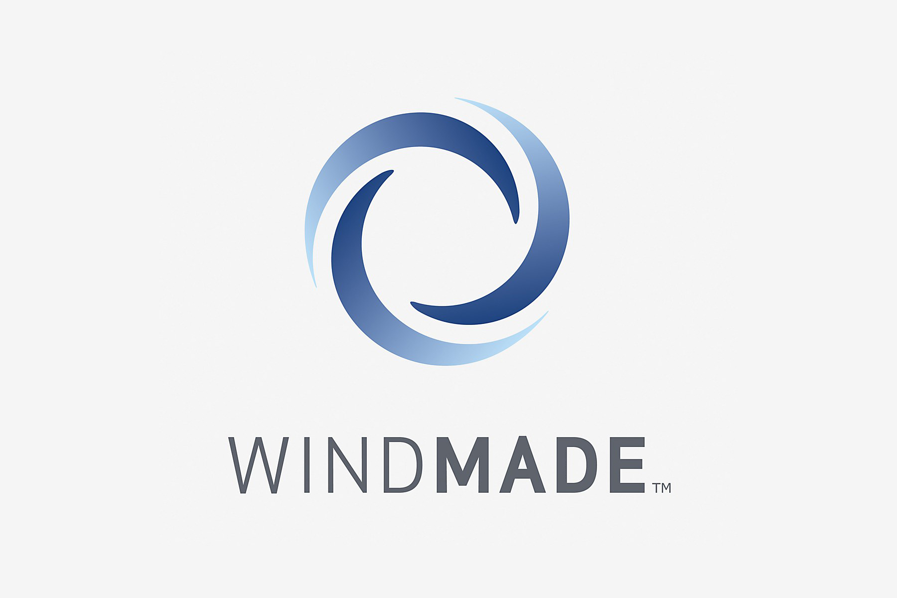
Windmade
Opinion by Richard Baird Posted 8 March 2011

Windmade is a new not-for-profit organisation launched by Vestas Wind Systems to brand products that have been made using energy sourced from wind farms on the back of a survey of 25,000 consumers and has already garnered support from companies such as Lego, WWF and PWc. Although the standards have yet to be defined they have released the visual identity that will sit on packaging alongside other initiatives such as USDA and FSC.
The CEO of Vestas Wind Systems Ditlev Engel describes their aspirations: “We want to build a bridge between consumers and companies committed to clean energy, and give consumers the option to choose more sustainable products,” Engel said. “We hope that this will create a strong element of consumer pull which will accelerate the pace of wind energy development globally.”
This is quite a remarkable and exciting initiative should it really take off which is a shame as the logo in comparison is quite unremarkable. One perspective would be that the logo does embody the characteristics of a spinning blade and it does have a sense of movement and energy. The blue gives it a sense of ‘airy’ lightness and the grey combined with a Conduit type selection that sense of technology and a view to the future. The problem lies in its unimaginative and almost literal by the book representation of wind energy (of which I have seen more than a dozen similar logos) concluding with a mark you surely can’t own. The second problem is its likely application, as it is, the lock-up, tracking and type weight don’t lend themselves well to downsizing, if you look at the marks on the left these are really tight and reduce well. As a single colour, mark only version it could be perceived as washing instructions on clothing labels.
This is no doubt a noble initiative but as a visual presentation the identity doesn’t clearly communicate its unique proposition. There is a great opportunity to change the way these initiatives visually interact with the products and packaging they appear on. Hopefully this is just the start of a larger more identifiable brand structure that will capture consumers’ imaginations.


