Google Chrome by Office
Opinion by Richard Baird Posted 17 March 2011
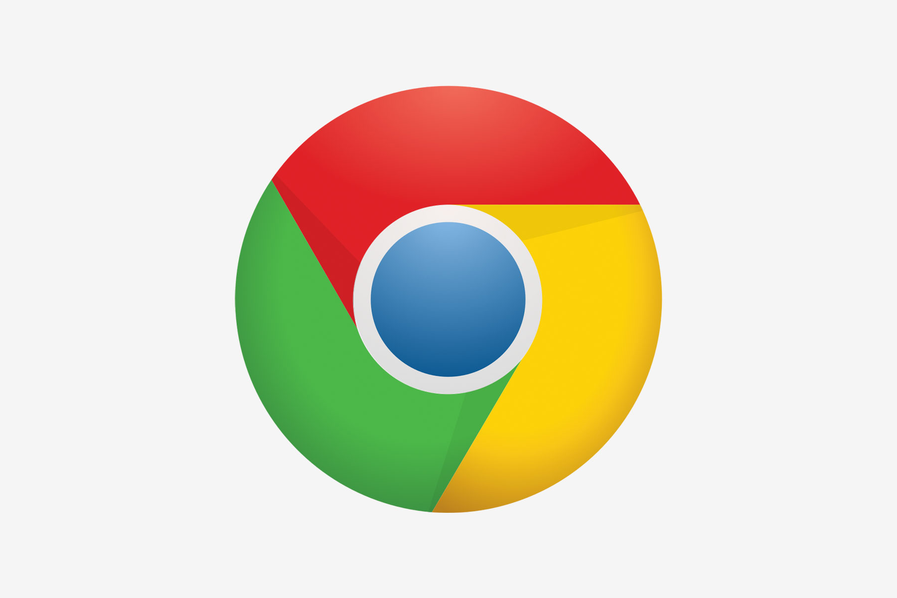
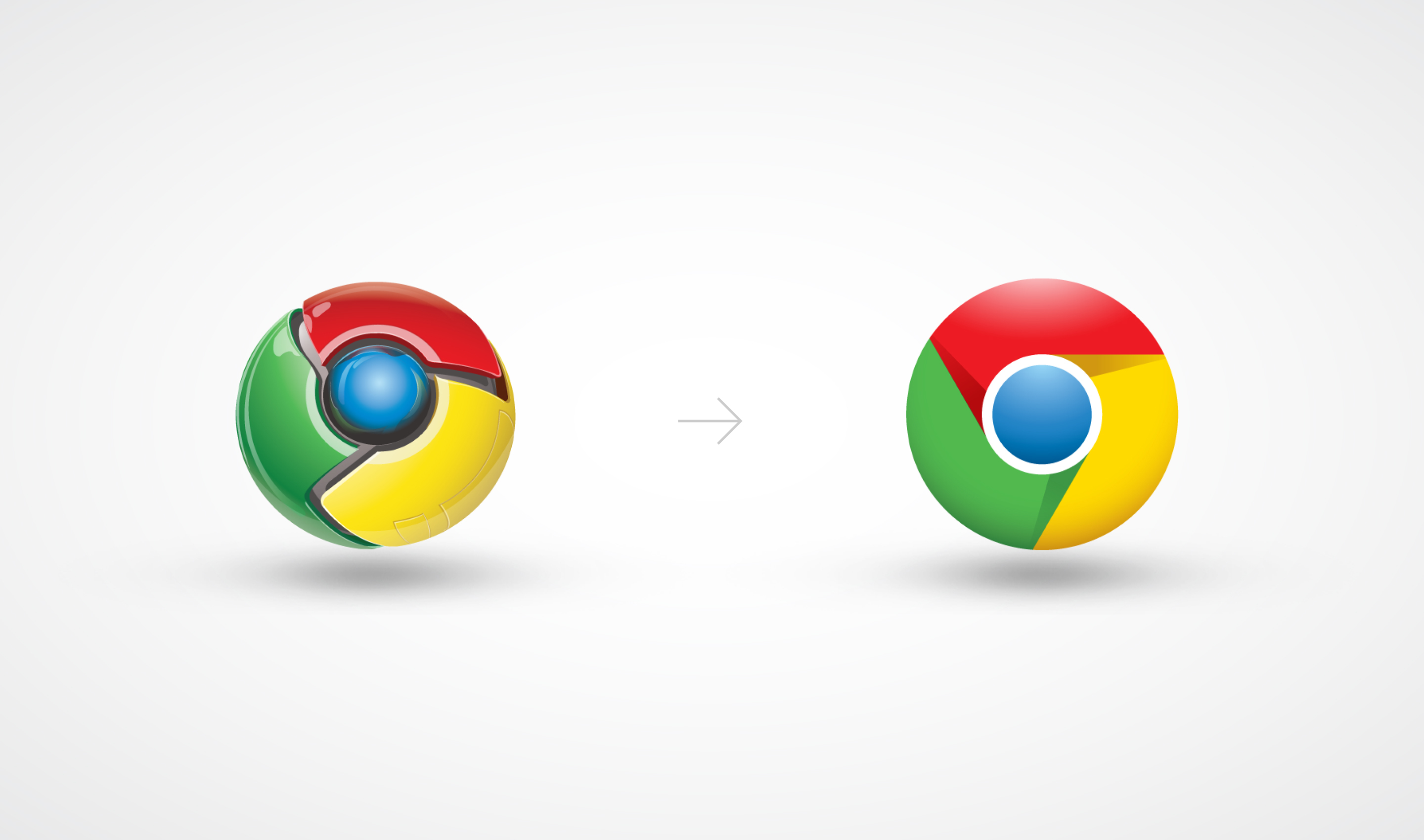
Google has started rolling out a new version of their logo designed by Office. This is a significant improvement, gone are the superfluous effects, in a favour of a flatter, but still dynamic logo that is better-suited to increasingly diverse use-cases such as a flat mark laser etched on to hardware.
“As the world’s most popular Internet browser, Chrome has over 1 billion active users and more than 60 percent of the global market share. When Chrome expanded from a browser to an umbrella brand that encompasses all of Google’s web experience products, Google Creative Lab asked Office to redesign the brand’s identity.”
“Office collaborated with the Google team to develop a simple, iconic identity that embodies the Chrome experience of making the web faster and easier for all.”
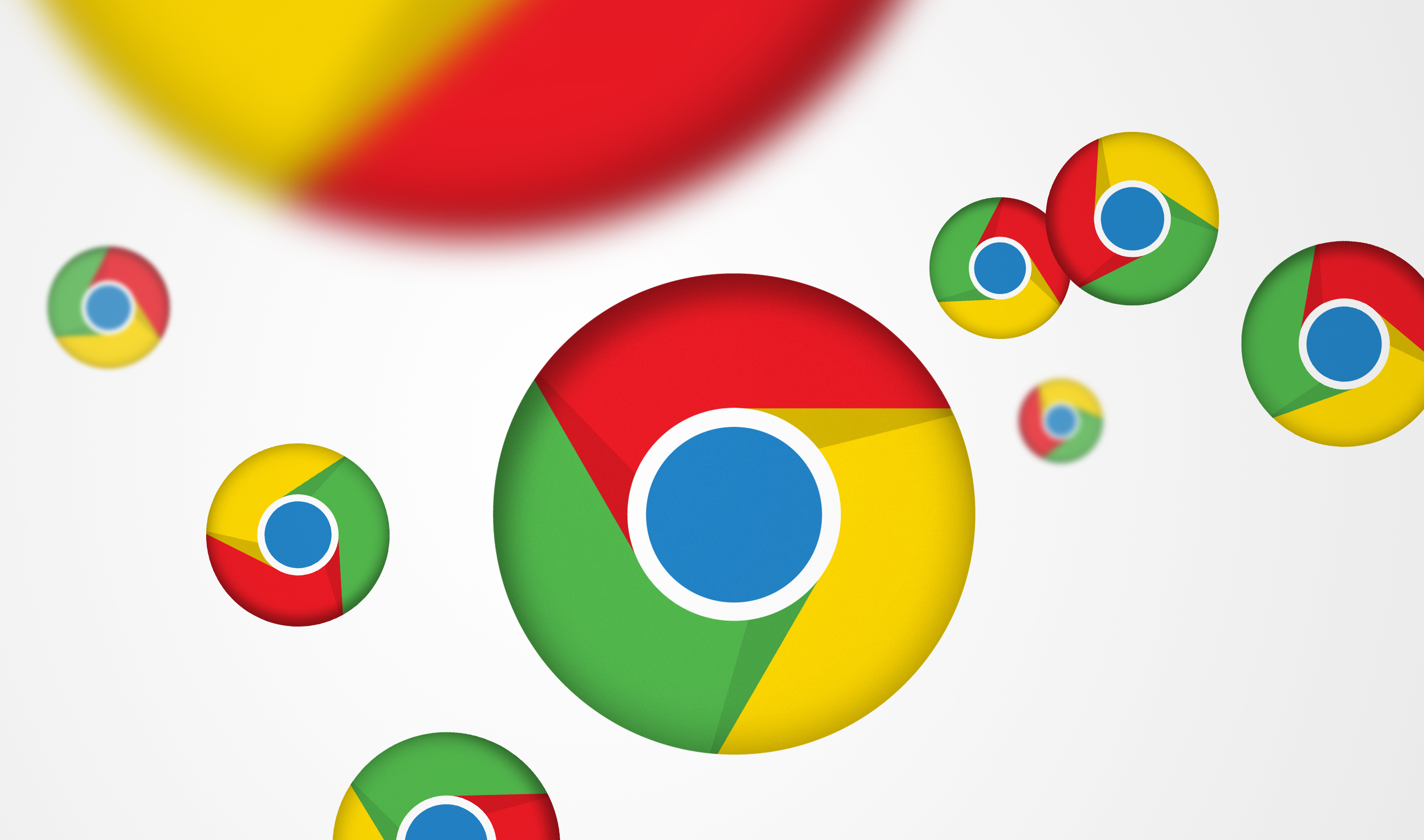
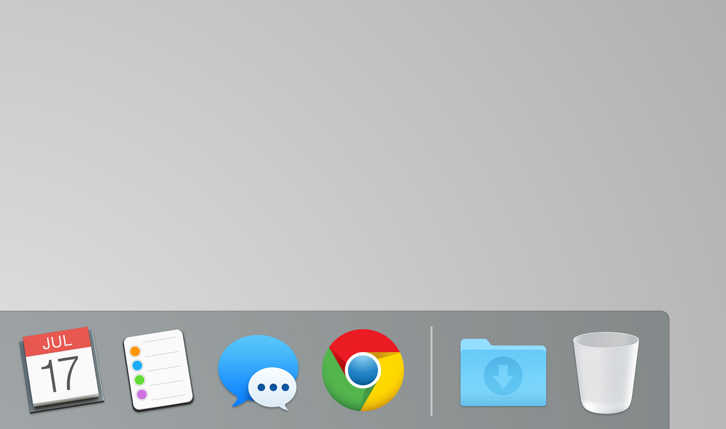
“The new logo is based on the same interlocking forms and colors of the previous mark, but the Office team stripped down the glossy 3-D icon to reflect Chrome’s super-simple, fast experience in a way that’s light and modern. The logo was also designed to fit in with Google’s family of products, and to adapt easily to a broad range of applications — from a PC menu dock, to notebook hardware, to TV spots. The mark’s flatter, simpler, more timeless style became the visual foundation of Google’s suite of product icons.” – Office
