Locomotion by Colmo
Opinion by Richard Baird Posted 24 May 2011
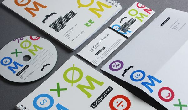
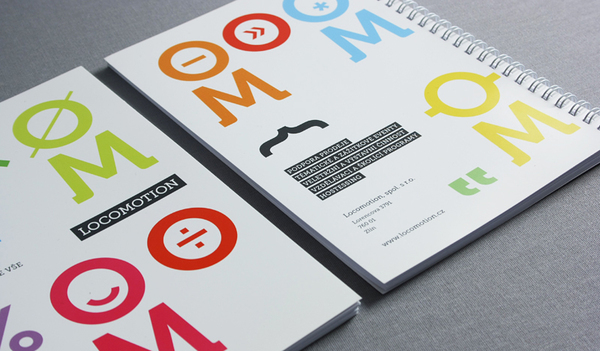
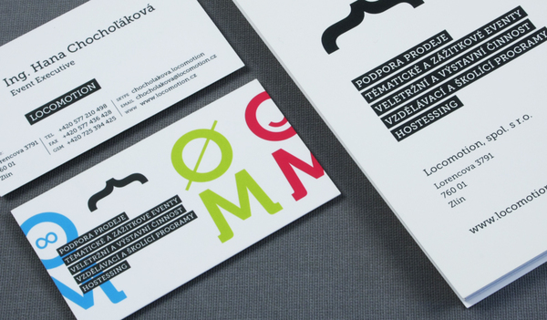
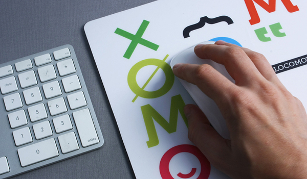
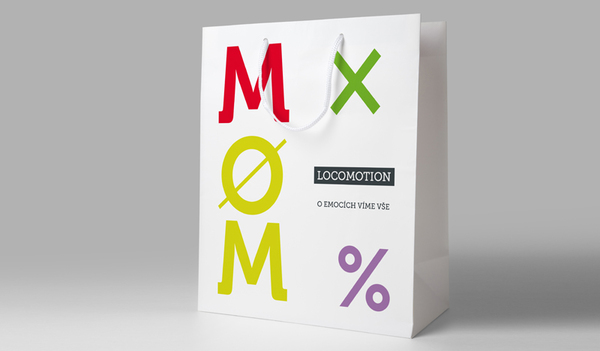
Locomotion is an event marketing agency based in Prague, Czech Republic. Their new identity, designed by Colmo, is a visual blend of mathematical glyphs and emoticons representing Locomotions understanding of consumer behaviour.
I’m not entirely sure what to make of the concept but the visual result is bold, unusual and very modern for the Czech market. The use of simple iconology delivers an interesting blend of mathematics and subtle ‘characters’ but could probably do without the ubiquitous quotation marks. The type selection feels a bit fussy and light for this style but it is helped by the black containers that contrast well against the bright and colourful shapes. I’m not sure if the message is clear or whether it really captures any particular emotion but the style is certainly engaging and well executed across the variety of printed collaterals.
