Paisaje Cultural Cafetero by Jaime Cadavid
Opinion by Richard Baird Posted 2 June 2011
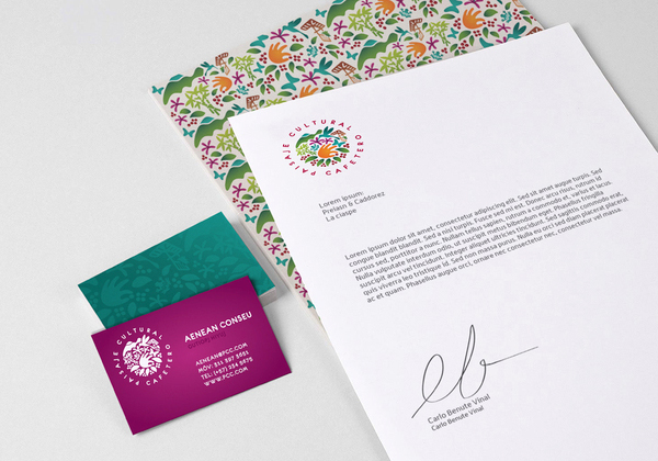
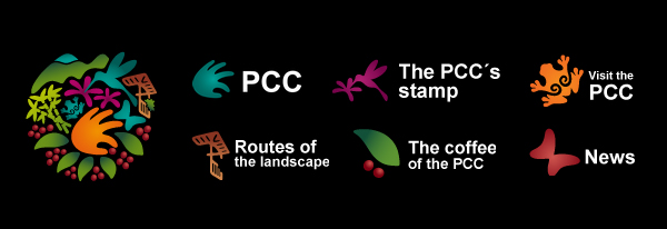
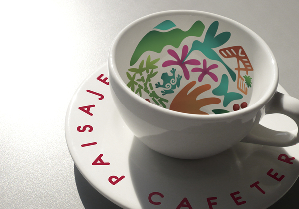
Paisaje Cultural Cafetero is an organisation that supports a number of coffee growing areas and heritage sites around Colombia’s central and western foothills of the Cordillera de los Andes. Their new identity developed by Columbian designer Jaime Cadavid characterises the natural, cultural and architectural significance of the area.
“The symbology expresses its natural richness, its characteristic architecture, its archaeological history, its mountains, its flora…” “…all the elements that make it so special and unique for being declared as a World Heritage site by UNESCO.” – Jaime Cadavid
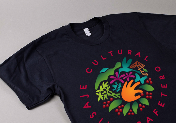
There are a lot of logo-marks that are based on the amalgamation of images and ideas (Unilever being the most prominent) but this is a solid example that subtly blends culture, agricultural industry and environment in a very positive and complementary way visually expressing a sustainable system in its circular form. While I am not a fan of gradients this stands up well, the colours capture an exotic nature without being garish while the illustrative structure has enough interest to work both as a flat colour or as a knock-out. The soft, curvy irregular nature of the type selection complements the mark well but it is a little unfortunate that this has not been translated on-line.
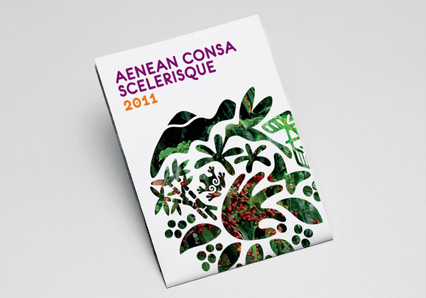
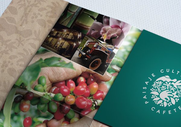
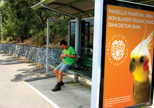
The printed collaterals make very good use of the mark (in its circular form and as a pattern) in both modern (see the poster) and more traditionally themed applications (see the brochure). There is a great strength in the versatility of this mark that manages resolve the unique individual characteristics of the region into a unified, modern and complementary identity.
