Yoobi Sushi by ico
Opinion by Richard Baird Posted 13 June 2011

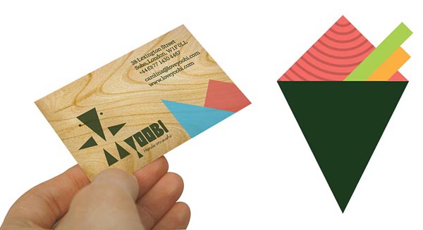
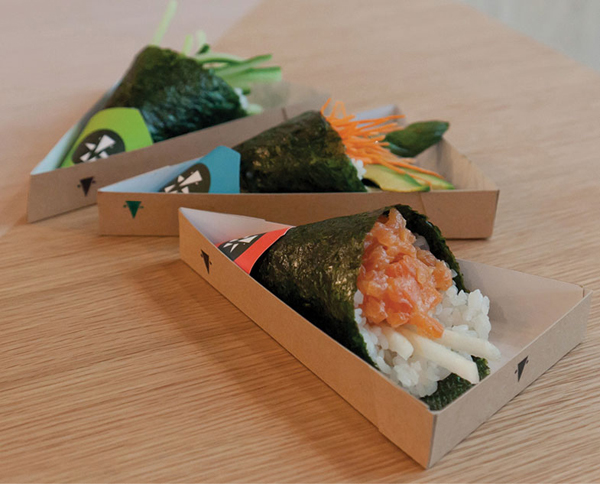
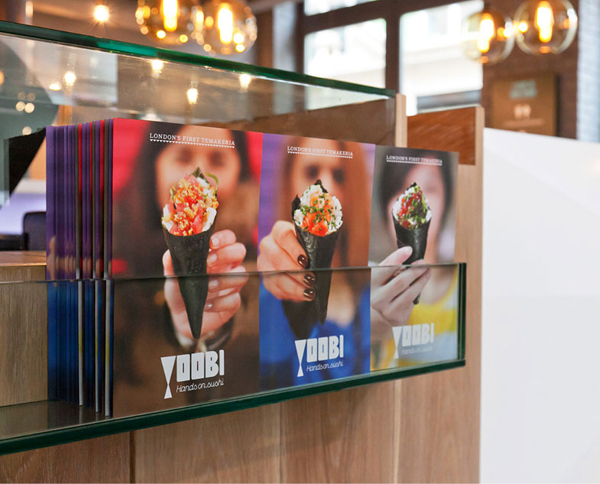
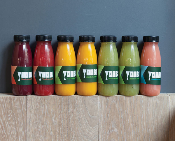
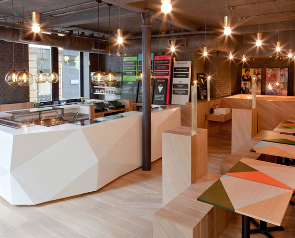
Yoobi Sushi will be a new Japanese hand crafted seafood experience based in Soho, London serving temaki rolls and fresh sushi, eaten by hand from a cone in a restaurant. The new name and identity, managed by brand design agency ico is based around the word ‘yubi’ (Japanese for finger) and was inspired by the founders’ trips to Rio and Tokyo.
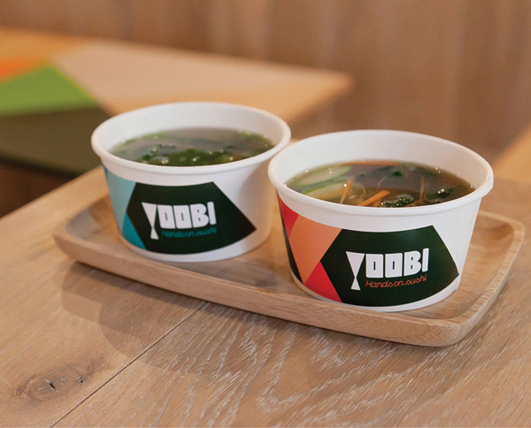
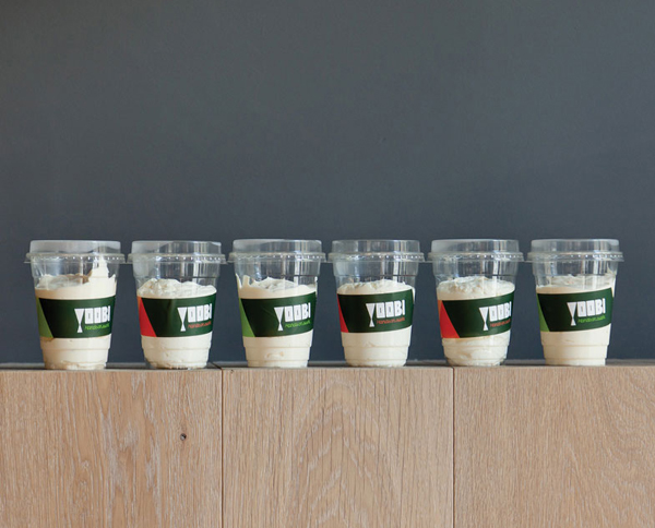
“The whole look and feel of the brand is built around key values such as the respectfulness of Japan, the vibrancy of Brazil and the artistic nature of London. Our remit is to cover all aspects of the brand as it grows, from packaging and menu displays to website and in-store signage.” – ico
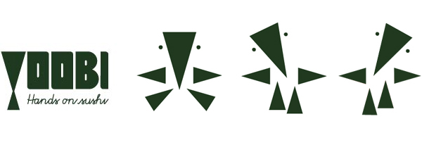
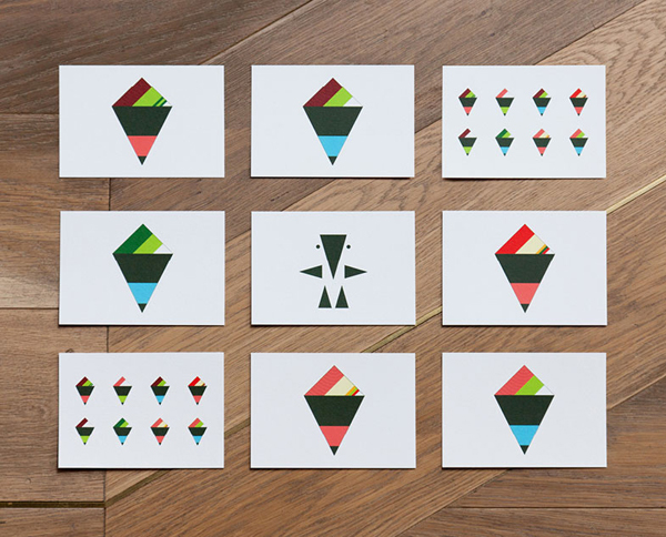
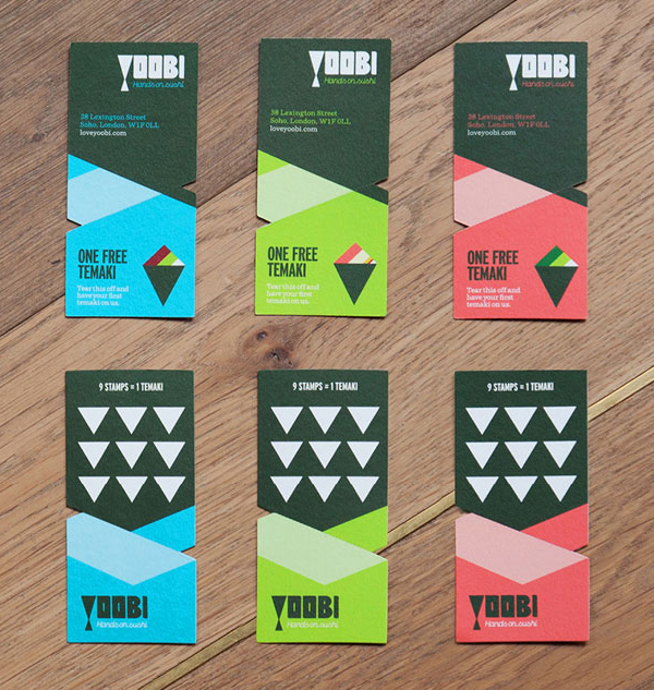
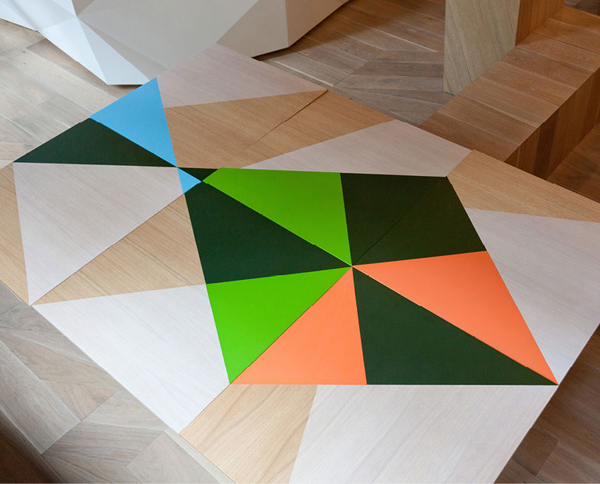
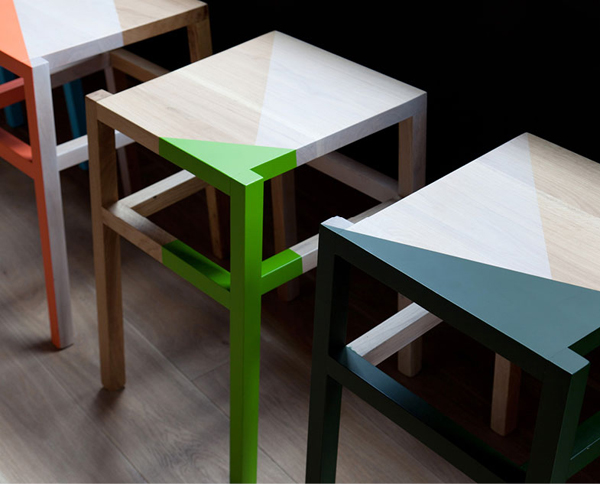
There is a distinctly eastern sensibility to this brand that playfully adopts an unusual and strikingly geometric character to communicate the fun and informal nature of the restaurant. The strength of the brand clearly lies in the simplicity of its execution while having a solid conceptual foundation to build from. The characters animated on-line presence works well to build a personality from its limited form while the backgrounds, iconology and patterns reinforce the brands tri-international influences.
The supporting colour palette of pink, lime and orange feels light and natural and contrasts well with the key seaweed green identity setting a suitably fresh seafood tone. Unfortunately the typographical treatment appears a little awkward in places and while it may be a ‘considered style’ the loose execution of the letter-forms (the weight of the ‘I’ in particular) don’t complement the accurately rendered logo-mark. The script strap-line does deliver a ‘hand crafted’ sensibility but feels a little obvious in its selection and struggles to resolve itself within the visual architecture of the brand.
Regardless of these type problems I do think that the character is very interesting in its rationale and should work well to visualise the restaurants unique character and proposition.
