The Armoury by Purpose
Opinion by Richard Baird Posted 25 July 2011
The Armoury is a traditional pub situated in an 18th century building by the River Wandle in Wandsworth, South London. As part of a recent change in management and following a refurbishment the pub underwent a re-brand. Developed by design studio Purpose their new identity takes its cues from local military history to build a modern brand identity with an old fashioned and traditional charm.
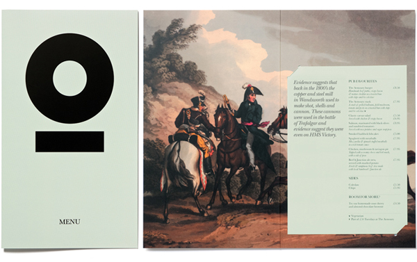
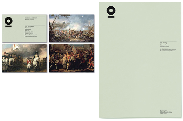
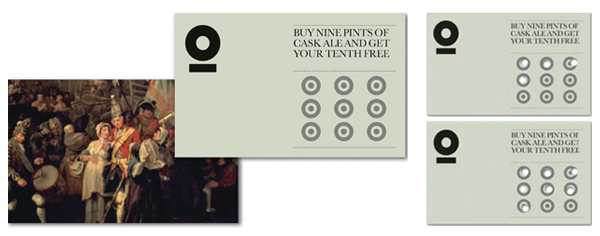
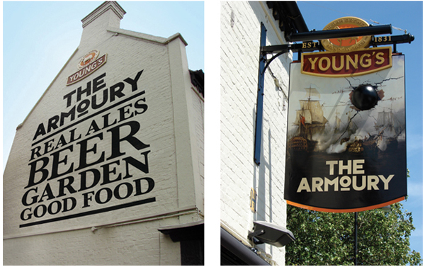
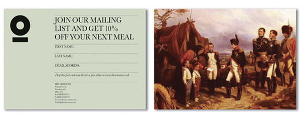
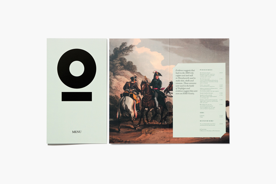
“Steeped in history, the new Armoury identity references cannons produced by the old local mill, whilst 19th century paintings set the scene for famous battles during that time. The new identity has been brought to life across loyalty cards, stationery, menus, signage as well as an iconic swing sign complete with a 3-dimensional cannon ball!” – Taken from the Purpose website.
“The pub was recently renamed The Armoury as a celebration of Wandsworth’s rich industrial heritage, that included a copper and steel mill owned by James Henckle (or Henkel). Using the power of the river Wandle to drive an enormous press, Henkel’s armoury produced cannon and shot to supply to the British Navy. Some of which were used onboard the H.M.S Victory at the Battle of Trafalgar, captained by Vice-Admiral Lord Nelson. The cannons are used to this day as saluting guns on the dockside of Portsmouth harbour.” – The Armoury
The logo-type created from Typeface-Six has a weighty aesthetic to it that carries the theme of wartime industry very well. The central O which I initially perceived as a front facing cannon or cannonball is actually part of the typeface, it still works well to imply this idea and is further reinforced as a separate brand element across the printed collaterals. In contrast there are a number of lighter secondary typographical choices that include a script and serif that add an element of classic sophistication and a sense of quality that helps to deliver a more thoughtful and intelligent pub and brand experience. The period paintings have been neatly applied as full page spreads and their muted colour palettes and fine details work to balance the minimal layouts on the reverse.
The juxtaposition of modern typographical combinations, layouts and bold iconography cuts interestingly against the historic 19th century paintings and delivers an interesting and unusual style. I cannot quite get over how well this identity works to give the paintings new life and a very modern aesthetic.
Fonts used: Typeface-Six
