OVG by Studio Dumbar
Opinion by Richard Baird Posted 3 August 2011
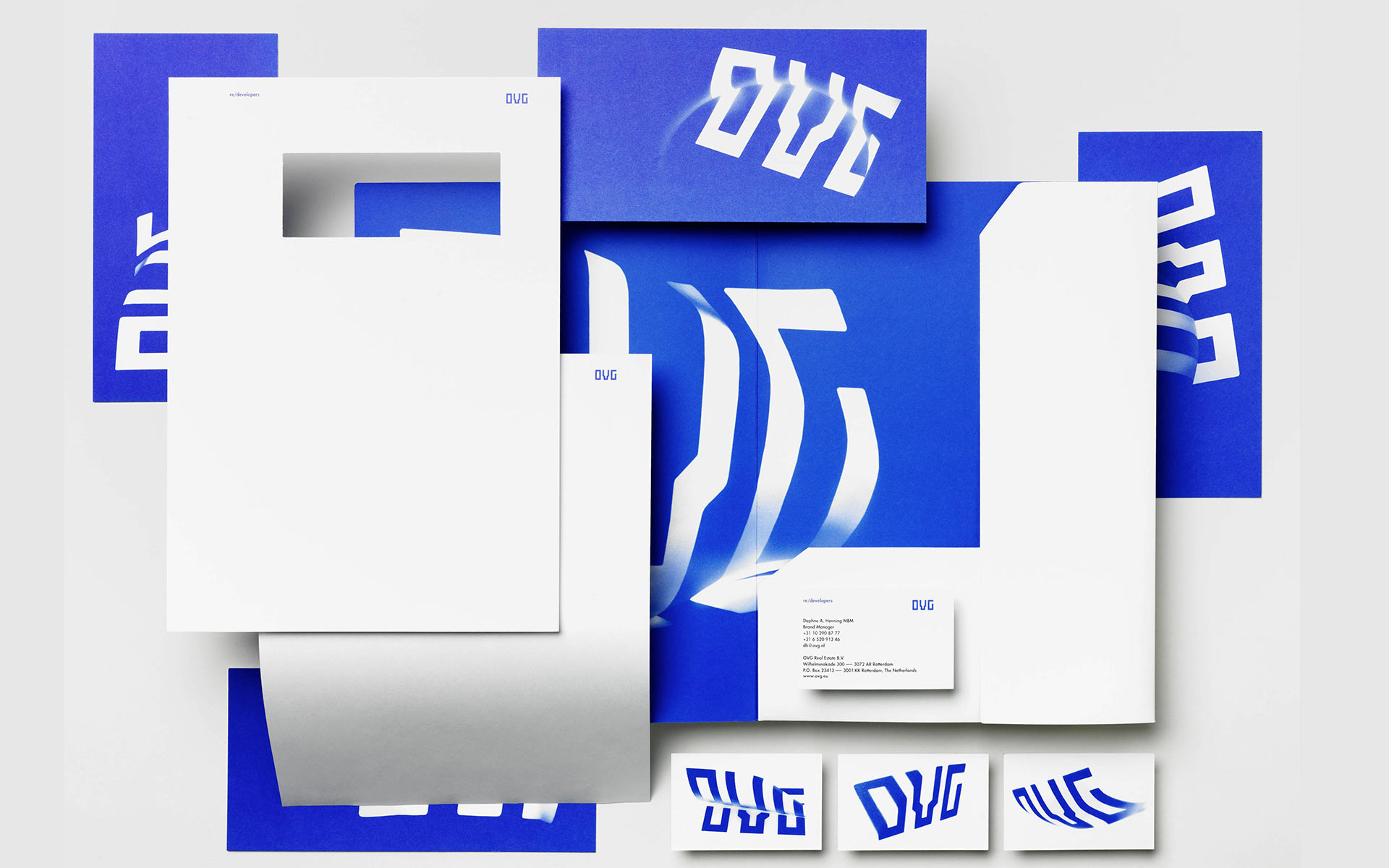
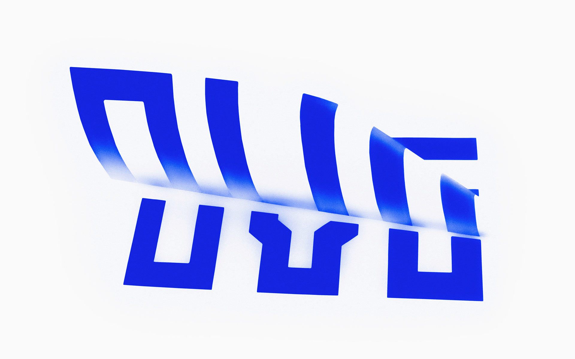
OVG is a Dutch company that specialises in the development, redevelopment and restoration of buildings and land across Europe. Studio Dumbar created their brand identity around the changing nature of our landscapes to characterise the solid reliability and innovative approach of the company.
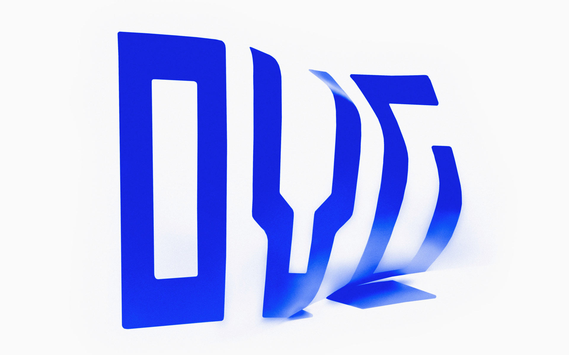
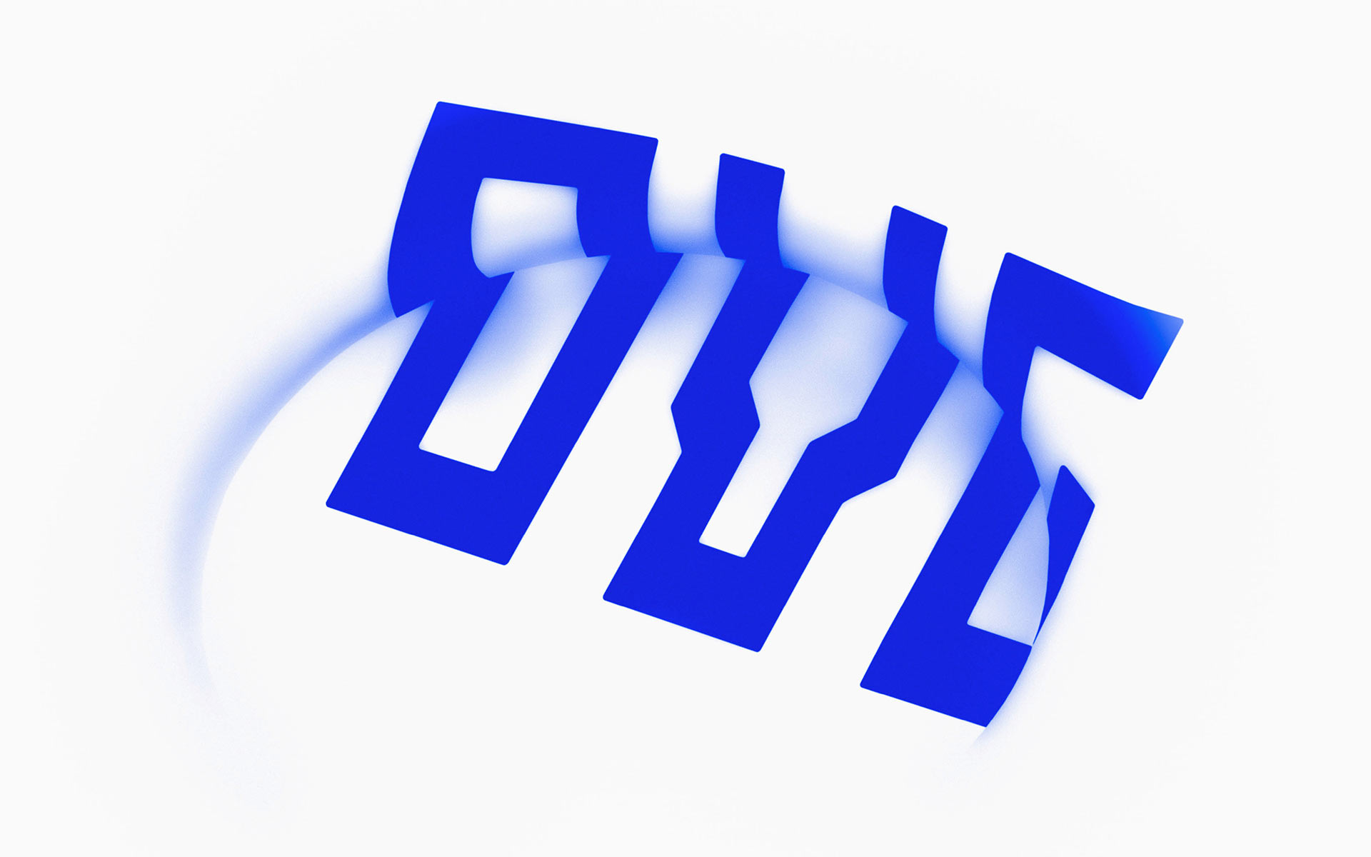
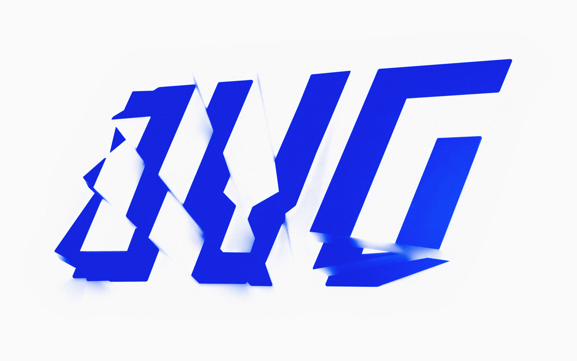
“The logo is like an icon, expressing straightforwardness, reliability and strength. Projected on various shapes the style becomes a ‘living identity’, dynamic and adapting to each new situation or creating new situations; just like OVG’s approach to the project it develops.” – Studio Dumbar
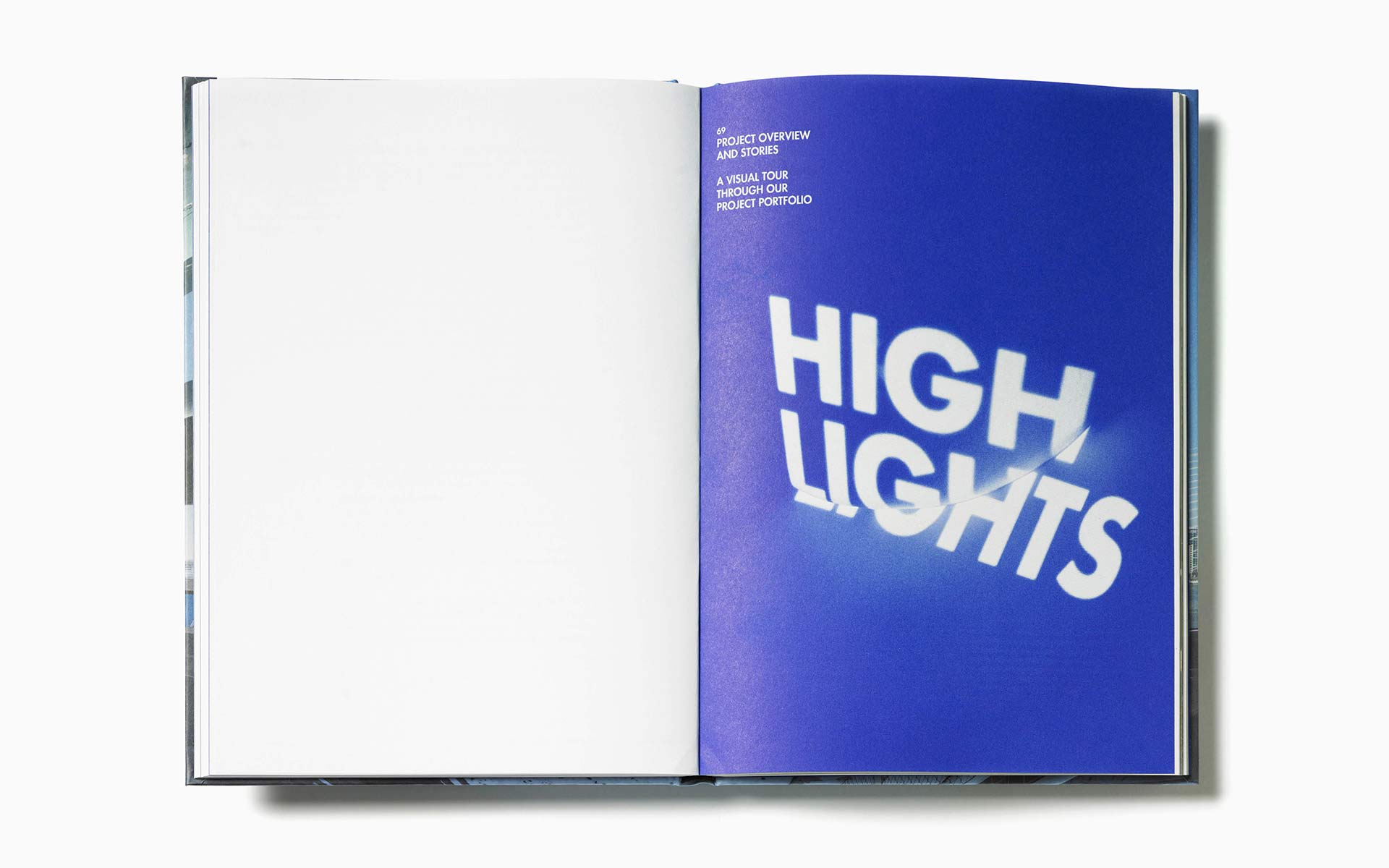
The integration of identity and physical space through projection is an innovative idea that has allowed OBV to have multiple brand expressions freely moving between a rigid structural aesthetic and a more sculptural fluid form unifying creativity, construction and innovative thinking. The OVG logo-type when presented in its most elementary form is simple and straightforward with a structural and engineering sensibility that does not stray too far from what you would expect from the industry. Where this identity really stands out is the ‘projected’ iterations which manage to express much more of the company’s ideas. The use of blurs to add texture, depth and movement is neatly done and delivers an energy that presents OVG as a very vibrant and evolving company.
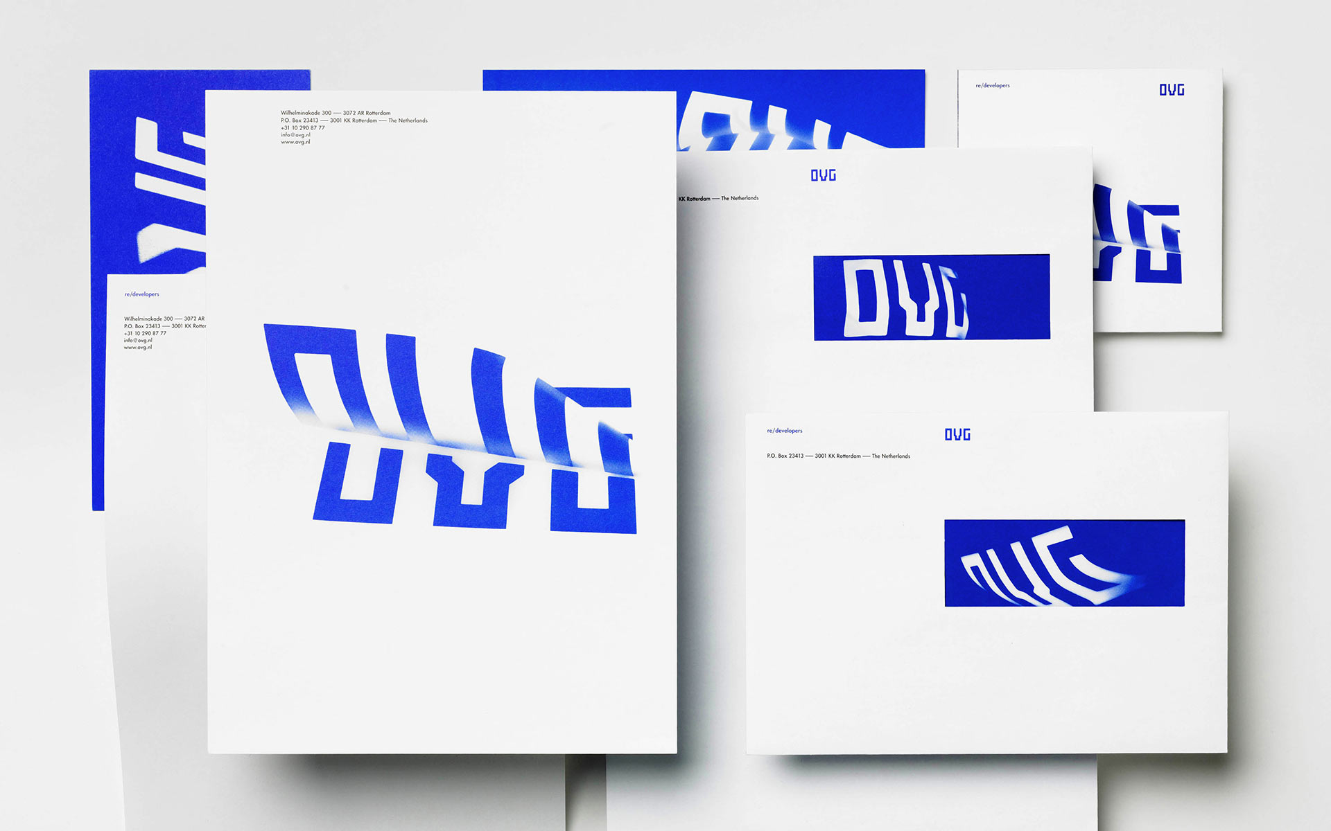
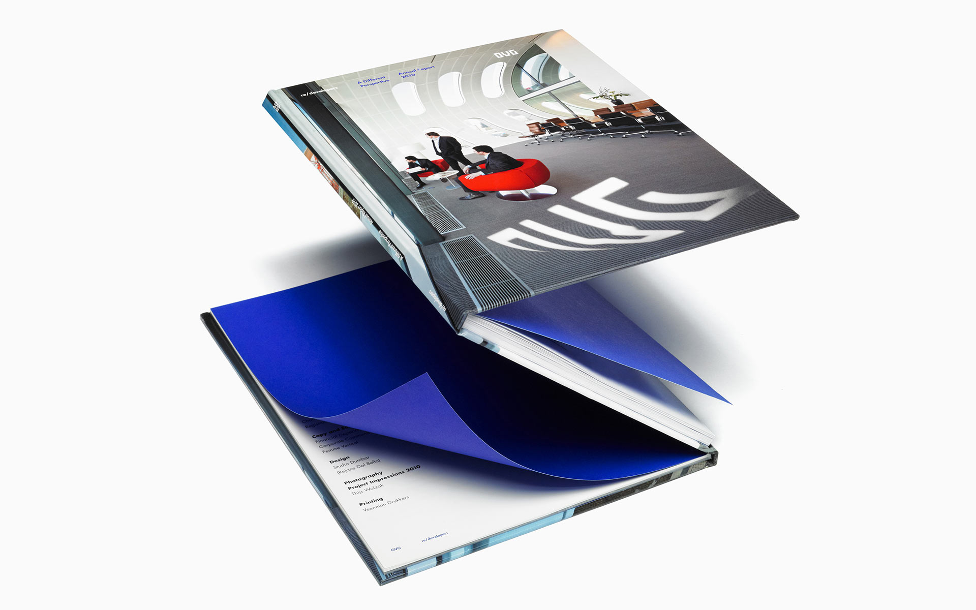
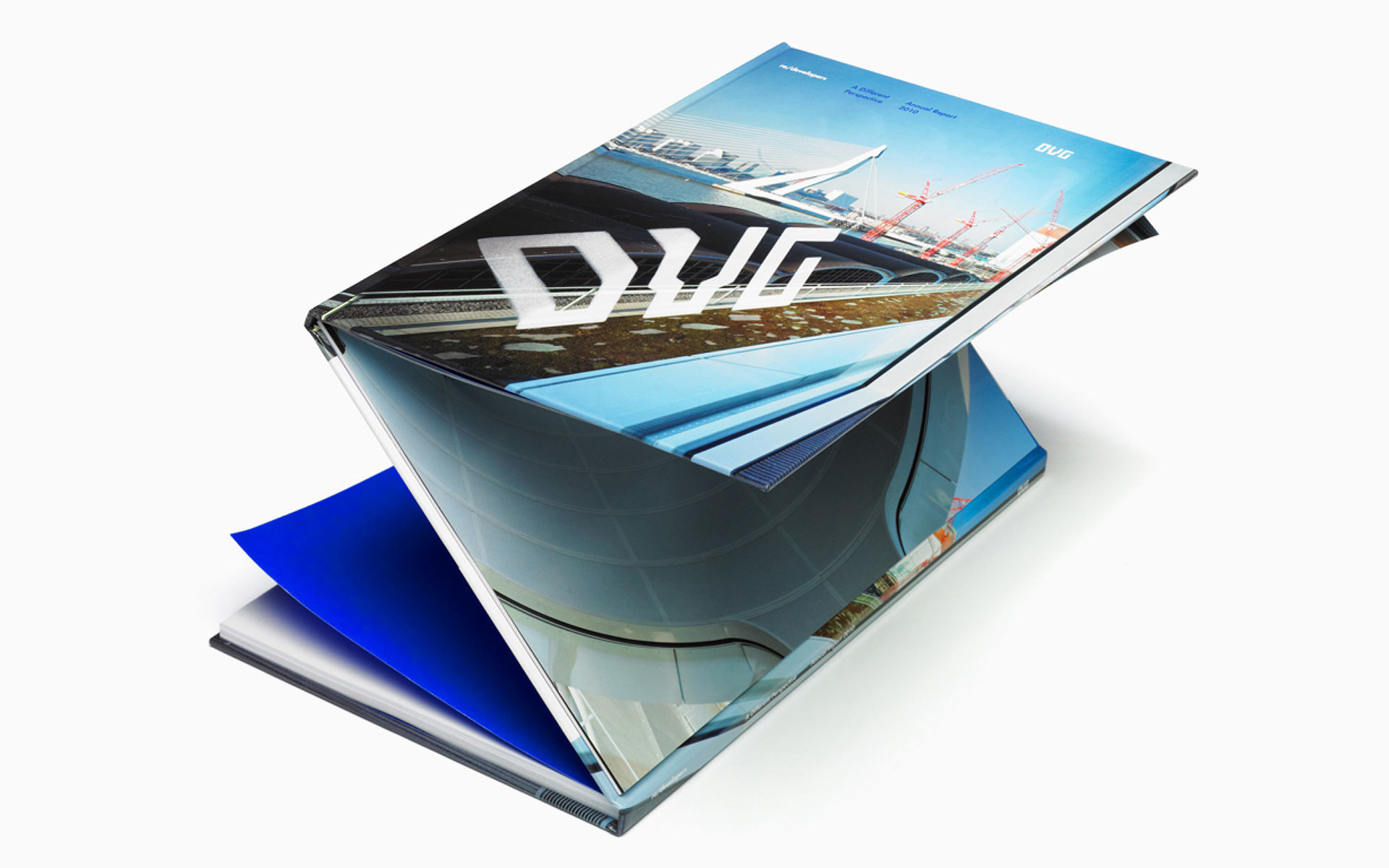
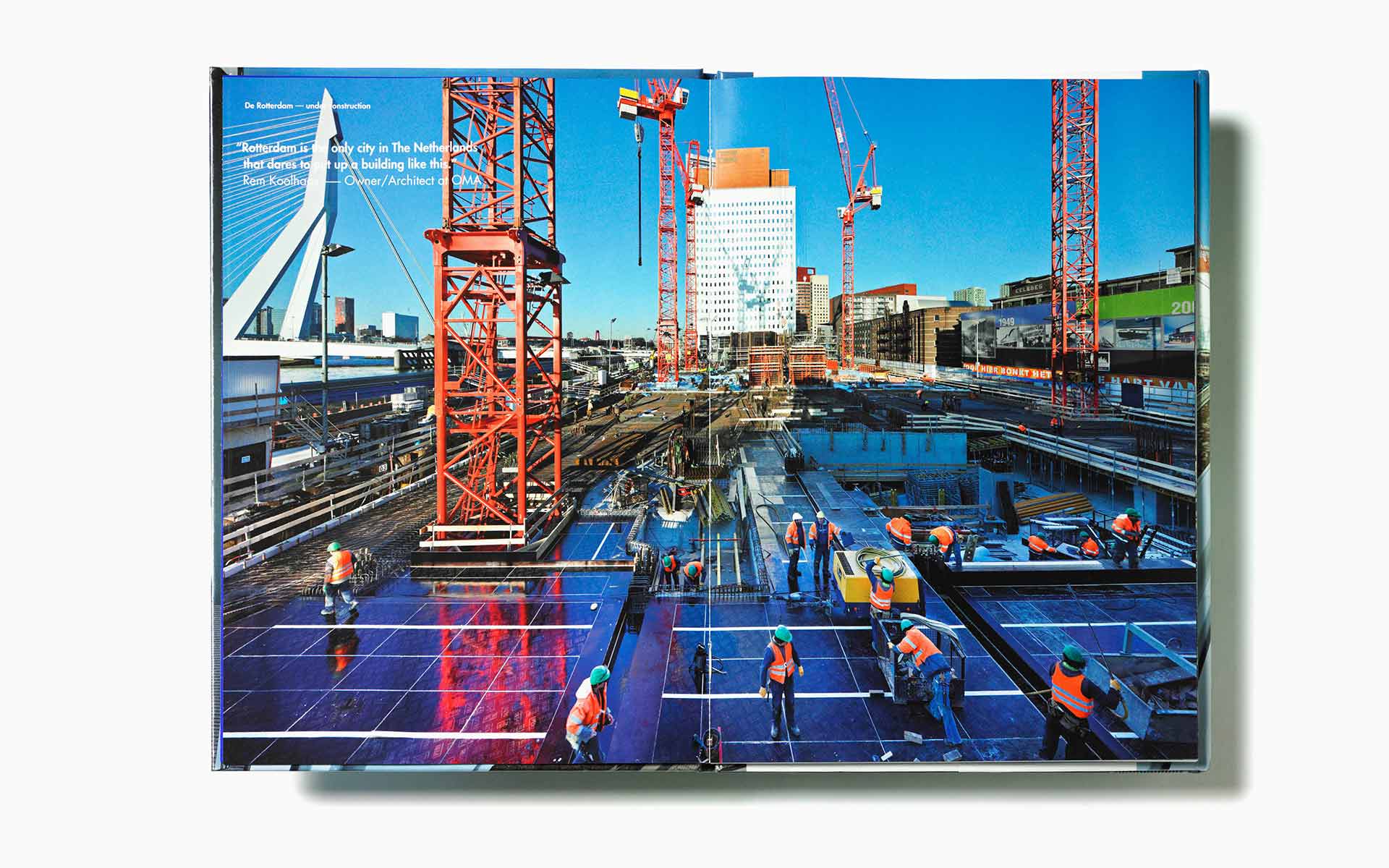
The application of the identity across the business cards and brochure covers look spot on with a formal grid based typographical layout contrasting well against the more ethereal versions of the logo. The blue colour palette carries much of the standard architectural references of open spaces and forward thinking but looks great against white backgrounds or reversed. The integration of the logo-mark into photography in the annual report reinforces a sculptural aesthetic capturing a sense of innovation and creativity but feels a little disconnected in places, a physical version, 3D rendering or projection of the logo-mark into the actual environments may have resolved this issue.
Studio Dumbar has managed to draw together the many aspects and often contrasting ideas of OVG in an easily expanded and transient identity system that could result in ever more interesting and complex forms while retaining much of the simplicity and identifiable geometric character of the basic logo-type.
