Cloudberry by Perky Bros
Opinion by Richard Baird Posted 2 September 2011
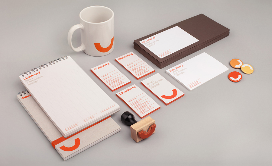
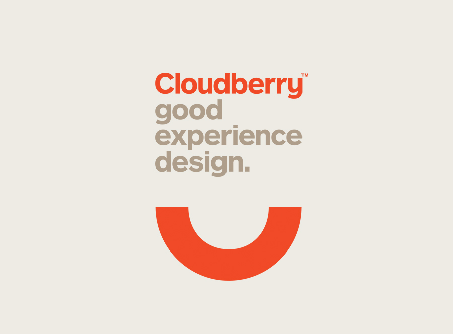
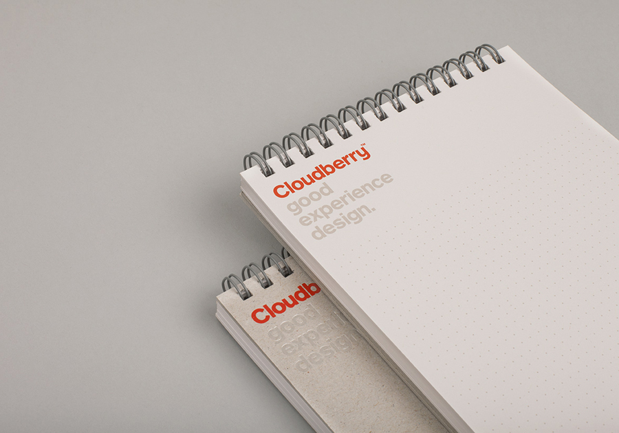
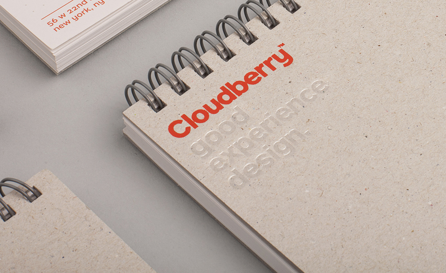
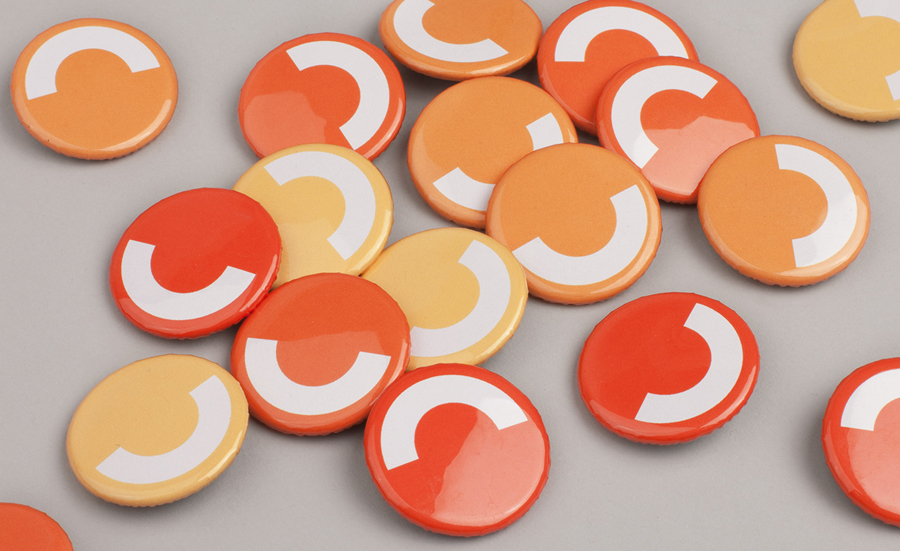
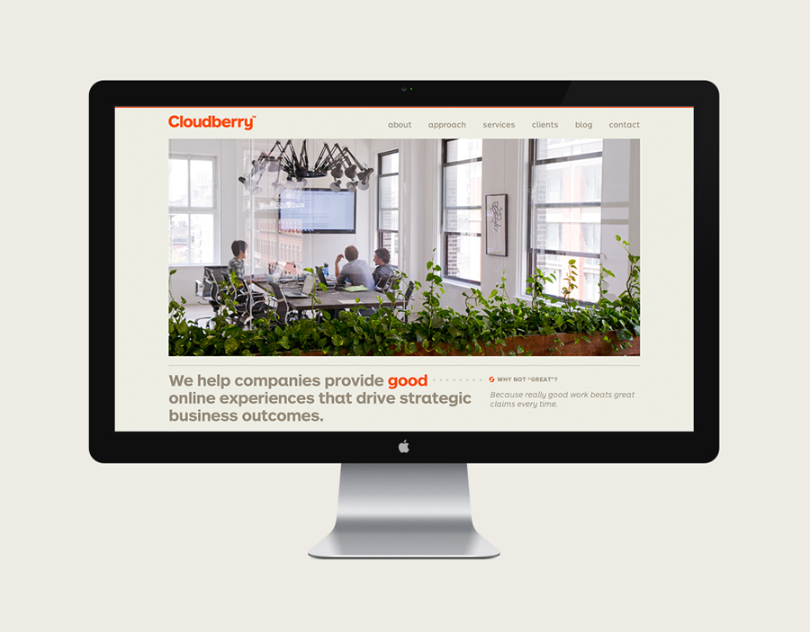
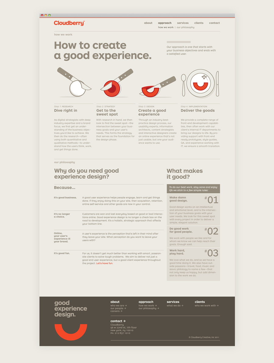
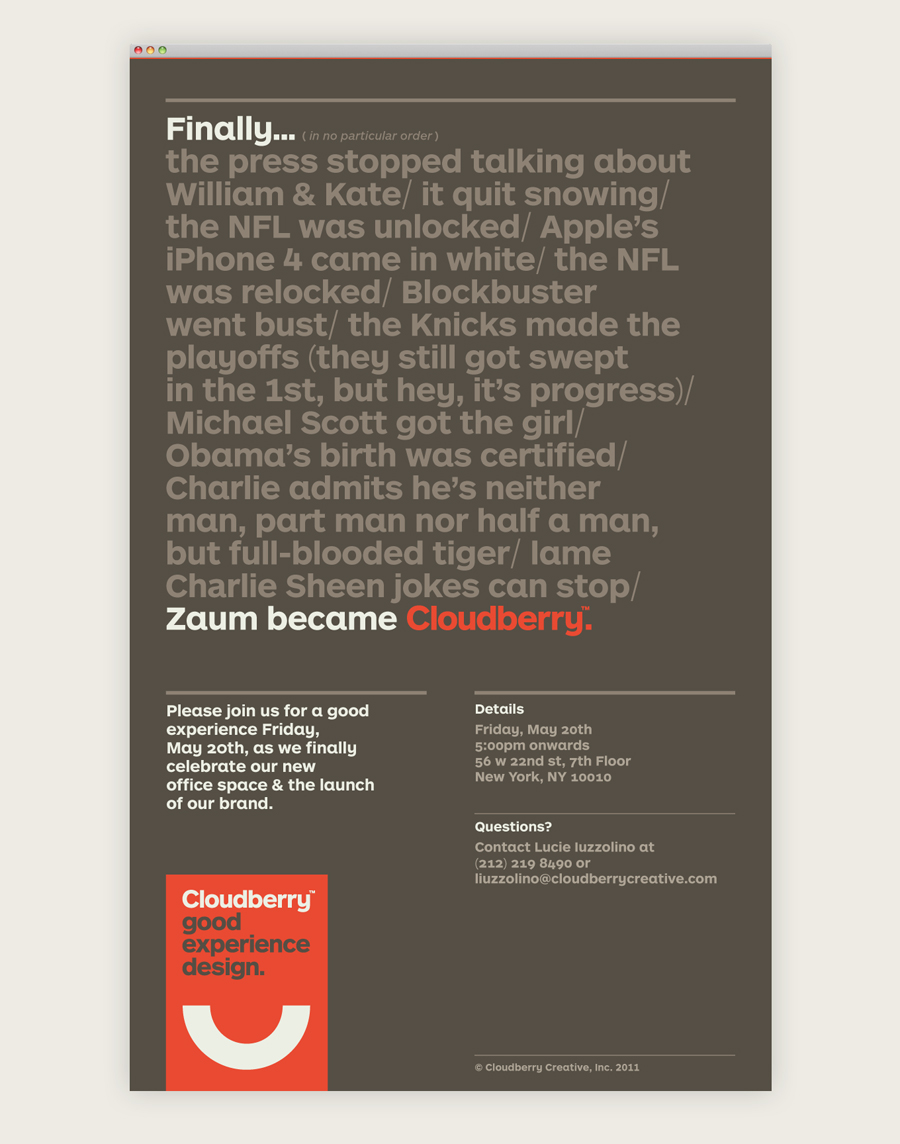
Cloudberry is a New York-based interactive design firm that specialises in simple and intuitive on-line experiences for both the financial and healthcare sectors. Brand design agency Perky Bros – commissioned to develop Cloudberry’s visual identity and website – created an abstract smile like logo-mark to resolve and express the simplicity of ideas, the positive impact these have on Cloudberry’s clients and its clients’ customers and a friendly, accessible approach.
“Our challenge was to communicate the idea of “delivering a good experience.” The solution was delivered complete with a rotatable monogram that suggests a little more about its character.” – Perky Bros

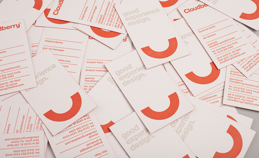
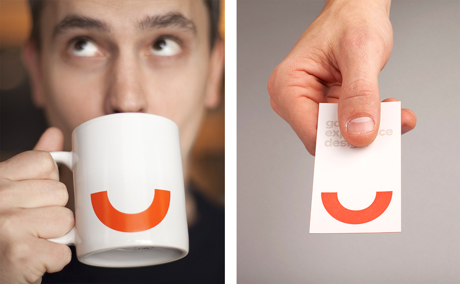
This identity’s minimal but distinctive anthropomorphic form is striking in its immediacy, effortlessly conveying a sense of positivity and personality that functions well to build on the healthcare specialisation of the company. Its dual role as both a smile and a ‘C’ is a really neat idea while the bold red, executed throughout the stationary as a vivid single colour treatment, delivers a warm and modern sensibility that suitably represents simple but creative thought. The logo-type, set in ARS Maquette Pro, is perfectly spaced, the symmetry of the db in the centre is a lucky detail that gives it an intrinsic balance and could be considered representative of the two equal elements described on Cloudberry’s website as Cloud = The Thinking and Berry = The Results.
There will inevitably be some comparison to the on-line bank Smile which uses a similar device but I believe that there is a conceptual weight to this identity that manages to convey an accessible attitude – amplified by employee illustrations – given a very contemporary execution.
Design: Perky Bros Opinion: Richard Baird Fonts Used: ARS Maquette
