Di Alpino by Art Lebedev
Opinion by Richard Baird Posted 8 September 2011
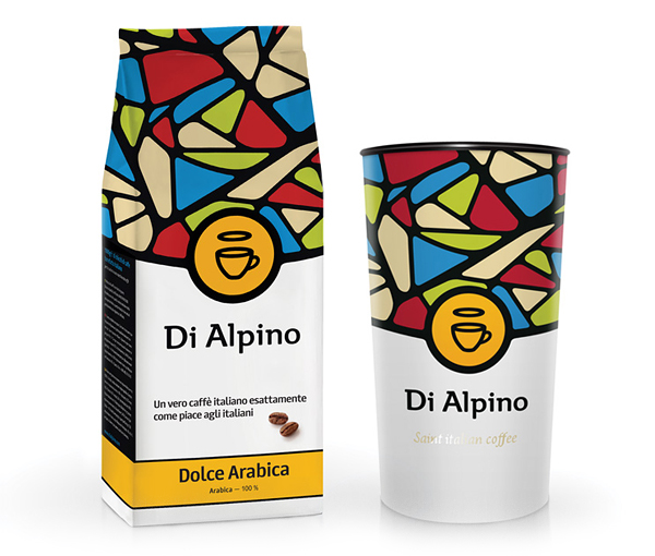
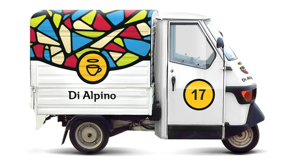
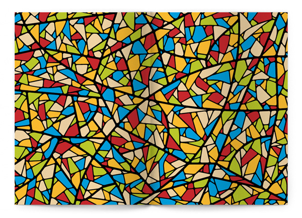
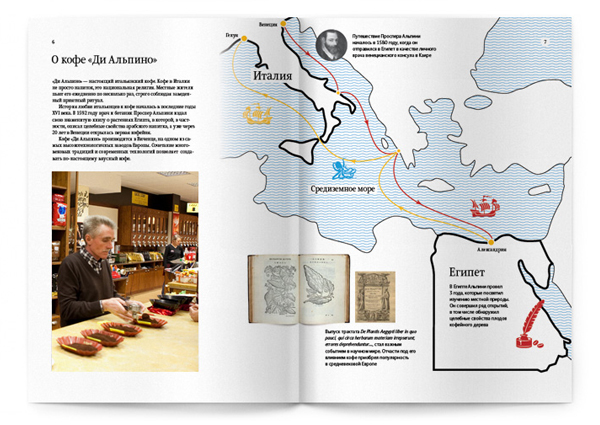
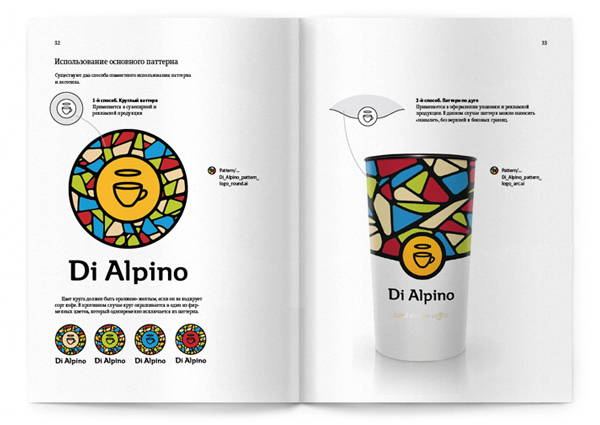
Di Alpino is a mobile coffee brand servicing the Odessa region of Ukraine. Designed by Moscow based studio Art Lebedev, the brand’s new identity and packaging utilise a brightly coloured stained glass visual aesthetic to symbolise the Renaissance and the elevated position of coffee in Italian culture.
I love the bold simplicity of this project and how it manages to avoid most of the clichés associated with coffee packaging to deliver a warm yet cosmopolitan style through a smart blend of heavy outline work and a bright colour palette set against black and white backgrounds.
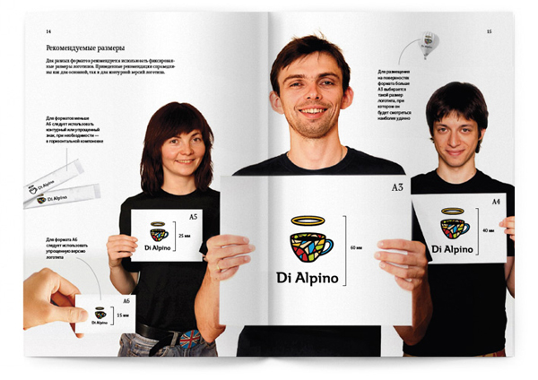
The coffee cup logo is nicely weighted and feels iconic in its ideation, execution and central placement on the packaging, the stained glass version is slightly cluttered but helps to communicate the concept when isolated.
The type is simple with neat semi-serif flourishes and rounded terminals that compliment both the mark and the illustration. It is nice to see that while stained glass was a reference point the result is not overtly religious and manages to resolve the unusual balance of quirkiness and understated sophistication.
