Zerogon by Nicholas Hawker
Opinion by Richard Baird Posted 14 September 2011

Zerogon, (a mathematical term to describe a circle visualized as a polygon that has no edges or vertices) is an Australian software engineering firm that focuses on developing practical solutions for businesses. Their new identity and stationary, designed by Melbourne based graphic designer Nicholas Hawker, is a visual abstraction of the Zerogon concept that appears to balance both a mathematical and mechanical visual style.
There is something really interesting and unusual about this project but I am struggling to grasp the overall concept of the logo-mark even after a fair amount of research into the theme. Regardless of this complexity it does roughly express the idea of – understanding through the systematic deconstruction of the whole and the theoretical, transient nature of the software industry through its exploded visualisation of a zero albeit it in a very (very) abstract way.
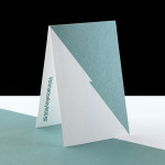
The typography and layout of the printed collaterals are solid and manage to have a 1930’s teleprinter aesthetic that appears quite contemporary when combined with the minimal and expanding circular forms of the logo-mark.