Heineken by VBAT
Opinion by Richard Baird Posted 19 September 2011

Heineken is a Dutch beer brand owned and distributed by Heineken International. Today they launched a new corporate identity designed by Amsterdam based VBAT that will be implemented across their website, internal documents and printed collaterals while the popular beer branding will remain the same.
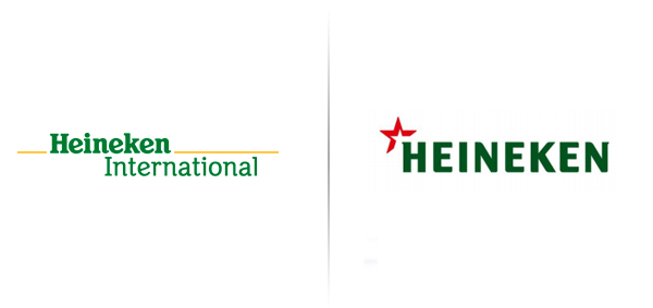
“At the heart of the new company identity is a re-designed HEINEKEN name, appearing in capital letters, complemented by a red spark to represent the spirit and energy of the company’s more than 70,000 employees worldwide. The logo will appear on all corporate publications, printed materials, the corporate website (www.theHEINEKENcompany.com) and will be used in some capacity by the majority of its operating companies worldwide.” – Heineken
This seems to be a distancing exercise between corporate activities and the core product, freeing it up to pursue other avenues and sponsorships without being too synonymous with the product and the advertising limitations alcohol has in some countries.
The new logo-type, set in upper-case and with a darker green tone, succeeds in edging it towards a more corporate sensibility while drawing on the heritage associated with their original identity created in 1864. The individual letters forms are significantly more modern in their taller resolution with subtle characteristics that avoid the logo-type becoming too generic. The small serifs on the H and N give a bit of movement but the ample spacing renders the overall execution quite static. The iconic red star associated with the beer has been replaced with a spark across the H and suitably represents the dual ideas of energy and spirit but in a fairly straightforward manner (a star within a star) that manages to build on the quality and heritage of its primary product while introducing corporate values.


