Olmeca by Coley Porter Bell
Opinion by Richard Baird Posted 5 October 2011

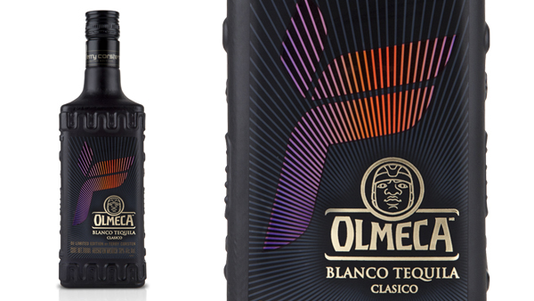
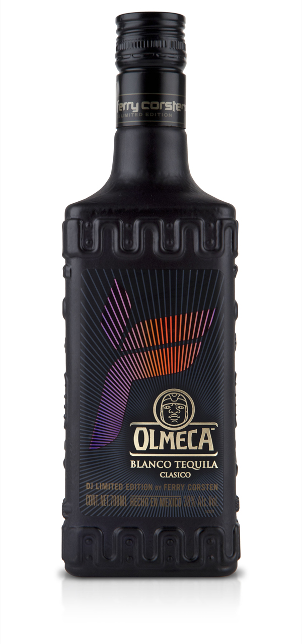
As part of a new ‘Be A DJ’ campaign, Pernod Ricard teamed up with international Dutch DJ and producer Ferry Corsten to release a limited edition bottle for their tequila brand Olmeca. The packaging, designed in collaboration with agency Coley Porter Bell, switches the classic and clear bottle with an all black finish and Ferry’s iconic ‘F’ logo-mark.
“Corsten wanted a cool, contemporary bottle design to communicate his cutting edge electronic dance music. CPB presented different responses to the brief which were then modified with Corsten’s direction.”
“The final design consists of a matt-black bottle with a holographic label that glimmers hypnotically under club lights. It is intended to overcome the merchandising challenge of making a black bottle stand out in a dark night club bar.”
“The label design features both the Olmeca and the Ferry Corsten logos. The radiating lines in the design suggest that the fact clubbers are like a modern day tribe, worshipping the DJ in the same way an ancient tribe worshiped the sun three thousand years ago.” – Coley Porter Bell
The matt finish to this bottle is a marked improvement on a fairly conventional tequila proposition and takes the brand in an interesting direction albeit for a limited period. Its mysterious black rock aesthetic neatly resolves the themes of both Aztec and DJ worship while looking striking and unusual. The Ferry Corsten ‘F’ fits neatly around the gold foil Olmeca logo (defining a clear brand hierarchy in favour of the product) while the red/blue holographic treatment gives the label energy and movement and should look neat under the low lights of a bar or nightclub.


