Ayelet Naturals by Oh Boutique
Opinion by Richard Baird Posted 9 October 2011
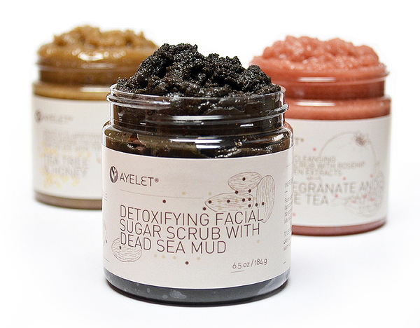
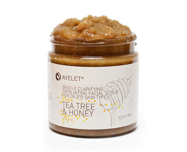
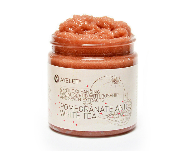
Ayelet Naturals is an organic, aromatherapy and skincare business predominantly retailing products on-line from New York. As part of a rebrand, Buenos Aires based collective, Oh Boutique designed a series of new labels that draw together the natural and effective nature of the ingredients with loose illustrations, structured details and a modern type choice.
“We tried to develop a label system that looks fresh, natural and beautiful to costumers’ eyes. In this way, we used clear hues and created linear hand-made illustrations showing the main ingredients of each product. We also included little geometric shapes with powerful colors used as accent in the general color scheme. The result is an attractive label system easy and cheap to print and stick on standard glass jars.” – Oh Boutique
This project is an interesting visual union of the clinical and the organic, appropriately characterised by the tone of the typography, in its simple, clean and refined letter-forms and the hand drawn execution and fine line weight of the illustrations. The idea of ‘scientific’ effectiveness is reinforced by geometrically structured, brightly coloured details and a primarily white colour palette that provides a neat contrast against the deep and rich tones of the product. A slight variation in line weight between the typography and illustration work have been effectively utilised to establish a pack hierarchy while adding a slight depth to the labels.
