Yoma Architects by Kobi Benezri
Opinion by Richard Baird Posted 17 October 2011

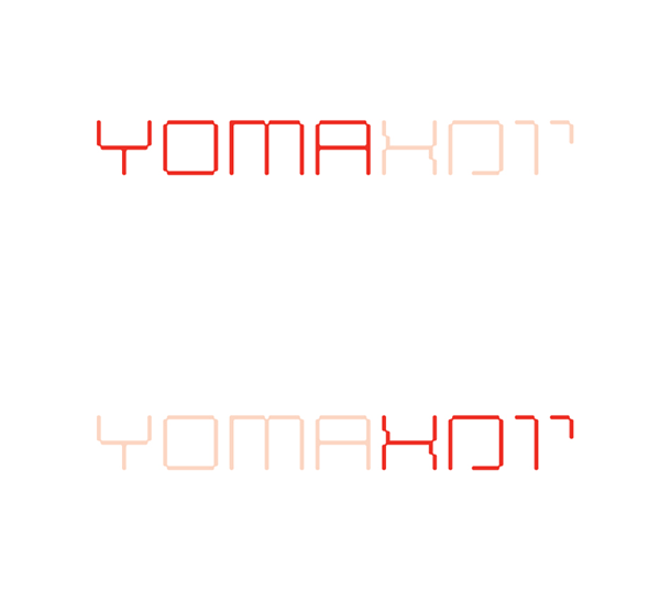
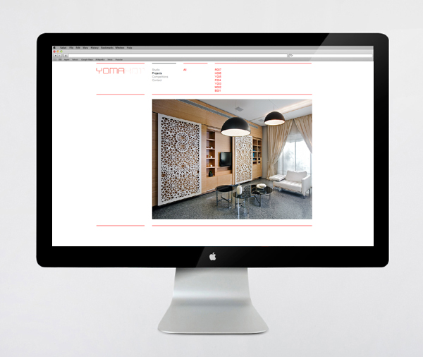
Yoma is an architectural studio based in Jerusalem and founded by Michal and Netanel Mayer. Their new identity, designed by Kobi Benezri (born in Jerusalem now working from Zurich, Switzerland) is an interesting dual language bespoke logo-type solution that not only characterises their regional and international clientèle but also their interior and exterior expertise.
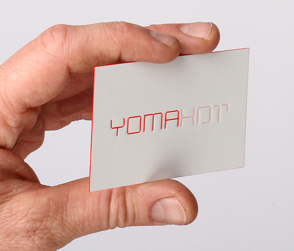
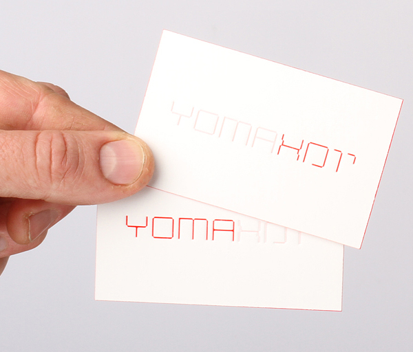
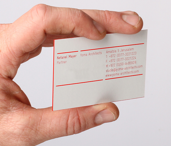
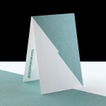
“The bilingual identity, in Hebrew and English, echos the architectural typology of a line, and line thickness. The logo is a monostroke custom typeface appears on all stationary items at 0.5mm thickness. The letter-pressed business cards are printed on a 0.5mm thick stock, with red gilded edges that three-dimensionally reflect the two-dimensional logo’s line thickness.” – Kobi Benezri
This is the first time I have come across a logo-type constructed from two languages, a technique that I think works really well to establish an international aesthetic. The on/off visual device successfully draws focus to the appropriate portion of the type while also emphasising the interplay of light and shadow (an effect that influences our perception of form within our environment). The geometric execution of the letter-forms have a structural aesthetic that neatly balance positive and negative space (visualising the internal and external architectural principles) while the broken characteristics of the Hebrew component add a top down plan like sensibility. The line weight of the identity, set at 0.5mm is carried through to the thickness of the business cards, an exceptional detail that allows the combination of logo and stationary to resolve the aspects of two dimensional planning and a three-dimensional build with consistency and quality at the heart of the brand. The relief created by the letterpress gives the logo-type a subtle dimensionality as well as a high quality and a contemporary finish.
