Hidden by Bunch
Opinion by Richard Baird Posted 20 October 2011

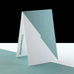
Hidden is a recently refurbished nightclub located in south London. Their new identity, developed by creative design studio Bunch is a simple logo-type ‘hidden’ and revealed by an expanding and contracting visual device.
“We created a logo where ‘Hidden’ is contained in the two vertical lines, which convey both ‘H’ of Hidden and resemble a pause button to hold direct reference to music.” “The logotype, strong in simplicity and bold in design, represents a fine, premier contender in club-world.” – Bunch
I really like the simplicity and very urban nature of the logo-type and while the animated concept is not unique (see Prima Cool) it confidently takes the name and draws a very neat idea from it. I will be interested to see how this is translated across printed collaterals but I can imagine that there are a multitude of possible print techniques and visual tricks that can reinforce and expand on such an identity.