Tjuvholmen Sjømagasin by Work In Progress
Opinion by Richard Baird Posted 11 November 2011
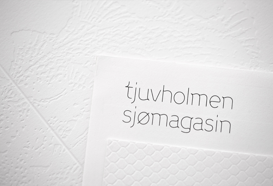
Tjuvholmen Sjømagasin is a Norwegian grilled seafood restaurant owned by the Fursetgruppen group and located waterside in an area under redevelopment just outside the Aker Brygge region of Oslo. The restaurant’s identity, designed by Work In Progress, reflects the architectural theme ‘a play with water’, the high quality and delicate flavours of the food with fines lines, an undulating custom logo-type and symbol.
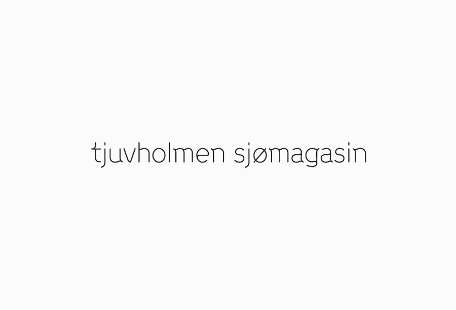
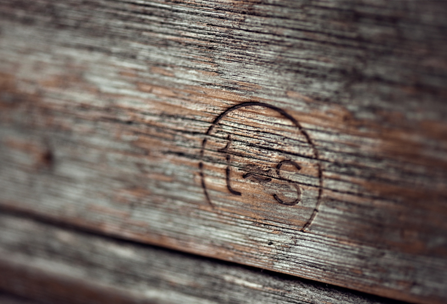
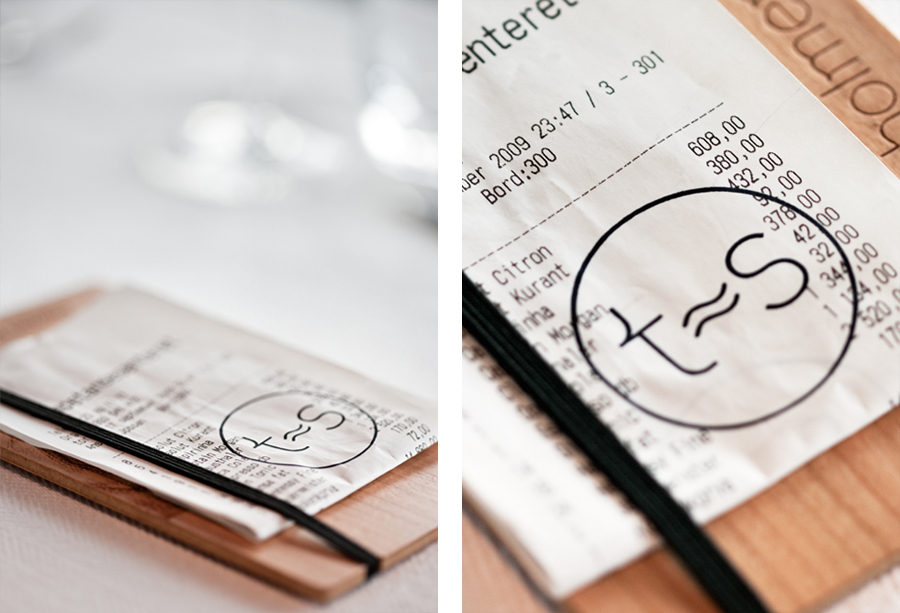
“The symbol [below] is a play on the mathematical symbol ‘approximately equal to’. The restaurant is claiming the area by saying that Sjømagasinet, ‘S’, is approximately equal to Tjuvholmen, ‘T’.” – Work In Progress
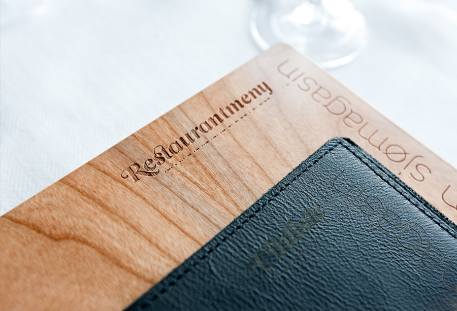
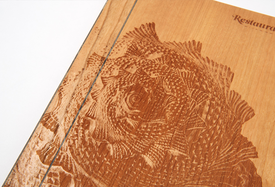
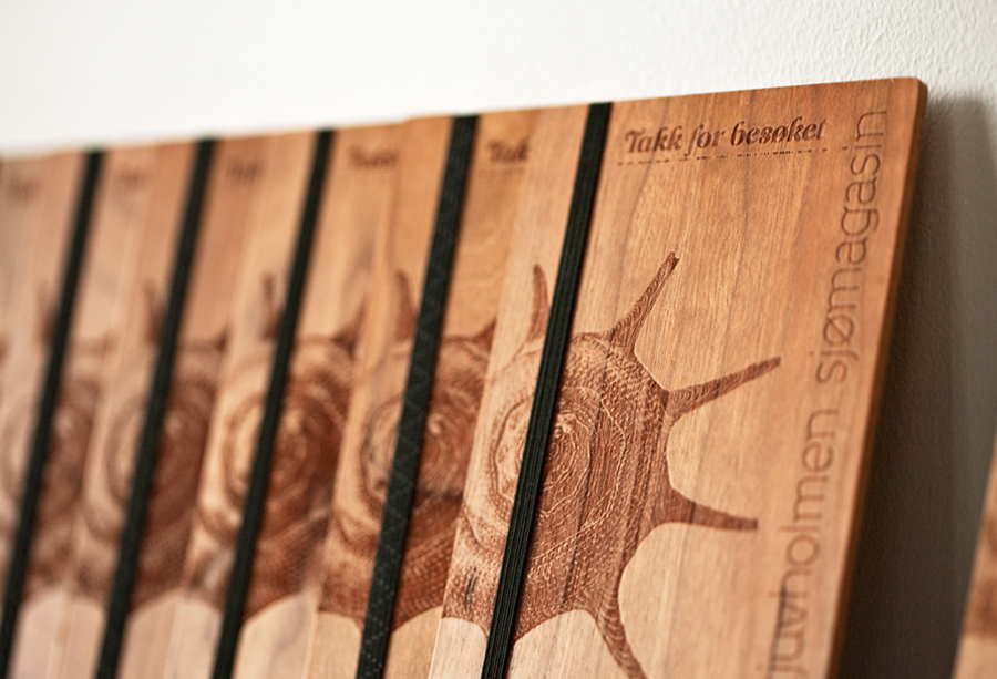
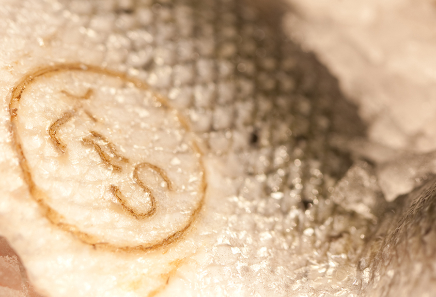
The logotype is really well constructed with an underlying seafaring quality in the waves of some of the characters that is subtle yet distinctive. This is reduced down to a monogram with an interesting rationale that delivers an additional depth to the identity whilst also functioning as a traditional mark of quality. Each application of the symbol adds a tactile and communicative dimensionality with the seared wood treatment being the highlight, neatly resolving the grilled aspects of the menu.
Both the logotype and monogram are bound by a consistent single line weight, minimal and contemporary execution with a delicate ‘line caught’ sensibility that compliments the net patterns on the print work and the worn boat wood of the interior, delivering a environmentally conscious, earthy and tactile undertone that blends harmoniously with the interior space. The abundance of negative space allows the natural and uncoated architectural materials, surfaces and colour palettes implemented throughout the restaurant to communicate the quality of ingredients, their simplicity and honest presentation.
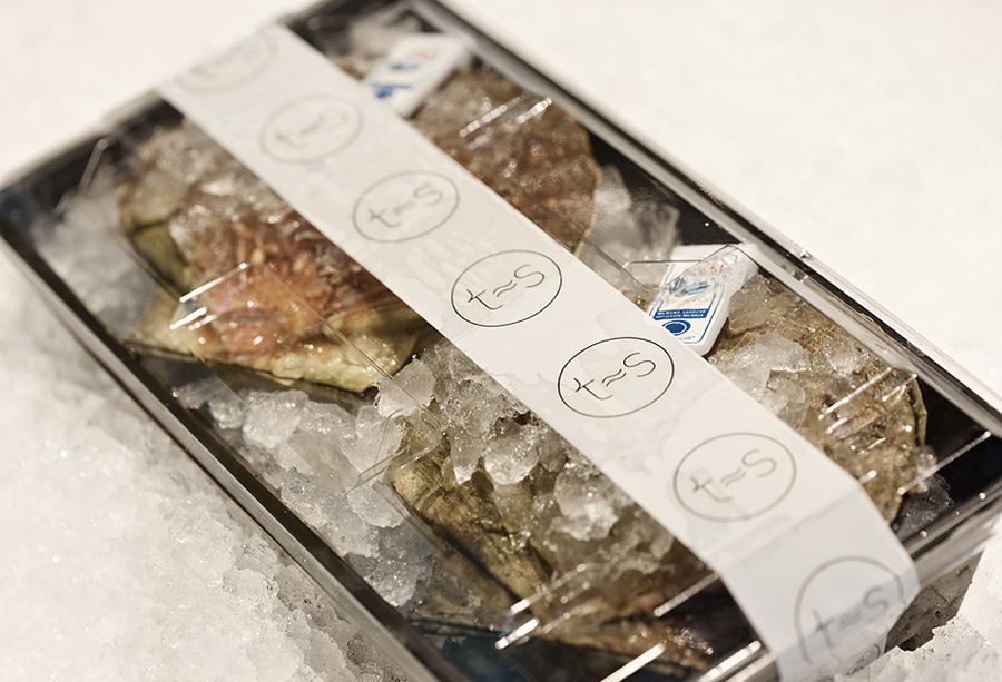
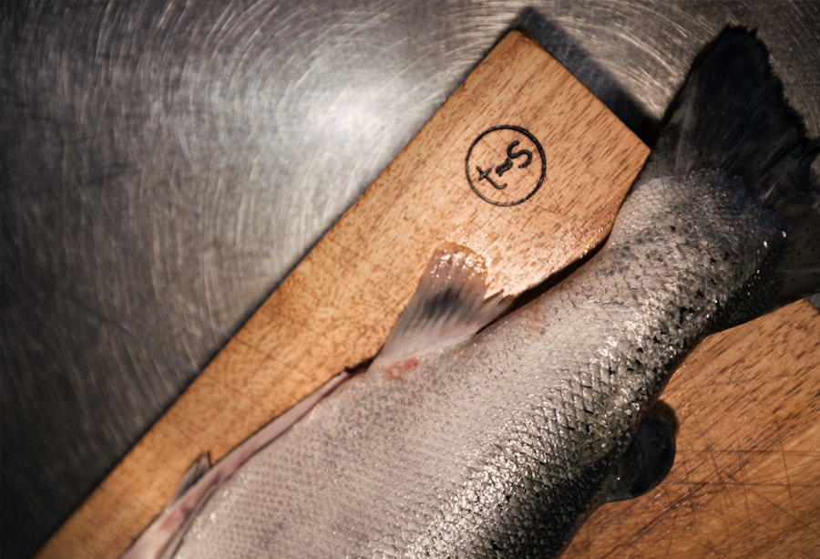
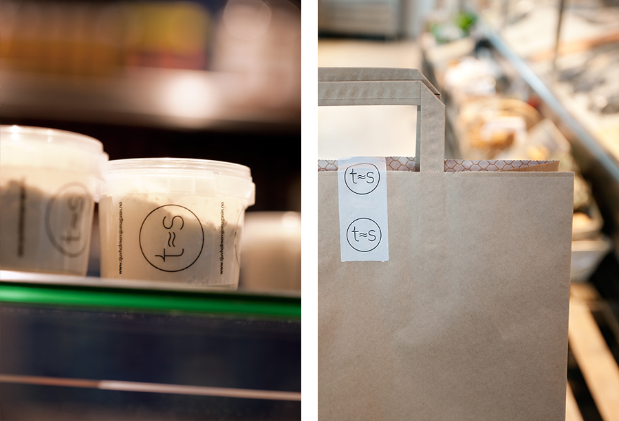
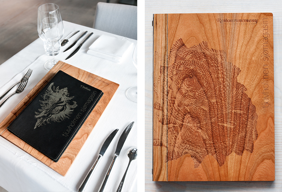
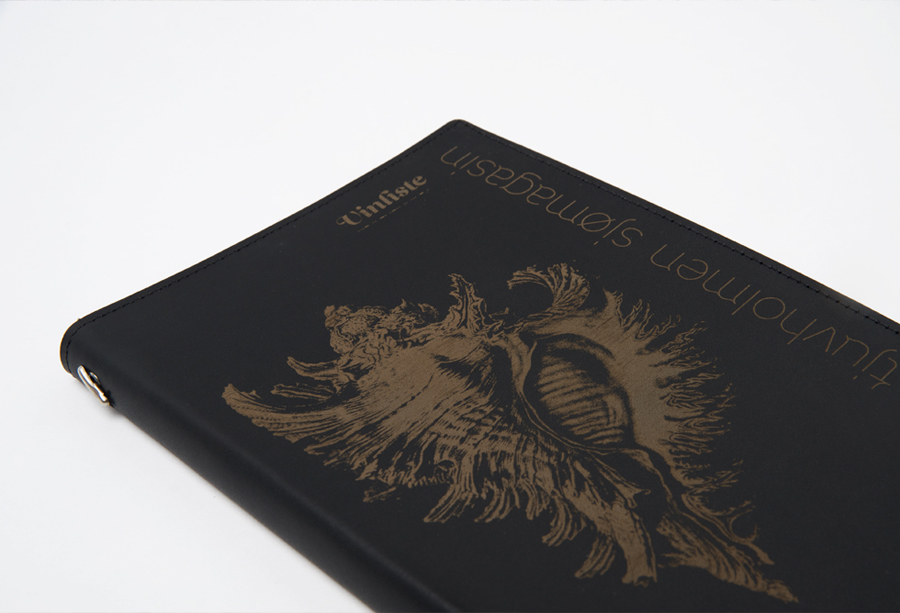
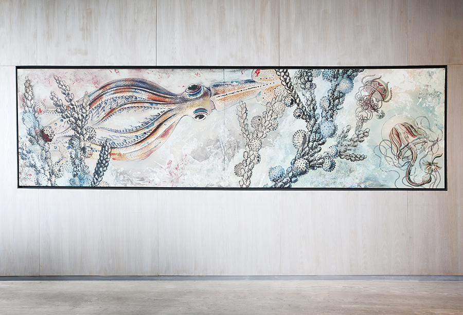
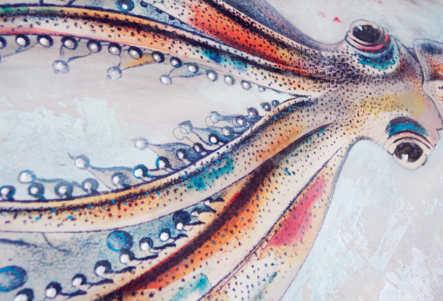
These fine details are juxtaposed alongside the heavy script flourishes of the accompanying italic typeface that adds a personal character to the dinning experience appearing across menus and signage. Detailed hand drawn illustrations, created by artist Jan T. Rafdal, adorn the walls of the restaurant and inject a sense of energy and life with a Jules Verne twist that work well in conjunction with the more accurate scientific etchings across the menus and wooden boards.
This is a complex piece of identity work that intelligently balances multiple values across various touch points that appropriately utilises typography, architecture and art to deliver a complete and consistent brand experience.
