m5architects by Werklig
Opinion by Richard Baird Posted 15 November 2011
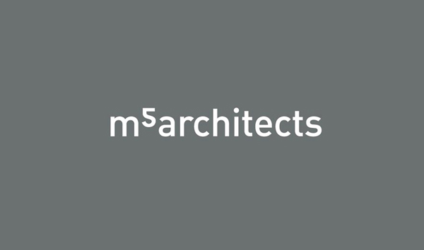
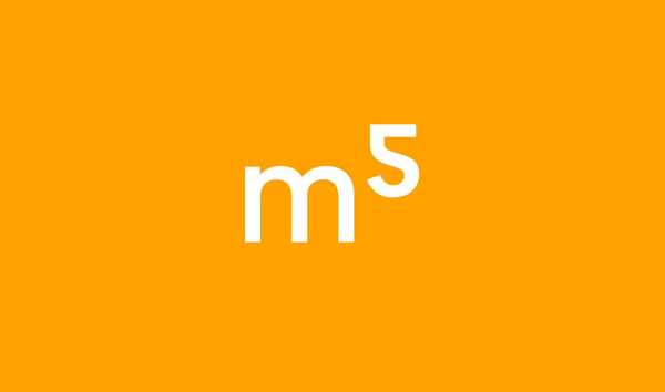
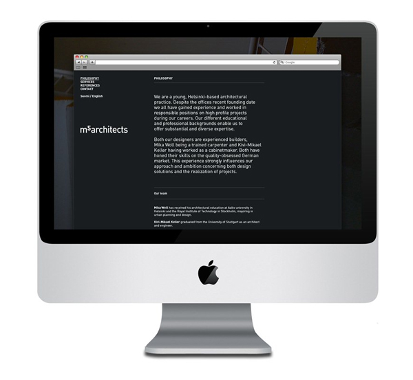
M5 is a Helsinki based architectural, urban planning and furniture design studio. Their new brand identity, designed by visual communications agency Werklig, captures a multi-dimensional and multi-disciplined approach with a simple logotype solution and flipped typographical device.
“m5 architects are specialised in so-called five-dimensional planning, which means integrating traditional architectural 3D modelling with two other layers of variables (such as construction time and building costs). m5 architects asked Werklig to create an identity based on 5D concept. The identity needed to be extremely simple, usable and timeless – with the “5D” element visible.”
“m5 logo is the key building block of m5 identity, the primary visual element that identifies the company. The logo is simple, but it has a subtle hidden message in it: a common square meter symbol (m2) has been flipped, thus creating a symbol for the five-dimensional approach of m5 architects.”
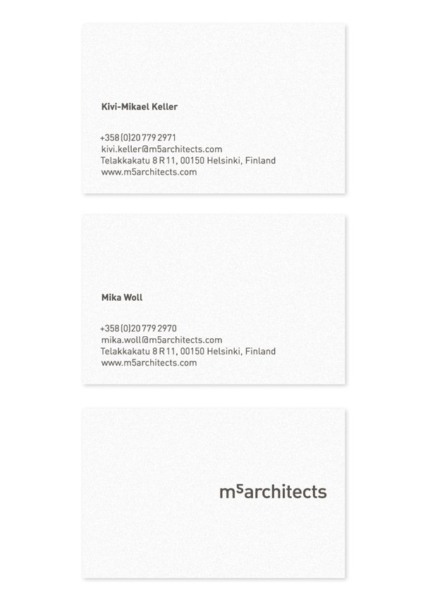
“The final touch to the overall feel was made with typographical choices. m5 uses FF DIN as a corporate typeface. FF DIN is a robust and very legible typeface, with a technical/architectural twist. Using DIN is also a small cultural hint towards Germany–both M5 main designers have solid German roots, so what would be more suitable typeface for them? ” – Werklig
The flipped and rotated 2 to form a 5 is a very smart observation that neatly ties the brand to its spacial discipline in a clean and understated way giving the simple construction of the logo-type a very own-able and distinctive characteristic. This device also characterises a strength of ideas, physical structure and calculation through its mathematical sensibility and the ability to view a project from alternative and unusual perspectives. The typeface, DIN, has a solid rationale and relevance to the firm, the irregular 2 fits neatly within this selection and is well executed across the stationary retaining a very clear and structural tone with plenty of space. A limited and flat three tone urban and industrial colour palette works well to compliment the simple concept that blends a vivid orange (ideas and creativity) with the utility of concrete grey.
Design: Werklig
Opinion: Richard Baird
Fonts Used: DIN
