The Tailoring Club by Saturday
Opinion by Richard Baird Posted 21 November 2011

The Tailoring Club is a new American styled clothing brand that will be sold through Brothers stores across Finland and Sweden. The Tailoring Club commissioned London-based creative agency Saturday to develop a new brand identity—which included a new logo, logotype and print—that would characterise both their traditional, handcrafted approach and individual character.
“It’s all about knowing the codes and rules of formal traditions – and then being courageous enough to break them, either with subtlety or with bold, sweeping moves. The rule is that there are no rules. Wear a suit creased or immaculately pressed. Match the suit with a denim shirt or your favorite t-shirt, and of course with a nice shirt. Adjust the pant leg with a straight turn-up. Mix an odd jacket with a scarf around your neck – or a skinny tie, but keep the top button undone and have the tie knot hanging loose.” – The Tailor Club
I generally avoid posting fashion based identities as they often have a clinical and very straightforward idea of how premium design should be presented and while these often do have a classic sensibility they convey little more than a ‘name’. What drew me to this identity was the very delicate twist on what is generally expected from this industry.

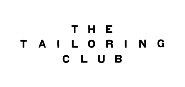
Based around a sans-serif logo-type the identity appears as a typical fashion brand but with some very delicate modifications that give it a subtle personality and a sense of craft. What might be perceived as imperfections, most notable in the tilted N and vertical stems of the characters, for me, appear as a really clever resolution of individuality and custom fashion. Each of these have been well executed and spaced especially for such a long name with the structure of the central characters being a particular highlight.

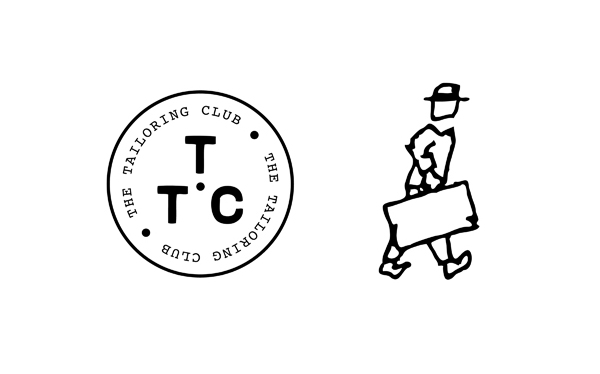
The roundel carries through the same traits established by the logo-type and is accompanied by a slab serif type selection that has a classic 60’s editorial, man-about-town quality. This concept is reinforced with a loose napkin sketch that has a distinctive sense of spontaneous creativity and character while complimenting the line style of the logo-type.
To describe any of this project as imperfect is misleading as each asset has been intentionally designed to deliver an interesting resolution of contrasting ideas and appropriately represents classic style but not at the expense individual character.


