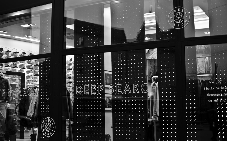
Deep Search by Bielke&Yang
Opinion by Richard Baird Posted 23 November 2011
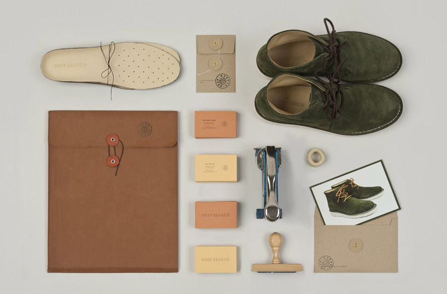
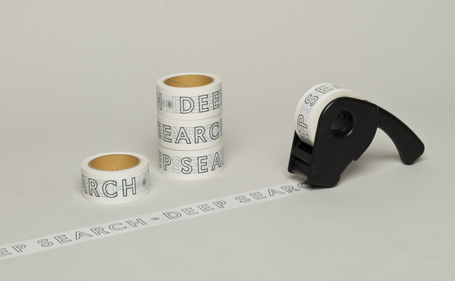
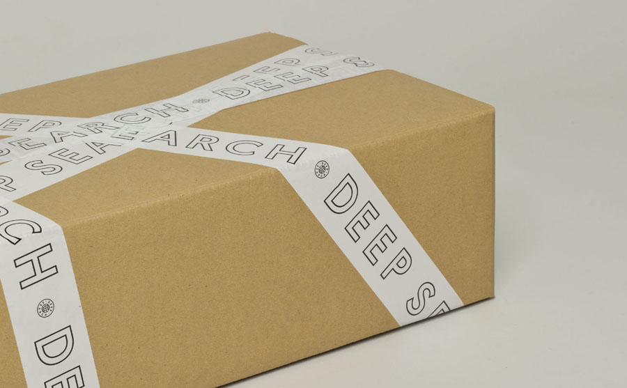
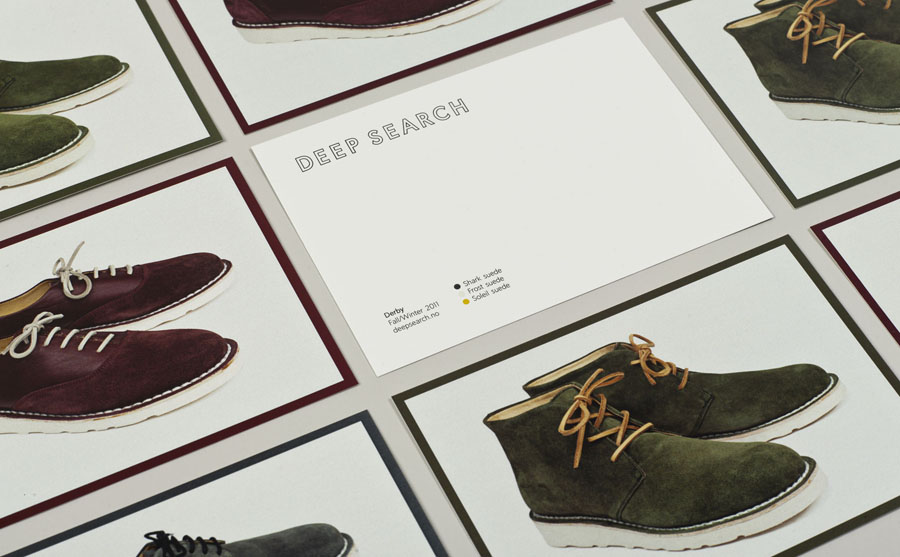
Deep Search is a Norwegian shoe brand that devotes its time to the inquiry of nature, fundamental human activities and their practical impact on the aesthetic of shoes. Deep Search’s brand identity—which includes a logo, logotype, stationery and packaging solution created by Bielke&Yang—is a neat fine lined and geometric logo-type that sits over the tactile quality of the material choices to resolve the functionality of foot wear alongside their visible, honest construction and high quality production.
“We wished to translate the essence of the products into a timeless profile, the printed material representing the same qualities as the products; classic cuts, seams and details with focus on quality and effective use of materials.” – Bielke&Yang

This is another great piece from Christian Bielke following BP&O’s review of Raconteur that displays an intelligent and thoughtful understanding of complementary identity work that allows each graphic component to resonate with the product and the brand’s philosophies.
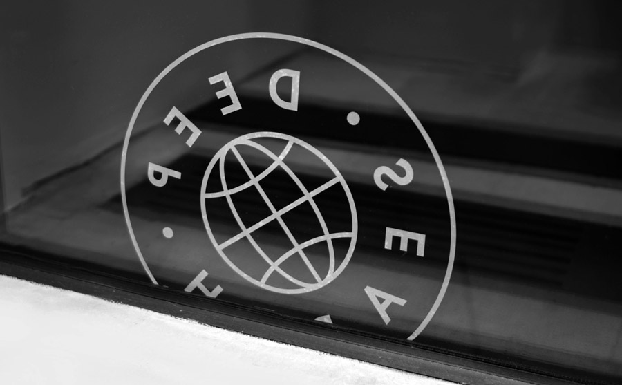
The light line weight of both the logo-type and stamp, which also serves as a mark of quality and reinforces the idea of exploration in its representation of a globe, work well to act as a window through to some well selected, uncoated, unbleached substrates that emphasise the natural tones and tactile quality of the shoes. The material choices, implemented across the stationary, packaging and business cards, reflect a truth to material and an honest approach to quality and craftsmanship that underpin the brand and its values.
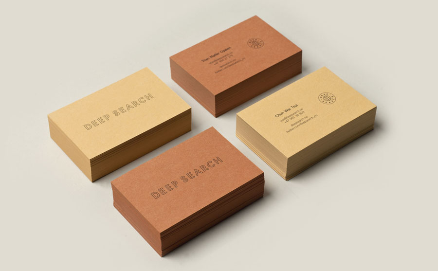
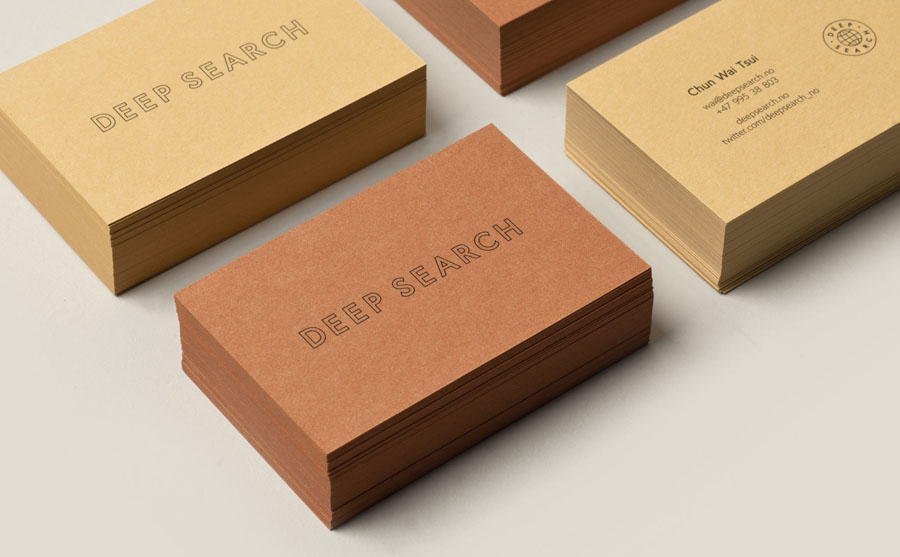
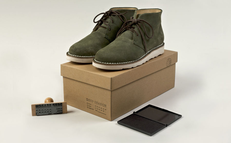
There is a strong sense of utilitarianism in the elemental functionality of each asset, the geometric construction of the letter-forms as well as the ink-stamp and tape execution that, together, manage to communicate both high quality and functionality.

