CAPI by CIP
Opinion by Richard Baird Posted 24 January 2012
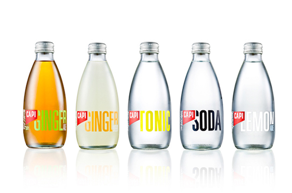
CAPI is an Australian producer of premium carbonated fruit juices, mixers and mineral waters. Recently, as part of a complete rebrand, Melbourne based design studio Can I Play developed a new visual identity, packaging system and website solution that utilise a clean and contemporary typographic approach to characterise the natural origins and bold flavours of the range.
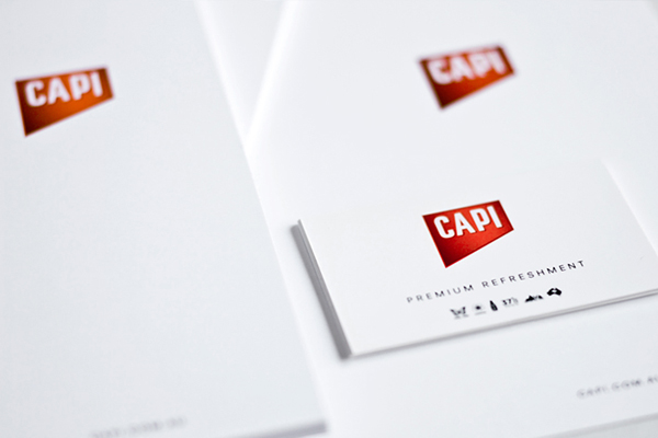
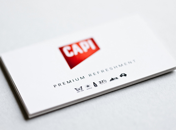
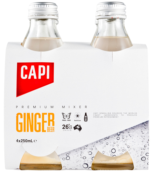
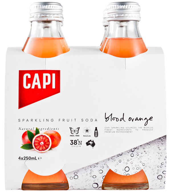
The CAPI logo-type is fairly straightforward in its execution with a clean and well constructed set of uppercase letter-forms contained within a red chamfered box that delivers a fairly conventional premium aesthetic while forming a smart and contrasting visual anchor across a more expressive and contemporary packaging solution. The stationary is very well handled with spacious layouts that maximise the impact of the logo-mark and introduce a lovely set of icons that communicate the brand’s key values and propositions.
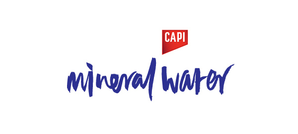
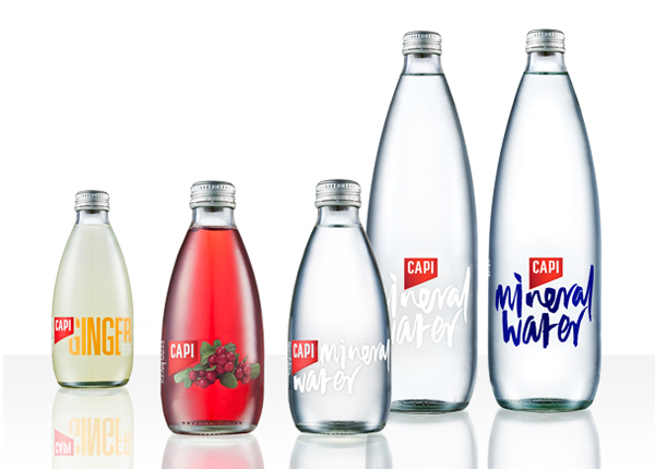
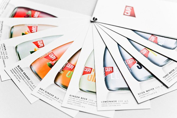
The packaging really stands out as bold and iconic with a confident and distinctive typographic simplicity. The script utilised across the mineral water is a personal favourite that delivers a great sense of movement, liveliness and youthful spirit that contrasts well with the sharp consistency of the CAPI logo-mark adding a greater level of depth to the brand. The mixer’s taller and geometric typography in comparison is confidant and sophisticated in its expression application drawing on the sensibilities associated with premium alcohol brands such as Absolut to communicate its position. The raised final letters of the words Lemon and Ginger introduce a slightly more traditional undertone that in isolation is neat but appears as too much of a deviation when presented as part of a broader range. The height of both the script and of the sans-serif neatly compliments the structure of the bottles while the use of a clear label gives it a remarkably clean and natural aesthetic that characterises the purity of product and the honesty of the brand. The colour palette across the range and fruit imagery comes across as both fresh and vibrant neatly avoiding anything too synthetic.
