Catalina Fernández by Anagrama
Opinion by Richard Baird Posted 25 January 2012
Catalina Fernandez is a San Pedro (MX) based pastry shop that began life in 1988 as a home bakery. Following continued growth, new customers and the opening of more premises, Catalina Fernandez approached independent design agency Anagrama to develop a more eloquent and sophisticated brand proposition.
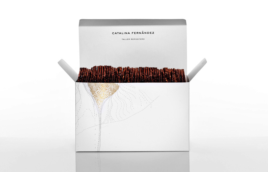
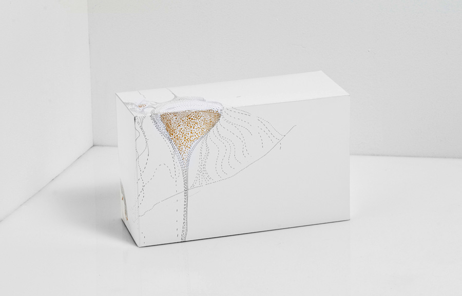
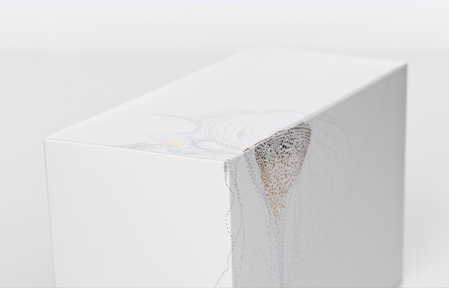
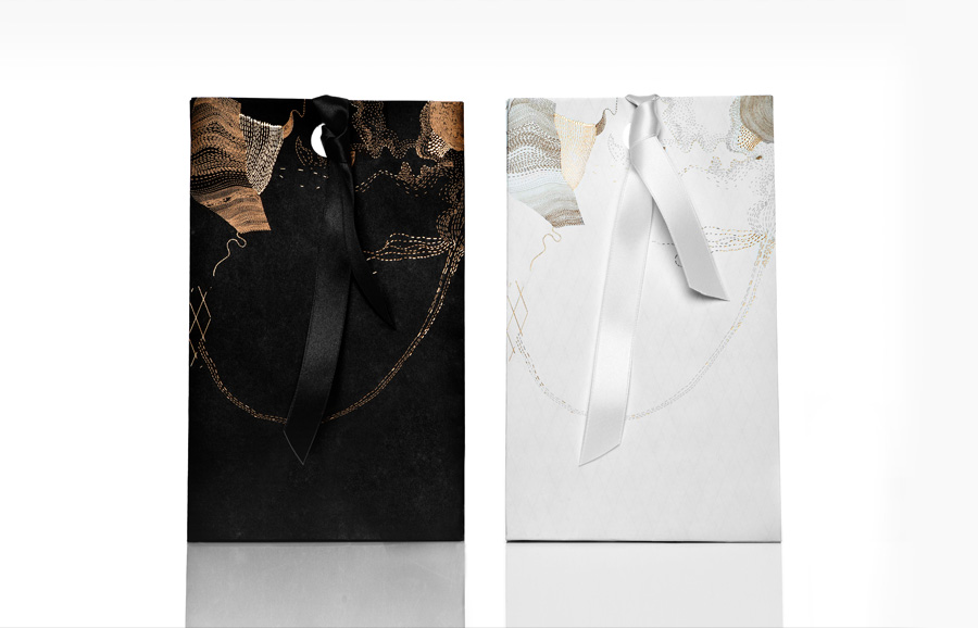
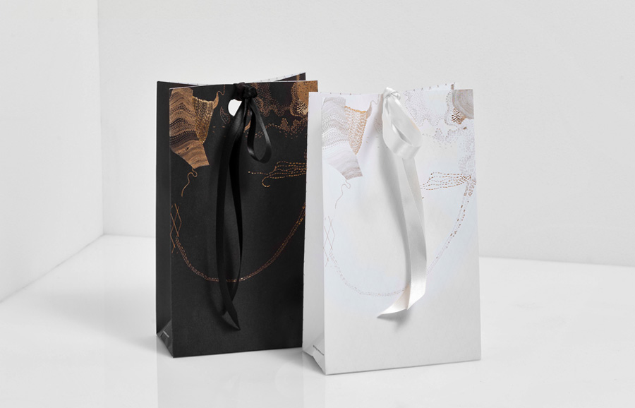
“When the client approached us, she told us her desire of upgrading the brand to a much more sophisticated style. Based on these requirement we developed a very elegant identity, with a sans serif typeface to keep the brand neutral and give it a chance to evolve in the long run, with new designs for their packaging and other printed pieces. The various boxes and bags were decorated with details in golden foil that, not unlike Catalina’s pastries were, took many hours of attention to detail.” – Anagrama
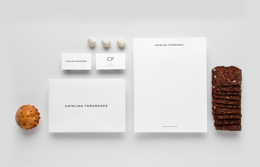
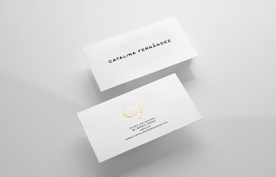
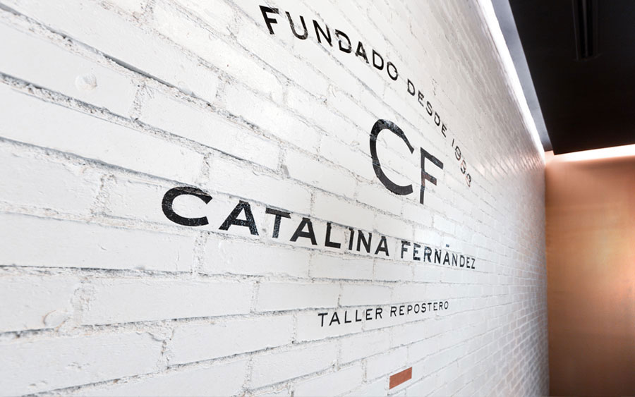
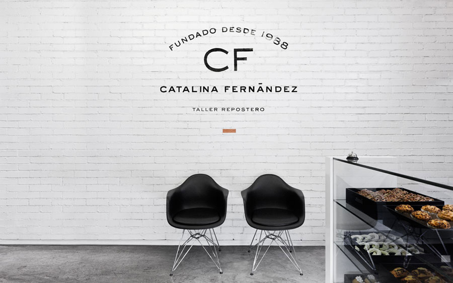
The multi-lined lock-up, curved and mixed weight typography, and ‘established in’ visual device, reminiscent of early hand cut decals applied to shop fronts, manage to intelligently deliver the classic sensibilities of a traditional local bakery shop but with a confident and contemporary sans-serif execution. Its interior application, in contrast, based around a predominantly black, white and copper palette appears more like a boutique perfumery and could, to its detriment be perceived as slightly inaccessible to a passing shopper but certainly fits the sophisticated and elegant brief.The components of the primary identity have been isolated and individually applied across the stationary making the most of the width and spacing of the Catalina Fernandez logo-type and delivering qualities you might expect to find from a high-end fashion label while the CF detail, set in gold foil, delivers a sense of luxury and opulence. The illustrative detail applied across the packaging looks beautiful and neatly mirrors the organic internal texture of baked products while its fine and delicate quality emphasises the brand’s sense of care and craft.
