The Blind Club by Catalogue
Opinion by Richard Baird Posted 3 February 2012

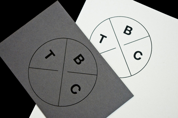
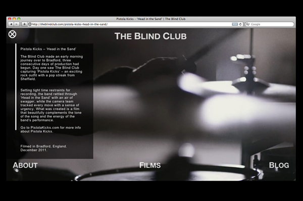
The Blind Club is a cinematic production company established in 2010 by James Rhodes and Matt Maude that delivers high quality audio experiences to the music industry. Their identity, designed by Leeds based studio Catalogue, delivers an interesting combination of fine line weights and bold typography to characterise an attention to detail, authenticity and a rich volume of sound.
“The ethos has always remained; capture musicians in the purest way possible, presenting and championing good music and the talented people responsible for it.” “The Blind Club regards quality audio recordings as the most valuable element of a project. The Blind Club works with a range of professional sound recordists and record producers, by whom special attention is given to capturing the live audio of each and every performance.” “Thought and care are put into every project The Blind Club take on. Quality is in the details as they say, and every detail is expertly considered and executed. As a result The Blind Club produces work that glows with an aura of quality, style and authenticity.” – The Blind Club
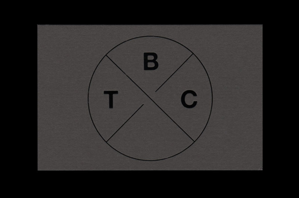
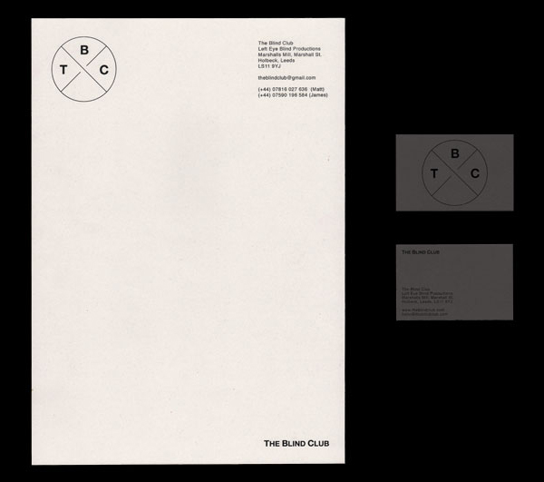
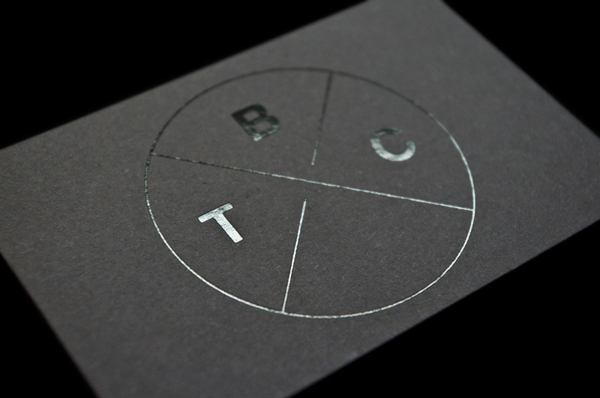
This is a remarkably minimal identity but executed with confidence and an appropriate level of restraint. The fine lines have a technical and detailed quality with a film reel or magnetic tape-like sensibility while the bold geometric typography rendered with rounded terminals deliver a confident volume and interesting contrast. The empty lower quarter could be perceived as a little unresolved but really helps to reinforce the purity and modernistic qualities of the brand, avoiding any unnecessary components and with a slightly curious left-field approach reflective of the indie music scene. The black and white colour palette feels like a smart nod to classic films and the cinematic experience as well as having an elemental simplicity that mirrors the construction of the identity neatly resolving The Blind Club’s niche proposition.
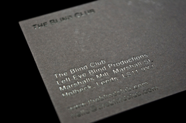
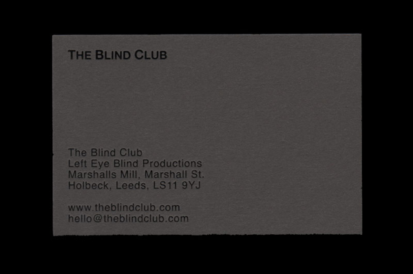
Characterising music through conventional visual cues can often lead to a contrived visual solution so the themes of light and images (delivered through a reflective black block foil across the uncoated collaterals), a technical approach (through the intersecting fine lines) and rich sound (bold letterforms) is a refreshing and original direction.
