Lucy’s Fried Chicken by Pentagram
Opinion by Richard Baird Posted 9 February 2012
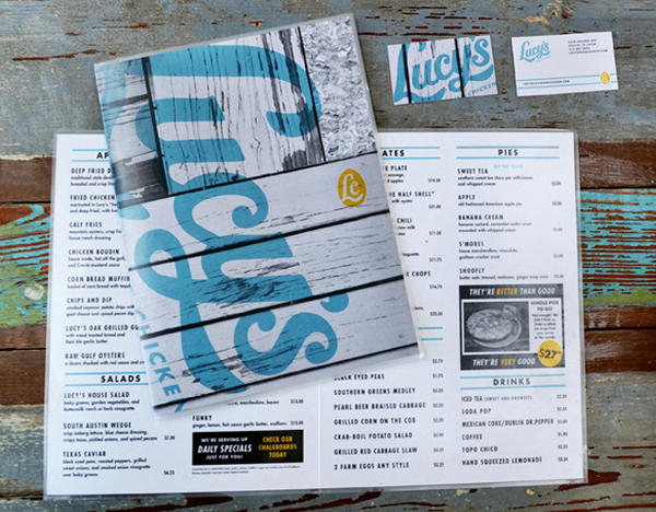
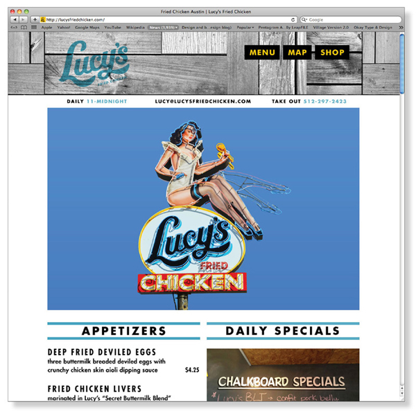
Lucy’s is an Austin (TX) based fried chicken and oyster bar/restaurant owned by James and Cristina Holmes situated on South Congress Avenue. Named after the owners’ grandmother and daughter, Lucy’s is the second of two restaurants following the earlier success of their more upscale restaurant, Olivia. Lucy’s identity, created by international design agency Pentagram, revolves around a simple, retro script logo-type, egg monogram and illustrated character executed as a neon sign.
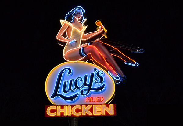
“Fry drew a retro script logo and created a down-home look for the menus and other collateral that uses patterns from old plywood and particle board—materials used to build backyard chicken coops—that echo the unique façade of the restaurant. The building, designed by Austin architect Michael Hsu, repurposes old wooden shipping palettes to give the restaurant a distinctive look from the street. Stout and Fry, working with Austin’s neon sign guru, Evan Voyles, also designed a large sign for the front of the building. The neon sign features a sassy 1940’s era bombshell dressed in a skimpy waitress outfit, with a fried chicken leg in one hand and kicking up one of her own shapely legs through the magic of old-school neon animation.” – Pentagram
I tend to associate Pentagram with larger branding exercises so it is nice to see a more conventional, accessible and down-to-earth piece coming out of their offices. The retro trend popular amongst today’s designers feels like the perfect fit for this establishment suitably blending a sense of classic Americana, food, family heritage and tradition.
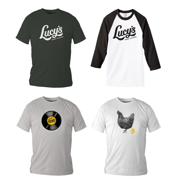
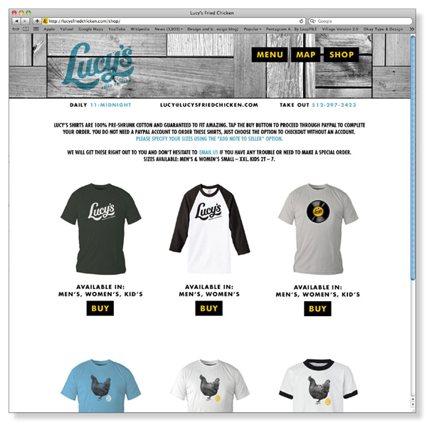
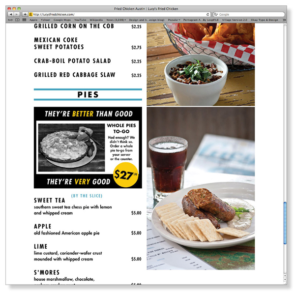
The logo-type is very well executed with a playful script construction and forward momentum that utilises the tails of the L and Y to deliver a finger-licking sensibility and while the bi-line does feel a touch isolated it mirrors the loose hand-painted qualities of 50’s signs and advertisements. The LC monogram is a simple and relevant reduction of the primary logo-type that reinforces dining experience and also functions alongside a broader set of brand assets and graphic components as part of the restaurant’s retail activities. The overlay effect of the identity across sun-bleached wood images across the menus and stationary gives the brand a warm familiarity and weathered quality that is well suited to comfort food and appropriately ties it to the environment.
