Isle of Mull Scallops by My Creative
Opinion by Richard Baird Posted 23 February 2012
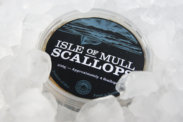
The Isle of Mull is the brand and location of a three boat scallop operation that takes advantage of the mixing waters of the cool Atlantic and the warmth of the Gulf stream, shipping the catch across the UK. The company engaged Glasgow based boutique design agency My Creative to develop a packaging solution that would capture the unique traits of the location, the traditions and authenticity of the brand and quality of the product.
“Mull Scallops wanted to build on their reputation of quality seafood by building a brand that would be recognisable to the public and by suppliers. They needed labeling, packaging and a set of branding tools that would fit their brief of being authentic, honest and of course delicious.
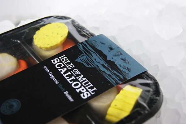
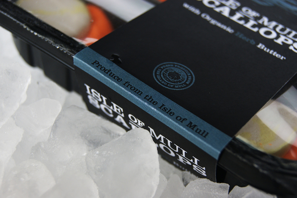
The logotype design makes a bold statement on the packaging with the typography conveying a direct message of what the company produce in a very clear manner. A set of complementary colours were produced for each product – Chili, Organic Butter and Herd. The overall feeling of this brand was to represent a rustic outdoor vibe that carries a Scottish quality.
The composition of the woodcut illustration is of the Isle of Mull in the distance back-lit by the setting sun. The boat pulled up onto the shore at the end of an honest days work, gives a timeless quality and could be any century. Adding a sense of history to the brand.” – My Creative
This packaging project is a great example of the identification and utilisation of consumer-familiar design techniques executed with a simplicity that avoids appearing tired or generic. The clear combination of type, illustration and material each contribute another level of detail to the brand’s proposition.
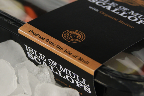
The construction of the logo-type delivers all the traditional qualities people have come to associate with a serif typeface but with the agricultural and contemporary overtones of a slab serif. The raised and underlined detail implies heritage and tradition, this, along with the mixed character weights neatly breaks up a text heavy structure into digestible components. The imperfections of the ‘hand carved’ illustration emphasise a localised and genuine business practice and while the idea of an ‘honest days work’ might not be immediately perceptible it adds depth and stimulates the imagination into contemplating a untouched Scottish shoreline. These values have been captured and reinforced with a nicely drawn seal device that draws together the crafted qualities of the illustration and the structured, classic aspects of the type.
A colour palette of dark and earthy tones provide a wonderful and very contemporary contrast against the fresh, white and bright qualities of the scallops and butter. Printed on an uncoated, textured substrate and with an embossed treatment the packaging has a very cohesive and regional sensibility that, along with a strong sense of craft, experience, honesty and the outdoors contributes to a complete and engaging brand narrative.
