Little Black Book by Freytag Anderson
Opinion by Richard Baird Posted 24 February 2012
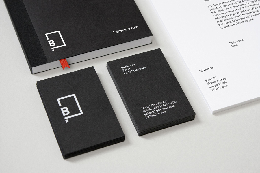
Launched in 2006 Little Black Book is a printed guide for the advertising industry to share new ideas and was brought on-line in 2009 with the inclusion of new features such as e-newsletters, job boards and show reels. This year sees the launch of a new visual identity, created by Glasgow based interdisciplinary design agency Berg now Freytag Anderson, which takes a simple and literal visual approach to frame a broad variety of content.
“We were asked by LBB to refresh the brand identity for their established online business. We were initially engaged to develop their existing identity but convinced our client that a completely new brand identity was more appropriate.”
“We began the project by deciding which assets of the existing brand should be retained. Which held the most brand equity and which should be discarded. We felt it was important that the identity convey the idea of a physical black book. This created an emotive curatorial platform thereby giving the content extra value. Furthermore this physical rendition helped inform the new brand assets such as colour, shape and typography. The dominant use of black lends a premium / exclusive quality to the brand. Whilst a minimal but bold typographic style communicates confidence and authority.”
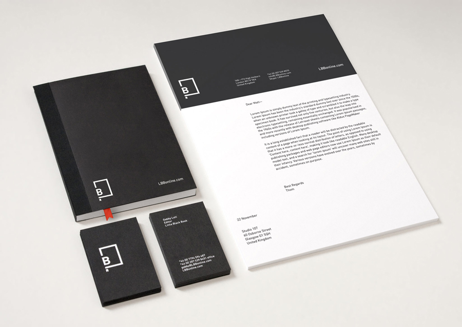
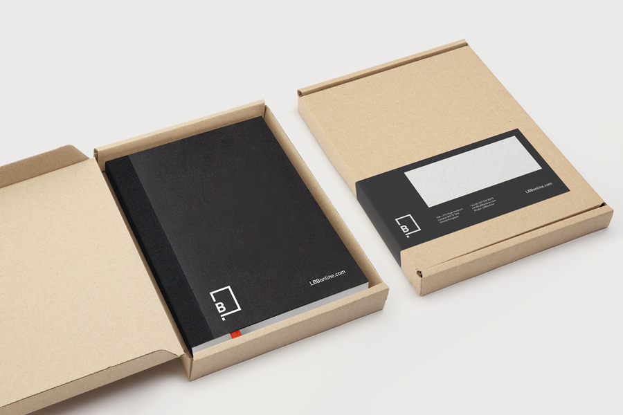
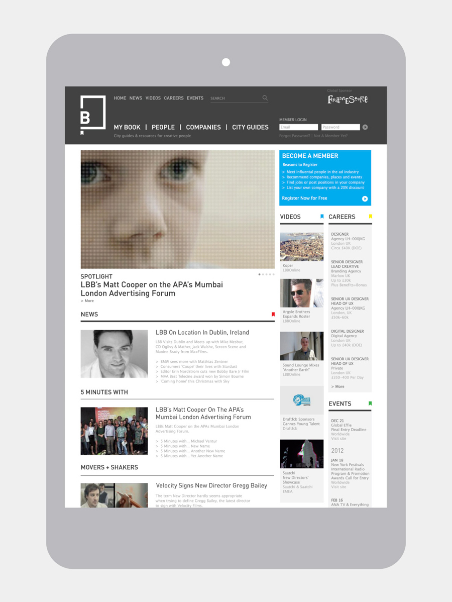
“These newly created brand assets were used to ‘re-skin’ an existing website framework. In addition we took this opportunity to reorganise content into clearly defined areas helping create a more fluid and intuitive user experience. We also created a number of printed items including a suite of stationery and user guide.” – Freytag Anderson

I really like the straightforward aesthetic of this identity and its ability to essentially frame a wide variety of content without over-branding it. The geometric construction and consistent line weight of the logo-mark feels incredibly restrained with a contemporary confidence that understands the brand’s proposition as a portal (reinforced by the mark’s wealth of internal space) from which to access information. The breaks between the line work and type have a stencil like utilitarian aspect and while it may have been neat to keep these at equal distances reinforces the idea of accessibility. The accompanying typeface reflects the geometry and functionality of the mark but with a lighter and contrasting weight that introduces a sense of detail and professionalism with a journalistic undertone.
A simple colour palette, straightforward layout across the collaterals, a very nice black notepad and website appear classically editorial but with a modern white on black twist that has a subtle but distinctive sense of creativity. The spot colour treatment across the texture of an uncoated substrate has a lovely sense of quality and compliments the bold simplicity of the graphic design.
