Siberian Cold by Studio In
Opinion by Richard Baird Posted 12 March 2012

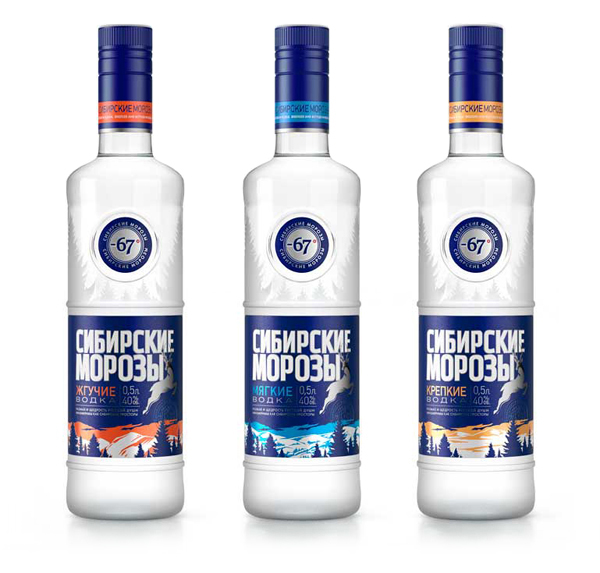
Siberian Cold is a Russian vodka brand made using water which has passed through the soils of a region that frequently endures temperatures of -67°. Owned and distributed by Moscow based MosOblAlkogol and designed by Studio In the bottles and labels utilise a combination of frosted glass, a reflective print treatment and sharp illustrative detail to capture the harsh and icy landscape of Siberia.
“STUDIOIN developed a new brand image of the “Siberian cold” for the company “MosOblAlkogol.” We were able to convey the character of vodka, successfully combining facts and feelings. The historical fact of -67 degrees, as the lowest temperature recorded in February 1933 in Oymyakon not break the Russian spirit, seasoned by centuries in the Siberian soil. Well, a strong friendship and warm fellowship is a place even at low temperatures. As a result, the label conveys a sense of strength drink regardless of the season. These “Siberian frosts” are able to smooth out any anomalies and balance of nature, whether it’s exhausting heat or cold winter. bright contrasting writing the names, graphically illustration, frost on the bottle in the form of taiga forests give the product identity and brand on the shelf.” – Studio In
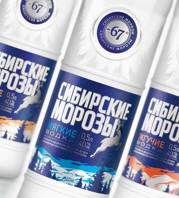
I really like the idea and visual narrative behind this project and its neat juxtaposition of hostile, freezing environment set against the warmth of human spirit and friendship, a contrast that could perhaps also extend to the burning strength of chilled vodka. This sense of cold travels through a white, navy and icy blue colour palette and a frosted dual detail across the structural design that utilises the fractal-like silhouette of trees to give the impression of expanding frost across the bottle. A changing mountainous background framed by a consistent wooded foreground in conjunction with warmer highlights successfully differentiates the three varieties and delivers a more story focused proposition that should stand out against the more straightforward premium aesthetics of the category.
The logo-type’s bold vertical height works well next to the mixed weight and stacked layout of the accompanying type but suffers from some awkward letter-spacing and counter space issues, a dotted divider splits this content and carries with it cues reminiscent of postage stamps adding a subtle exported charactersitic. The disk set into the top half of the bottle introduces a straightforward seal-like and quality focused sensibility further reinforced by an embossed snow-flake detail that is perhaps a little contrived but certainly lends itself well to the theme.


