Billington’s by JKR
Opinion by Richard Baird Posted 13 March 2012

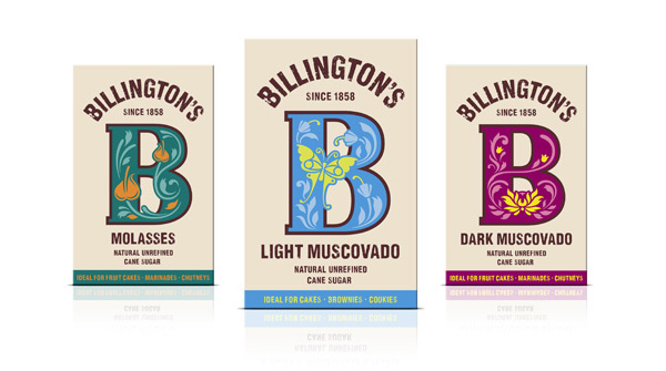
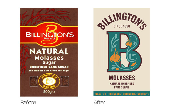
Following my earlier review of Whitworths for Baking, a new cooking sugar from Napier Brown, Billington’s, owned by The Silver Spoon Company, has launched its own repackaged range of sugar created by JKR. The design takes a bold, colourful and contemporary approach to classic illustrated typography and is based around an iconic B character drawn from Billington’s previous and fairly antiquated design.
This week sees the launch of new packaging for Billington’s sugar, designed by jkr. By developing personality through the Billington’s ‘B’, the new design strives to establish an impactful and memorable visual equity for the brand, giving it standout and charisma on shelf.
Known for its unrefined sugars, the new design celebrates the quality of the product inside the pack, inspired by the vibrancy of its Mauritian origins. The decorative ‘Bs’ then portray the personality of each individual product, in a charming and charismatic way.
“We chose to focus on the juxtaposition which existed between the refined nature of Billington’s founder Edward Billington and the unrefined nature of the sugar itself. To this end, we used the Billington’s word mark and a bold decorative ‘B’ to play to these two personalities. Vibrancy and colour was a key element of the design, replicating the sense of pleasure which baking brings.” Adam Swan, Designer, jkr. – JKR
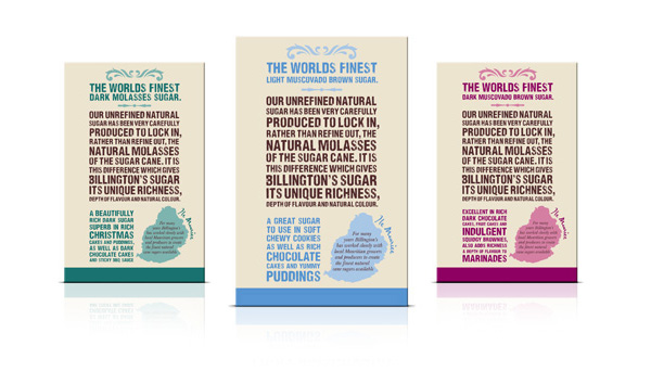
JKR have confidently mixed the practical utilitarian aesthetic of a rubber stamp and a simple geometric typographic direction with a more flamboyant set of illustrative flourishes that delivers interesting visual fusion of commodity and creativity. The reverse of the pack is quite content heavy but well constructed with a distinctive but familiar stacked narrative style, unfortunately the two sides appear to be split between style and substance rather than resolving the two cohesively across the pack. The base colours have a underlying classic sensibility and are cut against a more vivid set of highlights suitably reinforcing the dual themes. The fairly significant heritage of Billington’s remains subtle and perhaps over-looked as a simple typographical detail under the logo-type.


