Whitworths for Baking by Leahy Brand Design
Opinion by Richard Baird Posted 13 March 2012
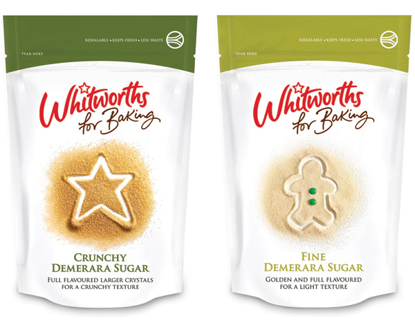
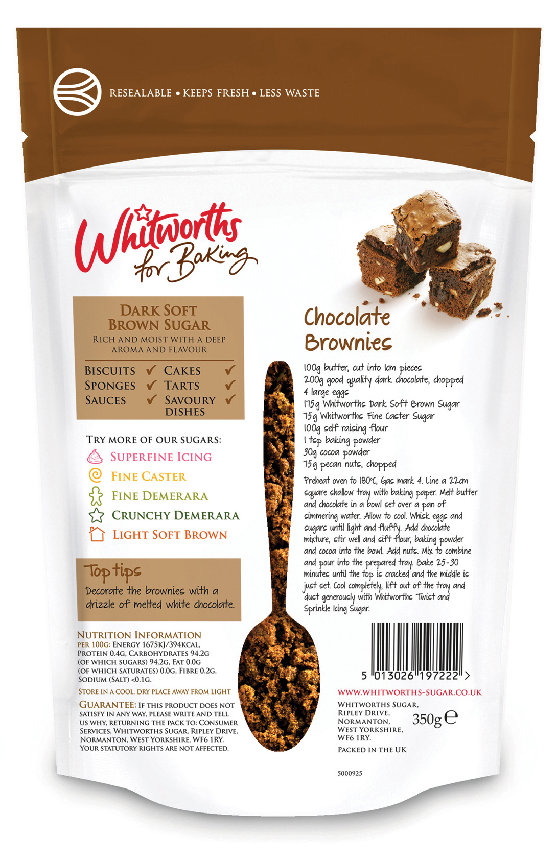
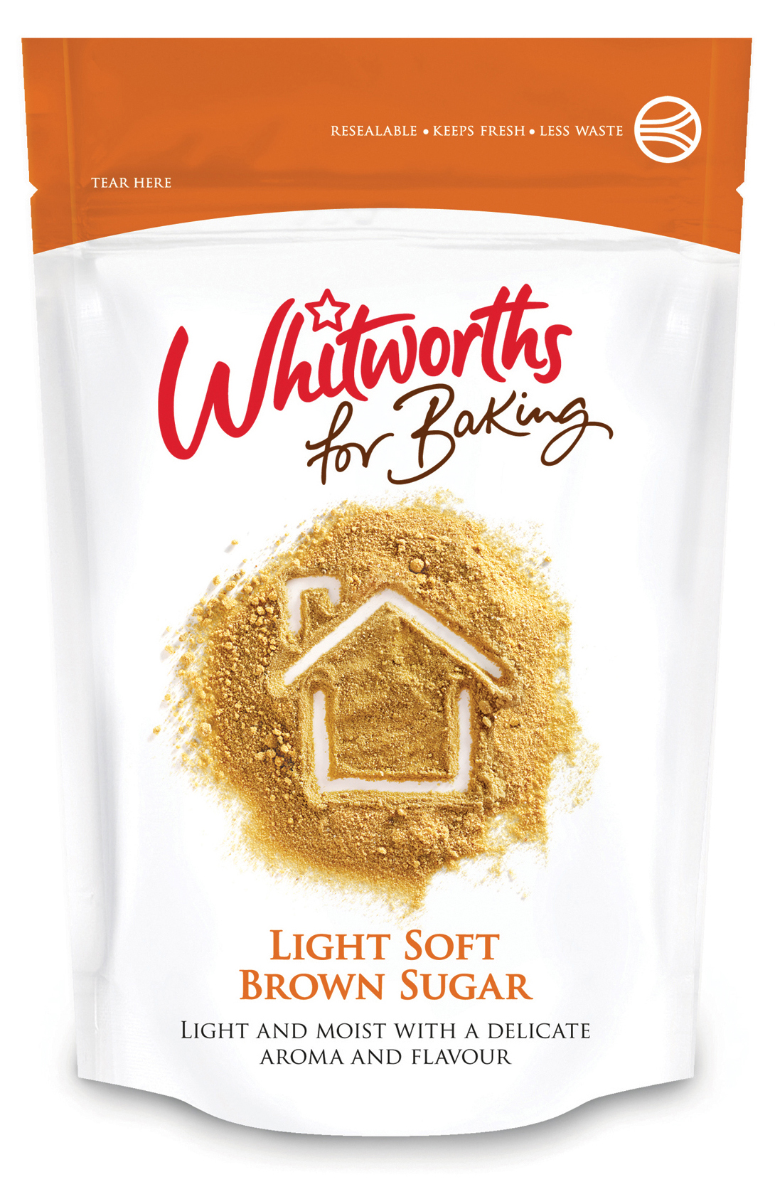
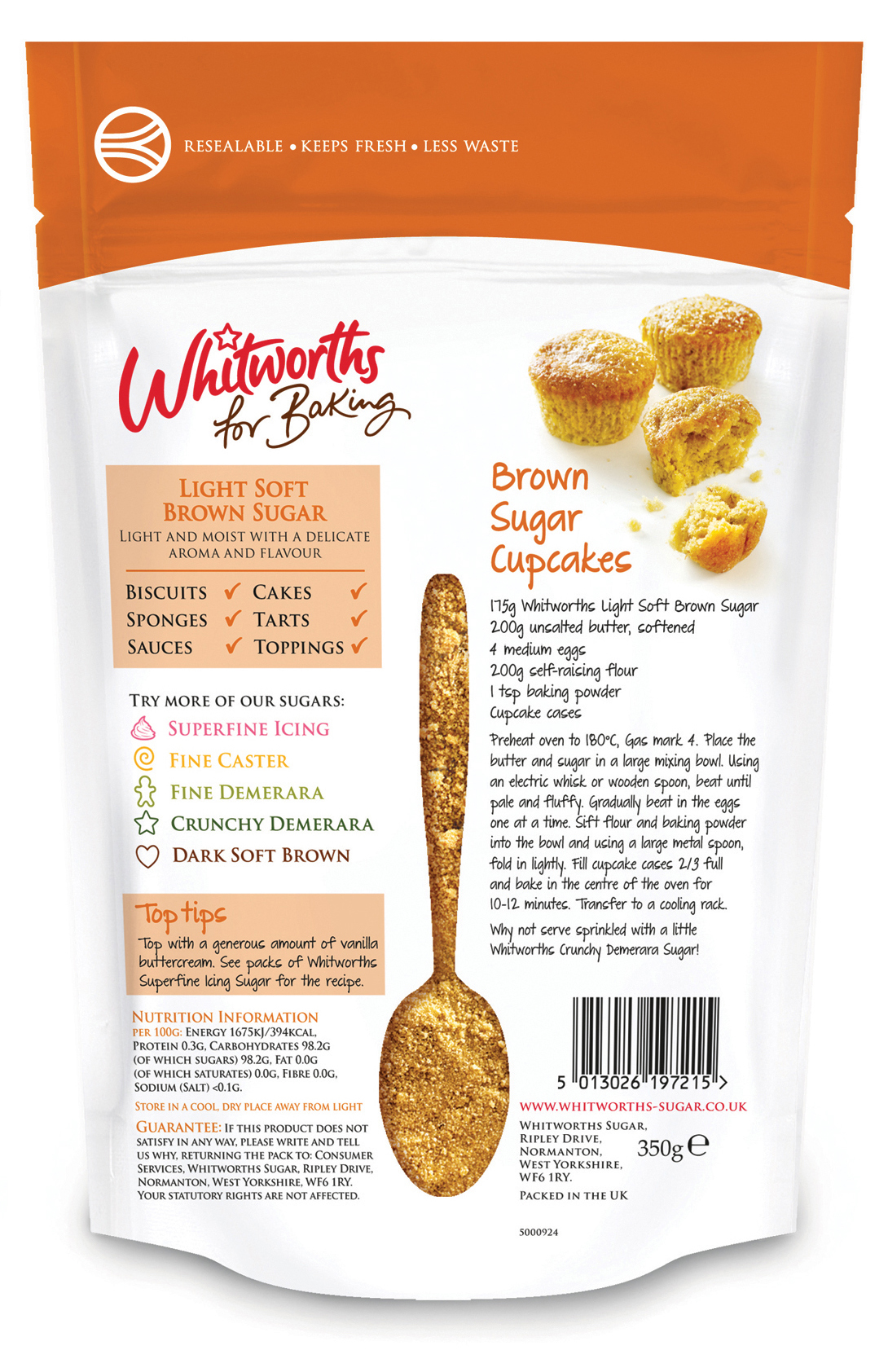
Whitworths for Baking is a new range of cooking sugars from West Yorkshire (UK) based specialist and importer Napier Brown. Whitworths’ visual identity and packaging solution, based around a resealable structural design, playful photographic and mixed typographical approach, were created by Leahy Brand Design.
“The Whitworths for Baking brand needed a memorable story, one that is accessible, helpful and communicates innovation. Our core idea was to simply tell the story of ‘Whitworths is happiness’, after all it’s the simple pleasures in life that make us happy and home-baking is one of those.”
“We explored a wide range of packaging structure options with the resealable stand up pouch being favoured for its convenience, freshness and impact and the sprinkler drum for its pleasure and ease of use.” – Leahy Brand Design
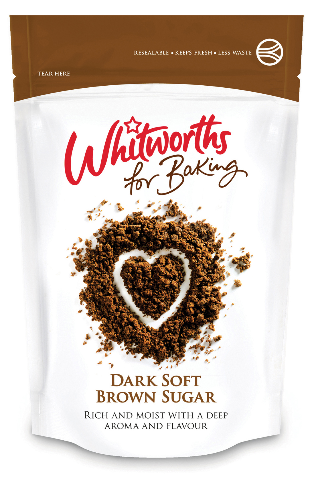
This is probably one of the more commercial packaging projects featured on BP&O but I really love how the images take a very elemental product and give it such a strong sense of fun and creativity, successfully playing on the importance of experience as well as the result. The script of the logo-type and content appears friendly and accessible, and while it might have been nice to draw up the recipes from scratch the typeface has plenty of individual character and motion through the letter-forms to feel spontaneous, personal and passionate. This approach has been appropriately accompanied by a serif typeface, set in uppercase it delivers a neat contrast to the more playful elements of the pack and introduces an important sense of professional quality, reliability and expresses a long-term product knowledge.
The sugar photography is incredibly well shot, drawing out the rich natural colours of the product and working wonderfully well against a clean white background which really emphasises the functionality of such a structural design. The finger drawn shapes are clear, relevant and childishly simple suitably infusing the energy and creativity involved in baking directly into the product that along with the single block colour uniquely differentiate the range.
