Brash Higgins by Swear Words
Opinion by Richard Baird Posted 14 March 2012
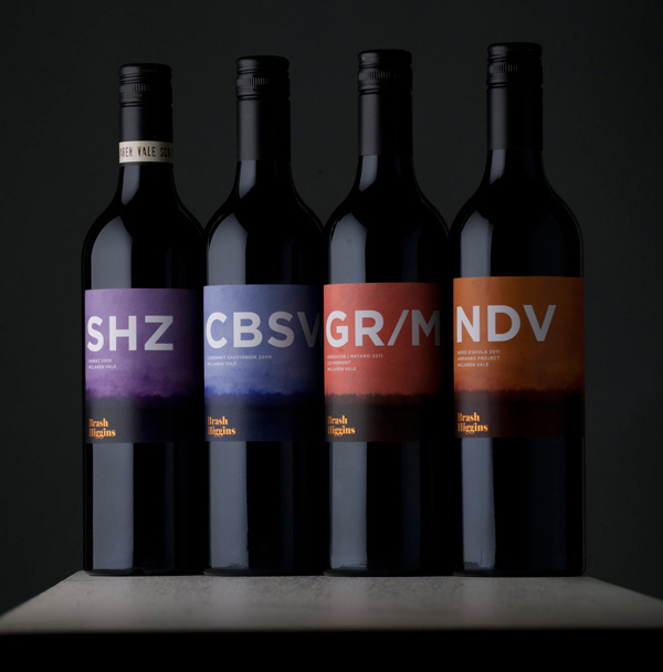
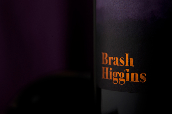
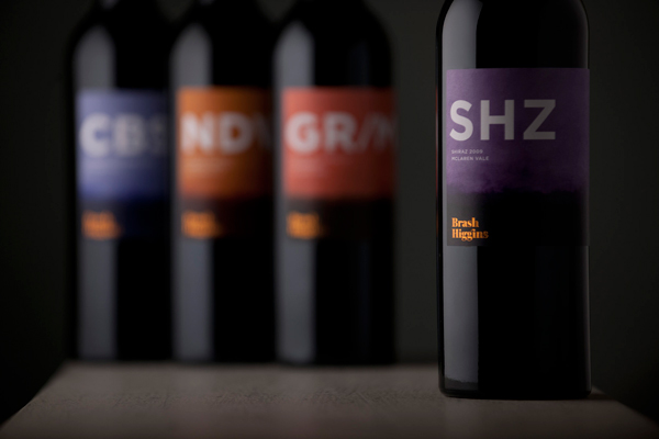
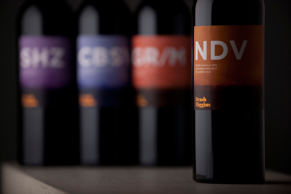
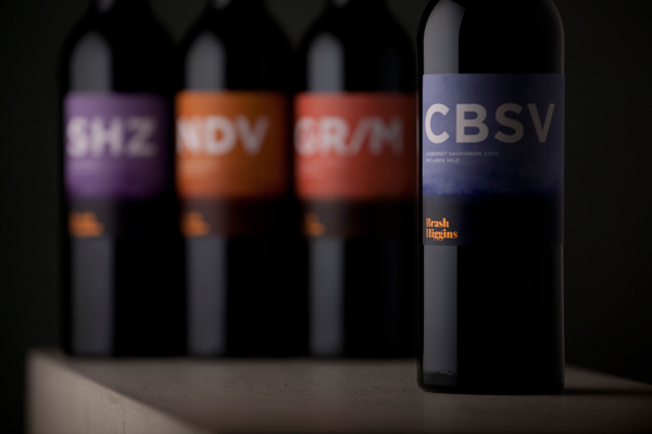
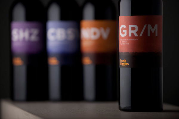
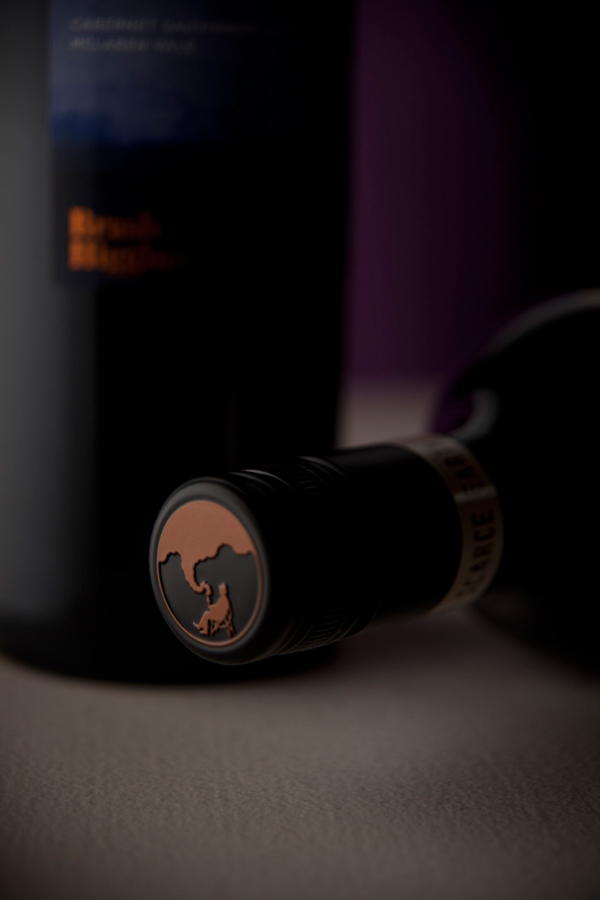
Brash Higgins is a wine range produced by Omensetter, a vineyard of red-brown clay and sandstone located in McLaren Vale (Australia). The bottle’s labels, created by design agency Swear Words, capture the earthy flavours of the wine, handcrafted clay amphoras used in the production process and the soil qualities through a warm water-colour palette, orange foil treatment and a tactile uncoated substrate.
“Brash Higgins is Brad Hickey’s wine label. In 2007 Brad, a New York City sommelier, swapped his wine knife for a pair of secateurs and came to work vintage in McLaren Vale. In true Aussie tradition, his name was summarily changed to ‘Brash’ which provided a ready alias to work under the radar” – Brash Higgins.
“Swear Words had a great deal of fun creating labels that had to be as brash as Brash. Big, bold, interesting and balanced wine needed labels to suit.” – Swear Words
I very rarely write about wine label design as I simple have very little experience of the commercial considerations involved in visualising the often subtle and complex flavour characteristics of different vintages, however this piece by Swear Words really caught my attention. The blend of bold typographical abbreviations set against earthy tones and a distinctive watercolour treatment across an uncoated substrate is a really lovely direction that feels both handcrafted and contemporary. The washed and graduated colour choices capture a warm environment and changing skyline that moves through dusk to early evening across each variety. A neat execution of a classic serif logo-type with ligature introduces a friendly yet knowledgeable sensibility while its orange foil treatment catches the light and mirrors the warmth of the backgrounds delivering a neat premium contrast to a crafted aesthetic.
