Secret To Live by Soporte Comunicación
Opinion by Richard Baird Posted 29 March 2012

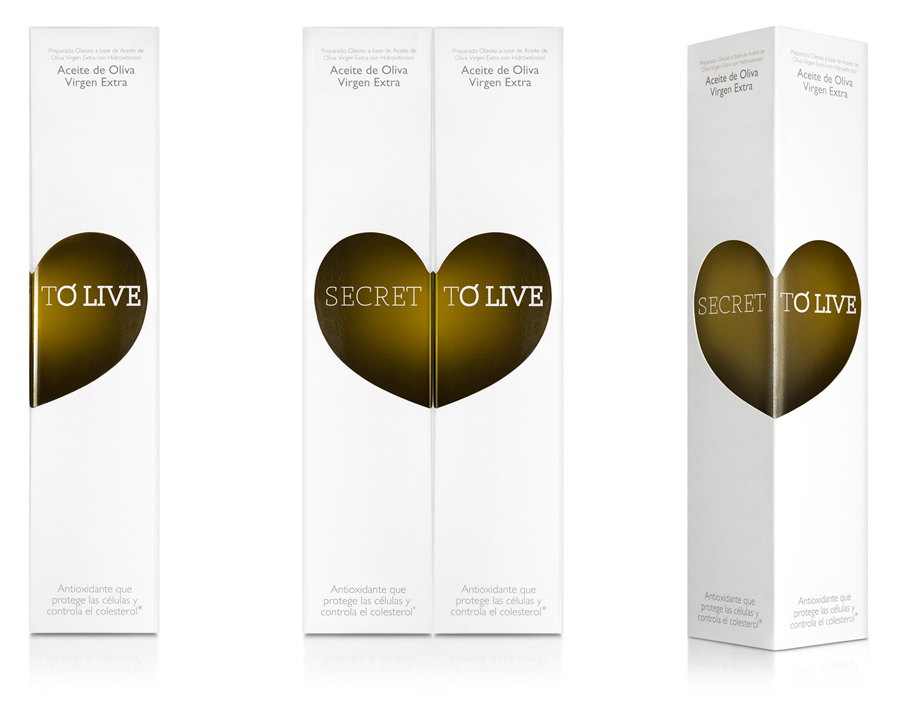
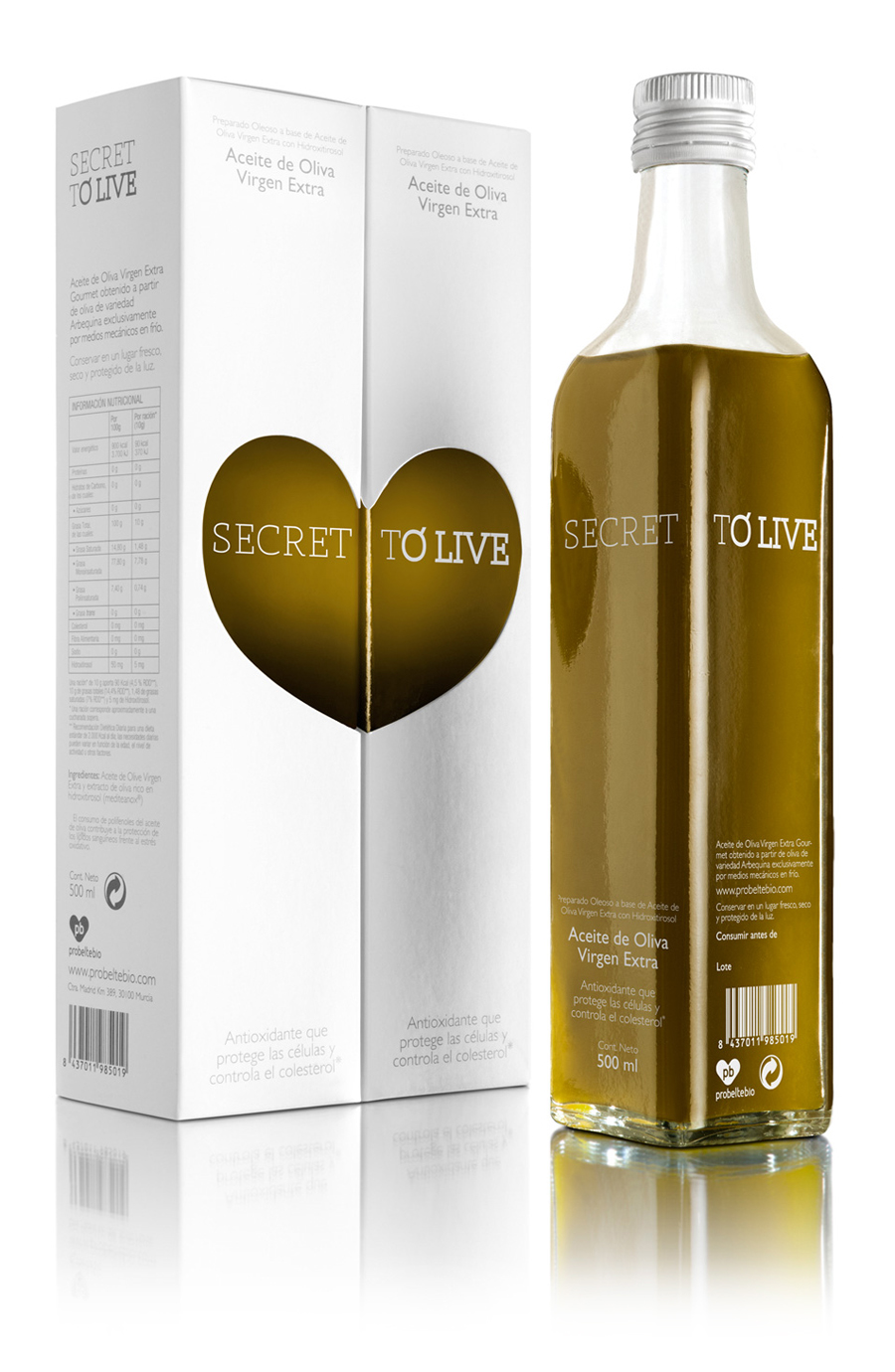
Secret to Live is a brand of olive oil infused with antioxidants and nutrients beneficial to the cardiovascular system. The packaging, designed by Valencia based Soporte Comunicación, utilises a minimal layout, a clinical colour palette and a heart/olive motif to visualise the active health benefits of the product.

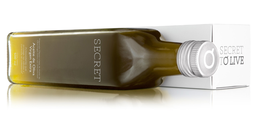
This is an incredibly simple solution that manages to subtly draw out an olive-like form from the split panel die-cut execution of a heart, neatly drawing together the interior product and its exterior proposition. Placed side by side two bottles form a complete heart and appears as a visual analogy to the power of companionship that along with a well-balanced and a healthy diet can have an equally positive impact on the body. The logo-type’s slab serif construction and fine but mixed line weight has a contemporary quality that compliments the spacious layout. There are some slight spacing issues, an unnecessary use of ligatures and perhaps a slightly forced inclusion of the word olive in the name but there is an appropriately earthy and agricultural undertone that ties the product to its farmed origins. A colour palette of clinical white and cool grey is an interesting mix for a food product that takes its premium cues from the cosmeceutical industry to amplify the warmth of the oil’s rich gold tone and appear medically effective.


