The Sour Patch Kids by Dale Doyle
Opinion by Richard Baird Posted 19 April 2012

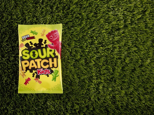
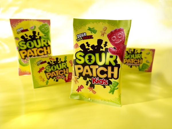
The Sour Patch Kids is a US brand of confectionary created by Paul Mihalick in the early days of soft sugar-coated candy and now owned by Cadbury Schweppes. The brand’s new packaging and visual identity, designed by Landor’s creative director Dale Doyle, replaces the dated illustrated characters of the original and draws on the products iconic and nostalgic silhouette to create a solution that hints at a new world inhabited by sweets.
The rubbery and bubbly typography, common to this market, has been suitably replaced with a more restrained combination of letter-forms with square and rounded terminals that gives the brand a more original and an almost dual, ‘for children and adults’, personality. Its circular composition of silhouettes, from which the packaging images and content revolve around, introduces an almost global sensibility that implies that these characters inhabit a world of their own and plays well to a child’s sense of imagination. The colours are more sophisticated and suitably drop the synthetic tones now associated with 90’s candy but not at the expense of impact as a black on colour combination delivers significant contrast that like the logo-type has a quality which should appeal to an older, nostalgic audience as well as children.


