Mal de Mar by Face
Opinion by Richard Baird Posted 25 April 2012

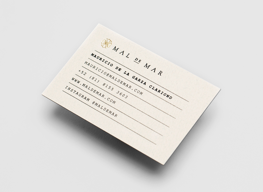
Mal de Mar is a San Pedro, MX based business and on-line journal where art, design, architecture, photography and travel combine. The journal’s new identity, developed by ‘supermodernist’ design agency Face, captures and binds the timeless pursuit of knowledge and experience through travel and culture with that of the modern technological world with a contemporary fusion of light, symmetrical and consistent line work and the classic sensibilities of a broadly spaced serif logo-type.
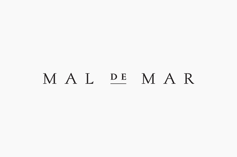
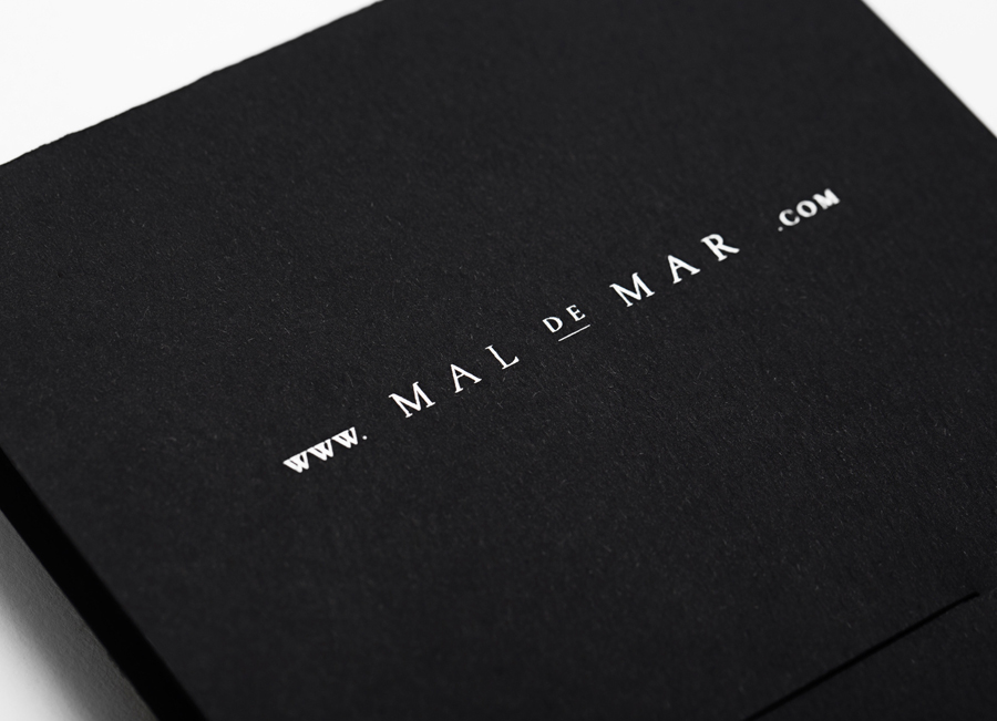
The logo-type, based on a solid, medium weight serif, executed with generous horizontal spacing and an underline detail, has been really well constructed and neatly resolves the traditional craft of writing and academic exploration of the arts.

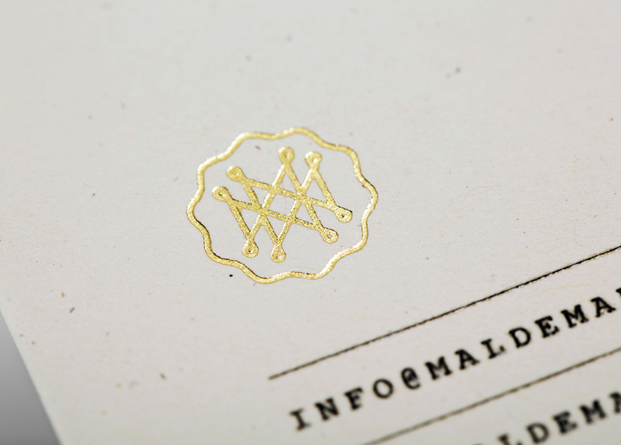
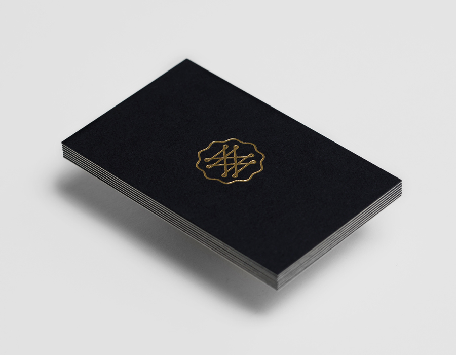
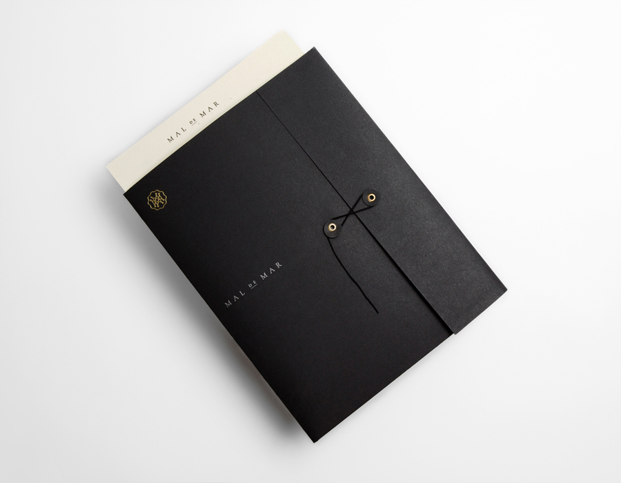
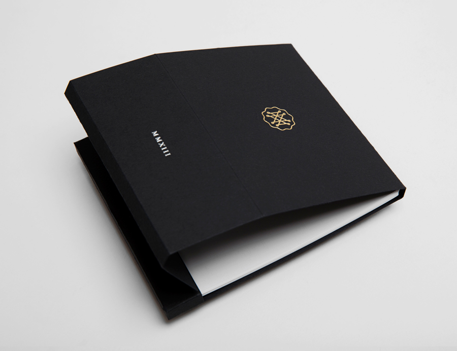
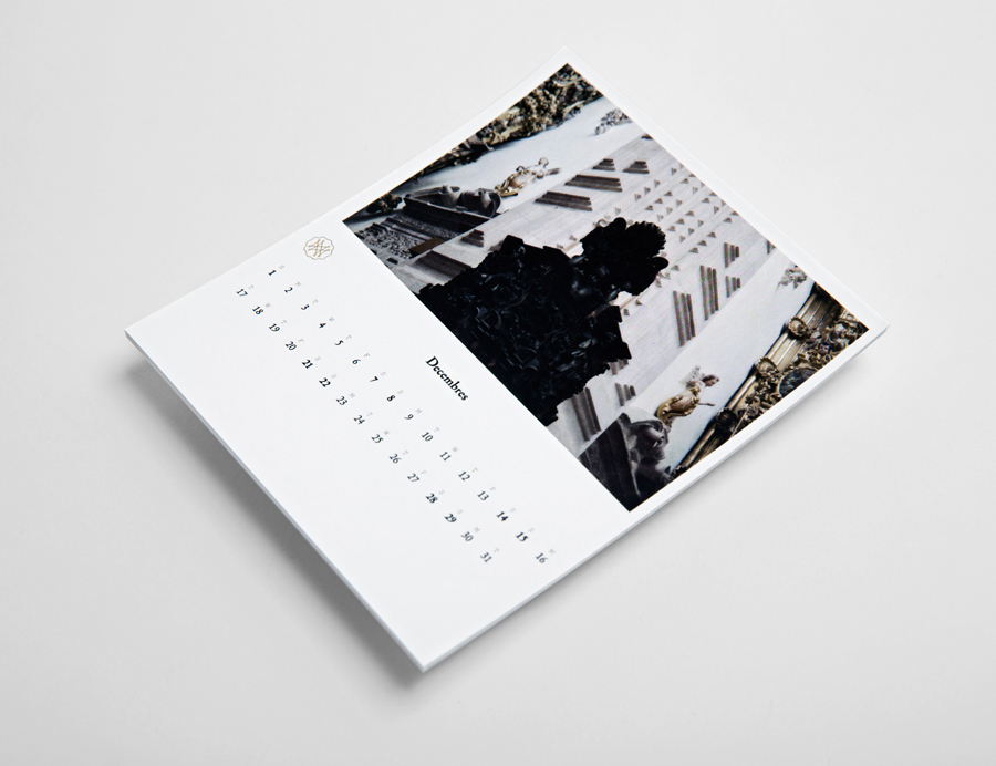
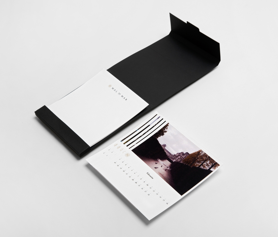
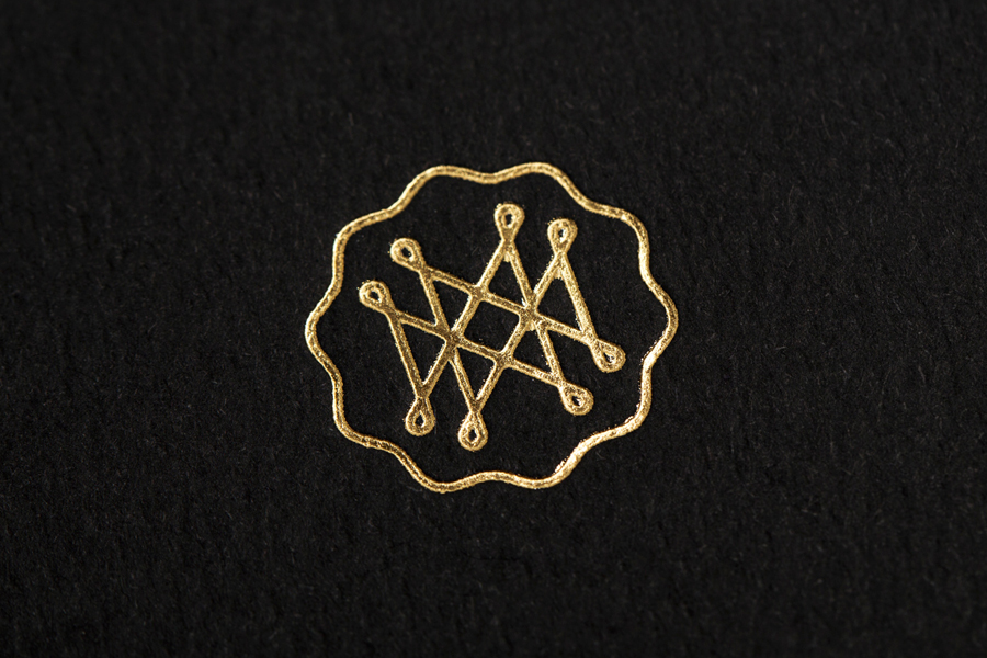
A complex monogram of loops and intersections offers a contemporary contrast to these qualities through its consistent fine line weight and geometry which introduces the ideas of technology and infrastructure, the union of various artistic interests and the journeys made through modern, metropolitan transport systems. The slab serif detail of the business card and website add an almost vintage editorial quality that resonates well with journalism and writing in the field. There is a wonderful sense of quality and timelessness in the black and cream colour palette, spacious layout and string tie of the collaterals while a gold and embossed bock foil treatment introduces a subtle sense of luxury and an interesting juxtaposition to the craft-like aesthetic and texture of an uncoated and unbleached substrate.
