Modhouse by A Friend Of Mine
Opinion by Richard Baird Posted 18 May 2012

Modhouse is an Australian design and building firm that specialises in sustainability, modular construction techniques and interior design. The company’s new brand identity, created by holistic design studio A Friend Of Mine, visualises their specialist approach with a set of elemental and geometric containers, bold sans serif typography and a colour palette that juxtaposes bright creative colours with warm architectural greys.
“Founders of ‘Beach House Constructions’ decided to create a new business, Modhouse, focusing solely on sustainable modular homes. The various Modhouse prefabricated modules are perfect for those who want a quality, contemporary, sustainable home in a short time frame. The Modhouse brand identity system is based on a grid on which various graphic modules can be composed. Like the homes these modules are flexibly arranged in dynamic layouts to best suit the given content and context. This concept revolves around the notions of choice, adaptability and control, suggesting that Modhouse clients have the perfect toolkit when designing their dream home or project. The typography is bold, simple and clean and the varied palette, again hinting to flexibility, reflects the Scandanavian style of the homes. Online environment by Golden Grouse and That Mob.” – Friend Of Mine
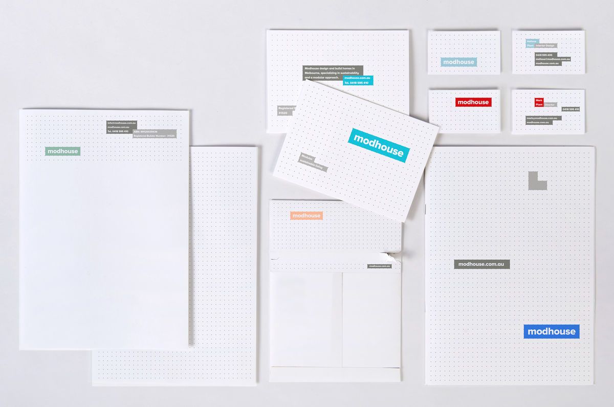
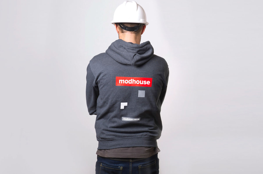
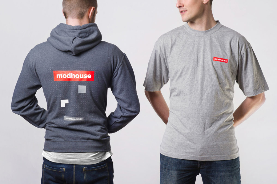
Like modular construction this visual identity supplies Modhouse with a flexible series of assets that fuses functionality, architectural planning and build with a simplicity and clarity. Each component is elemental in its construction with a playful Tetris like sensibility in the logo animation that offers a creative system, open to various iterations and dynamism, across printed and digital touch-points.
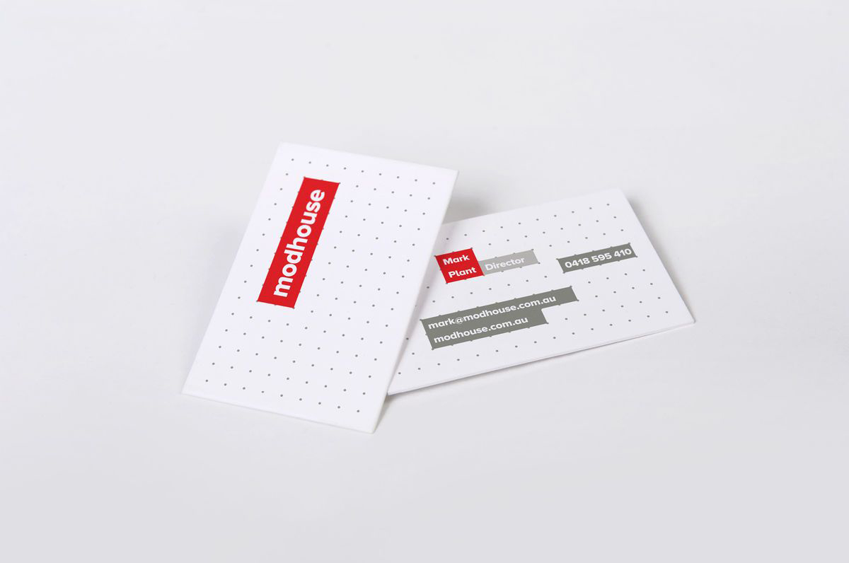
The dotted grid, executed with plenty of negative space and an unobtrusive light grey tone, provides a solid (and slightly more unusual but creative) foundation and layout that is functional with an underlying schematic aesthetic that perhaps reflects a pragmatic approach.
A red and blue and a warm grey colour combination delivers a representative mixture of creativity, sustainability and architectural sensibilities that are really emphasised by the clean white backgrounds of the stationery and business cards. The bold sans serif typography, born out of 20th century modernistic principles, is functional and practical in its consistent geometric proportions, fitting well within the containers and suitably reflecting the philosophies of the practice.
