Onsagers by Uniform
Opinion by Richard Baird Posted 28 May 2012

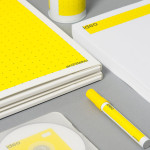
Onsagers is an Oslo based consultancy that specialises in the protection of intellectual property through patents, trademarks, design and law. Since its establishment in 1945 Onsagers has grown, aided by merger with Defensor in 1997, to become one of Norway’s leading IPR firms. Its new identity, developed by brand and packaging design agency Uniform earlier this year, is a simple but bold combination of a mono-line weight logo-type, icons and a striking, authoritative, white, black and bright yellow colour palette.
“The company has extensive expertise in intellectual property. An old and very outdated profile needed renewal. Uniform has provided new brand platform, visual strategy and implementation of a new profile on all surfaces. Counsellors at Onsagers are known to be accessible, trustworthy, productive and assertive. Yellow and black has always been the company color, and this was an important guideline for the new profile. With the new profile, you want to stand out from other patent offices and businesses in legal area.”
– From designbasen.no

I have a soft spot for stencilled logo-types and this is a pretty solid example. Constructed from a superellispe, line breaks, large curves, mono-spacing and recurring geometry, each letter-form has been resolved with a coherency and consistent line weight that appears technical, practical and utilitarian. The combination of rounded terminals and an all lowercase format introduce an accessible and democratic quality with a slightly taller x-height that adds a subtle authoritative edge.


The strong diagonal line that moves through the stationery alongside a secondary sans serif type choice juxtaposes the curves of the logo-type and keeps the visual identity looking sharp, formal and functional. Unfortunately while the icons are appropriately technical and share a similar (but slightly inconsistently executed) mono-line weight of the logo-type, they could have done with a more of a proprietary style that either built on the identity or appropriated the austerity of legal documents. The black and white colour palette delivers an official aesthetic alongside the industrial, hazard-like yellow that functions well to ‘highlight’ key information and visualises a strong sense of clarity, focus and purpose.
The result is a smart fusion of legal formality and individual personality with the accessibility, reliability and practicalities expected from a contemporary technology and ideas lead business.